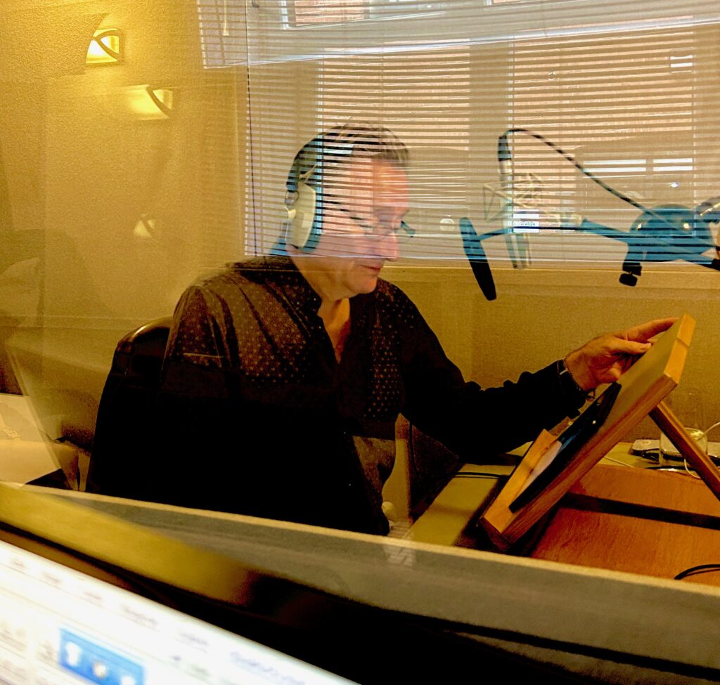
Nuclear Complexity and Oral History: Brianna Iswono’s Undergraduate Research, Fall 2024

a young woman smiling
Brianna Iswono at UC Berkeley, 2024.

by Brianna Iswono

Brianna Iswono is a third-year undergraduate student at UC Berkeley majoring in chemical engineering. Throughout the Fall 2024 semester, Brianna worked with Roger Eardley-Pryor of the Oral History Center to earn academic credits through Berkeley’s Undergraduate Research Apprentice Program (URAP). URAP provides opportunities for undergraduates to work closely with Berkeley scholars on cutting edge research projects for which Berkeley is world-renowned.  In this post, Brianna reflects on her research about nuclear power as it appeared in the Oral History Center archives.

As a chemical engineering student at UC Berkeley, my coursework only briefly touches on topics of nuclear power and energy. I wanted to learn more and my curiosity deepened as I saw more and more headlines about nuclear energy in news articles and social media. To dive deeper, in the fall of 2024 I joined Berkeley’s URAP (Undergraduate Research Apprenticeship Program) under the mentorship of historian Roger Eardley-Pryor at the Oral History Center, where I analyzed various oral histories and technical reports about nuclear energy. Through this experience, what I discovered was not only a stronger interest in nuclear power, but a field marked by polarizing perspectives and profound complexity—one where simple answers do not exist. 

A man in a suit and tie holding a smoking pipe
William E. Siri, environmentalist and biophysicist, 1964

Nuclear power stands as one of the most reliable carbon-free energy sources available today. Unlike fossil fuels, it produces no carbon dioxide during electricity generation, which makes nuclear power a critical tool in the fight against climate change and reducing greenhouse gas emissions. Given the growing urgency for energy facilities to reduce their overall emissions, nuclear power offers a viable option for large-scale, reliable energy production. As former Sierra Club president, mountaineer, biophysicist, and Berkeley Lab energy analyst William E. Siri noted in his oral history in the late 1970s, “Coal is a very dirty fuel… That leaves nuclear as one clean energy source until solar and other energy sources are fully developed.” Today, solar and wind are more developed, but the energy they generate drops when the sun sets or when winds cease. By providing steady, continuous power, nuclear energy complements intermittent renewable sources like wind and solar, ensuring grid stability. This reliability reduces the need for fossil fuel-based backup systems and thus helps mitigate climate change.

a smiling man with white hair
David Brower, environmental activist and first executive director of the Sierra Club (undated).

However, nuclear power is not without its environmental challenges. The construction and operation of plants can disrupt local ecosystems, particularly since they are often built in rural areas rich in biodiversity and ecological value. Habitat disruption, deforestation, and the high demand for water used in reactor cooling all remain significant concerns. The presence of nuclear plants places an increased strain on local water resources, particularly in underserved regions already facing water scarcity. In the first of his two archived oral history interviews, David Brower, the former executive director of the Sierra Club, the nation’s largest environmental organization, explained about the Club’s consideration of nuclear power, “You certainly haven’t helped the poor by degrading the environment, the working place, by not getting into the battles to protect them from the chemicals that they’re exposed to.”

a smiling young man wearing glasses and a suit and tie
Laurence I. Moss, nuclear engineer and former Sierra Club president, 1973.

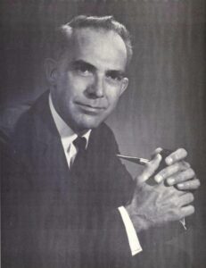
Also, the visual impact of large nuclear facilities can dramatically alter the character of scenic areas. At least in California, public opposition was fueled historically by concern that industrial structures for nuclear power detracts from the natural beauty and environment of rural areas, making them appear stark and out of place. Laurence I. Moss, former Sierra Club president and nuclear engineer, worked directly on construction of nuclear reactors. Moss shared in his oral history, “In my mind it was always a location issue. That was not the right place to put a nuclear power plant, or any industrial facility. I would not want to put a residential development there, anything that would alter the natural environment for the worse.” Moss’s perspective highlights the tension between technological advancement and environmental preservation, underscoring the importance of careful site selection to balance progress with respect for natural landscapes.

an older man seated and wearing a baseball cap
Professor Thomas H. Pigford, founding chair of UC Berkeley’s Department of Nuclear Engineering, 2001.

Another major challenge, and perhaps the most pressing, is the management of nuclear waste. Nuclear reactors generate long-lived radioactive waste that requires secure, long-term storage, and even the most advanced waste repositories carry the risk of leakage or contamination over the thousands of years that spent nuclear fuel remains toxic. Efforts to manage nuclear waste have included ambitious ideas such as deep-sea disposal or even launching the waste into the sun. However, these approaches fail to fully eliminate the risk of leakage, especially given the exceptionally long timescales over which the waste must remain secure, and they often introduce additional challenges. As Thomas H. Pigford, the founding chair of UC Berkeley’s Department of Nuclear Engineering, explained in his oral history from the late 1990s,“Another more attractive approach is to shoot the radioactive waste into the sun, which would require concentrating it to reduce the weight. And that’s where it belongs, because the sun is so radioactive. But there, the technical challenge or problem is the abort rate of missiles, of space vessels, and so when consulting the people in NASA, we concluded that that was just untenable.” Such unresolved issues remain a central concern for environmental advocates, highlighting the ongoing tension between the potential of nuclear power as a clean energy source and the ecological risks it poses.

Economically, nuclear power presents both opportunities and challenges. Once operational, nuclear reactors have relatively low fuel and operating costs compared to many other energy sources. Uranium, the main fuel used, is highly energy-dense, requiring only small amounts to generate large quantities of energy. This efficiency makes nuclear power a cost-effective solution to meet large-scale energy demands, providing a reliable supply of energy at a lower long-term cost while still delivering the high output needed to sustain industrial and societal needs. After working directly with the economic analysis of nuclear plant construction in the 1960s, Moss shared, “we were able to show that other alternatives, specifically a nuclear power alternative, built in those years could provide power at lower cost than the dams.” Nuclear power also has an extensive reach that goes far beyond reactors, influencing a wide range of industries and technologies. The advancements and expertise gained through working with radiation and the advanced technologies required for waste facilities have helped with the development of new medical technologies used to measure radiation. Professor Pigford was directly involved in establishing the nuclear engineering curriculum at Berkeley and saw its expansion into related medical technologies. In his oral history, Pigford shared “Yes, well, there are plenty of jobs in waste disposal. And they are emphasizing more and more the interaction with the bioengineering program, which, as you probably know, is a new push on the campus. There’s a new department, and they’ve even gone into the field of tomography, which is doing scans on the brain and on the rest of the body. These involve nuclear reactions and so the development of instrumentation for that, techniques of sensing the nuclear radiations and interpreting them, is occupying more and more time.” Pigford’s insight highlights how nuclear engineering graduates have the opportunity to apply their expertise to innovations in health-related technologies, such as medical imaging.

a young woman wearing a face mask holding a handmade sign
Environmental activist in Seoul, Korea, at a rally marking the 12th anniversary in 2023 of Japan’s Fukushima nuclear disaster (photograph by Ahn Young-joon of Associated Press).

Yet, a major economic challenge of nuclear power is the huge initial investment needed to build a plant. Designing, constructing, and meeting regulatory standards for a single nuclear plant can cost billions of dollars. While the long-term operating costs are lower, the upfront costs to begin production are much higher than those of other energy sources.This creates a significant barrier, particularly for developing countries that may also lack the technical expertise or regulatory infrastructure needed to operate plants safely. In his oral history, Siri captured the economic trade-off and complexity of nuclear power. Siri noted, “The more countries that have nuclear power plants, particularly the less advanced countries, the more likelihood there will be of meltdowns, simply because many such countries don’t have the technical base on which to maintain such an industry.” For these countries, nuclear power offers a chance to advance economically, but it also comes with the greater risk of catastrophic failure.

an older man wearing a tie
Roy Woodall, Australian geologist (undated).

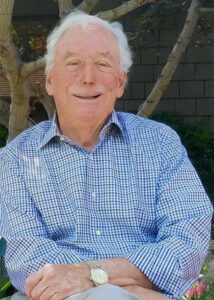
On the global stage, nuclear technology carries a sense of prestige. Non-nuclear nations often see other nations with advanced nuclear developments as leaders in innovation, which enhances their national pride and elevates their international status. The high demand for uranium to fuel nuclear reactors has led various countries to form alliances or joint ventures, employing any means necessary to secure a share of the advancements in nuclear technology. Roy Woodall, an Australian geologist known for his contributions to the mining and exploration industries, directly engaged with the mining sector to meet the growing global demand for uranium. In his oral history from the early 2000s, Woodall shared, “There was quite a lot of interest from other overseas companies in looking for uranium in Australia, so we formed a joint venture to look for conglomerate-type uranium deposits in Northern Western Australia.” His experience highlights the global scramble for uranium resources, reflecting how the race for nuclear technology has spurred both national and international collaboration. 

a seated man with white hair
Michael R. Peevey, an energy entrepreneur and regulator (undated).

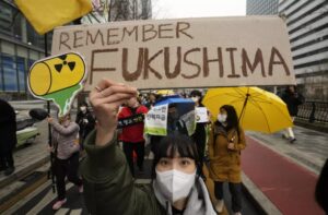
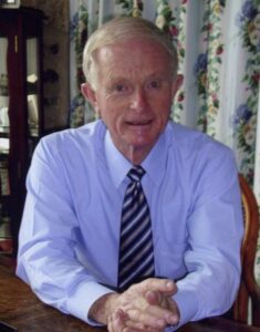
However, the social risks associated with nuclear power are significant. Public fear of radiation exposure, which can lead to various health risks, has been intensified by past large-scale nuclear accidents like Fukushima and Three Mile Island, along with the media frenzy surrounding them. When reflecting on nuclear concerns during his oral history in 2019, Michael R. Peevey, a UC Berkeley alumnus, former electric utility executive, and previous president of the California Public Utilities Commission, recalled “But we had Chernobyl in Russia, which was a disaster; it’s a lingering disaster today.” Such concern has resulted in widespread resistance to the construction of new nuclear reactors and calls to shutdown existing ones. Grassroots movements and anti-nuclear campaigns have further fueled this opposition, creating a broad social aversion to nuclear power.

a young man crouching by three fish he caught using a fly rod
David Pesonen, attorney and environmentalist, 1963.

David E. Pesonen is a UC Berkeley alumnus, attorney, and environmental activist best known for his leadership role in the battle to defeat a PG&E nuclear power plant at Bodega Bay in the early 1960s. In his oral history recorded in the late 1990s, Pesonen explained his motivation for spreading the anti-nuclear power agenda. “Mainly because of the waste disposal problem. I don’t know the answer to that. I don’t know that anybody does. And also because I think the design of the generation of plants that we are involved with is inherently unsafe.” Despite the advanced safety features of modern plants, the widespread fear and skepticism continue to challenge the nuclear industry, highlighting the complex intersection of technological progress, environmental concerns, and public perception.

After conducting this oral history research and diving into the different aspects of nuclear power, I have come to realize that this field is inherently complex. I am still unsure where I stand in these debates, but one thing is clear: nuclear energy shouldn’t be dismissed outright. A recent LA Times article notes that, as energy-demanding technologies like AI continue developing rapidly, the demand for energy will only increase and all carbon-free options must be considered, especially in light of climate change. At the same time, we cannot ignore the risks that nuclear power poses. I think that the best approach is to carefully consider all non-fossil energy sources, such as nuclear or renewable, to make informed choices. Nuclear power is neither entirely good nor entirely bad; it is a complex and multifaceted technology with the potential for significant benefits and serious risks. Attitudes will likely continue to shift back and forth, but embracing the complexities of nuclear power is important to making wise decisions about its future role in meeting global energy needs. Reflecting on my semester of oral history research, I am grateful to have taken this URAP opportunity, as it gave me valuable insight and a new understanding of nuclear power that I always hoped to explore. Nuclear power is a complicated yet astonishing field, and I hope others can be informed on it to formulate their own stance on how to create a greener future. 

Works Cited: 

Siri, William E. “William E. Siri: Reflections on the Sierra Club, the Environment, and Mountaineering, 1950s-1970s.” Interview by Ann Lage in 1975, 1976 and 1977. Oral History Center, The Bancroft Library, University of California, Berkeley, 1979.

Brower, David. “David Brower: Environmental Activist, Publicist, and Prophet.” Interview by Susan Schrepfer in 1974, 1975, 1976, 1977 and 1978. Oral History Center, The Bancroft Library, University of California, Berkeley, 1980.

Moss, Laurance I. “Laurance I. Moss: Sierra Club President, 1973-1974, Nuclear Engineer: Energy and Environmental Policy.” Interview by Ann Lage in 1992. Oral History Center, The Bancroft Library, University of California, Berkeley, 2014.

Pigford, Thomas H. “Thomas H. Pigford: Building the Fields of Nuclear Energy and Nuclear Waste Management, 1950-1999.” Interview by Carl Wilmsen in 1999. Oral History Center, The Bancroft Library, University of California, Berkeley, 2001.

Woodall, Roy. “Roy Woodall: Australian Geologist, 1953 to 1995: Success in Exploration for Gold, Nickel, Copper, Uranium, and Petroleum.” Interview by Eleanor Swent in 2004. Oral History Center, The Bancroft Library, University of California, Berkeley, 2006. 

Peevey, Michael R, “Michael R. Peevey: An Entrepreneur in Business, Energy, Labor, and Politics” conducted by Roger Eardley-Pryor in 2019, Oral History Center, The Bancroft Library, University of California, Berkeley, 2019.

Pesonen, David E. “Attorney and activist for the environment, 1962-1992 :opposing nuclear power at Bodega Bay and Point Arena, managing California forests and East Bay regional parks” Interviews conducted by Ann Lage, 1991 & 1992. Oral History Center, The Bancroft Library, University of California, Berkeley, 1996.

Haggerty, Noah. “Has Nuclear Power Entered a New Era of Acceptance Amid Global Warming?” Los Angeles Times, November 18, 2024. https://www.latimes.com/environment/story/2024-11-18/a-new-generation-finds-promise-in-nuclear-energy.

ABOUT THE ORAL HISTORY CENTER

The Oral History Center of The Bancroft Library preserves voices of people from all walks of life, with varying political perspectives, national origins, and ethnic backgrounds. We are committed to open access and our oral histories and interpretive materials are available online at no cost to scholars and the public. You can find our oral histories from the search feature on our home page. Search by name, keyword, and several other criteria. Sign up for our monthly newsletter  featuring think pieces, new releases, podcasts, Q&As, and everything oral history. Access the most recent articles from our home page or go straight to our blog home.

Please consider making a tax-deductible donation to the Oral History Center if you’d like to see more work like this conducted and made freely available online. As a soft-money research unit of The Bancroft Library, the Oral History Center must raise outside funding to cover its operational costs for conducting, processing, and preserving its oral history work, including the salaries of its interviewers and staff, which are not covered by the university. You can give online, or contact us at ohc@berkeley.edu for more information about our funding needs for present and future projects.


The Bias of Notability in Wikipedia

Let’s chat about Wikipedia as a source of general information. For many people, Wikipedia is a first stop to check on information about who’s who, genre overviews, lists of books, and more. In theory, as a place to find the “sum of all human knowledge” (Wikipedia: About), it should be a good place to get an overview of what’s out there to know. Yet, using Wikipedia’s coverage leads to a skewed understanding of what’s available. Instead of being a reliable source for all human knowledge, Wikipedia’s policies means it reproduces institutionalized biases related to gender, community groups, and other categories of identity and knowledge. Furthermore, those policies mean that the platform’s biases are very difficult to address despite Wikipedia’s calls for public contributions and claims to desire to be an unbiased source of information.

What do I mean by that?

Bluntly, I mean that Wikipedia’s coverage privileges white, male, English-speaking people in positions of power (Wikipedia: Gender Bias; Racial Bias). I personally think that having editors, having some checks, are incredibly important. There needs to be some level of standard, but there are problems with how the standards for things like notability are enforced.

But why?

The issue is partly one of Wikipedia’s focus on “Notability” (Wikipedia: Notability). Wikipedia’s guidelines claim that not everything needs an article. To be included within Wikipedia, contributing authors are expected to provide information that is “worthy” of notice. Yet, worth is a value judgement. So, who’s judging that worth and on what criteria?

The answer is that Wikipedia has an excellent team of employees and volunteer editors who are predominantly white men. Most humans are predominantly interested in things that, in some way or another, represent themselves (Hall ed., Representation, UC Library Search). Those white men with their particular interests then evaluate worth based on criteria of things like how many people have written about someone. Given historic inequalities and continued social bias, men in positions of power are more likely to be written about than other groups. Those “worthy of notice” end up being men.

Take, for example, the problem of a diplomat’s wife Varvara Dukhovskaia. For a person like this princess, we have a woman whose job is partly predicated on her husband’s, but she was part of his team (if you allow) and an essential part of the job. Particularly in a past when women were denied access to most official positions, women performed labor analogous to a man’s without the official acknowledgement. A diplomat’s wife, for example, was expected to host events, make connections, and spread good will for the state they represented … which was precisely what many diplomats were hired to do. The woman, however, was not socially or legally considered a diplomat in and of themselves – they were often the “wife,” “daughter,” or “mother.”

In this case, Varvara Dukhovskaia was an influential presence, known as a “first lady of Siberia.” She spearheaded efforts to establish schools, was part of problems with discussions of Russian government and nationalism, and wrote about her efforts. Dukhovskaia’s autobiography (on Project Gutenberg) has been translated into English but the majority of scholarship about her is in other languages (English language scholarship includes Katya Hokanson’s A Woman’s Empire: Russian Women and Imperial Expansion in Asia on JSTOR).

So, we have a highly influential woman in a position of power about whom multiple scholars have written. Yet, while Wikipedia has an article about her husband (Wikipedia), Wikipedia’s editors refused to publish an entry about her because writing a travel narrative is not notable.

This example is hardly the only one of its kind. There are multiple examples one could refer to about how Wikipedia’s editors refused an article because the person, the idea, the movement, the book, wasn’t important enough … but the problem was circular. The idea wasn’t “important” because of institutional bias, which meant it didn’t spread, which in turn meant Wikipedia didn’t value it.

For students and scholars in the humanities, that means Wikipedia isn’t necessarily a great place to find information about the people, the books, the media, the ideas, the groups, that they study. And, not only does the current content skew toward institutionalized forms of discrimination, but that imbalance is difficult to address because Wikipedia actively turns down material that could address some of those problems.

So what to do?

What can we currently do to address some of these considerations? One of the ways to increase notability is to scour scholarship for references to the different people/ideas that are important to include. Another way is to begin writing about the people, ideas, and things that are missing in related articles. For example, including a paragraph in the husband’s Wikipedia article about the person raises their “Notability” and leads toward Wikipedia’s viewing the person, the book, the event as worthy of having individual entries.

To get some experience with how to do this, join us for UC’s I Love Data Week’s Wikipedia Edit-a-Thon on Feb. 10! You can find out more about it on our guide.


Exhibit: “The Book as Art” up until February 28, 2025

The Book as Art showcases a selection of artists’ books from the collections of the Art History/Classics and Environmental Design libraries. The selected items span several decades and include artists’ books from Ed Ruscha, Sol LeWitt, Kiki Smith, Jenny Holzer, and many more.

The exhibit will be up in the Bernice Layne Brown Gallery in Doe Library until February 28, 2025.

Curated by: Nina Bayley, Lynn Cunningham, Abby Scheel

See the Library events calendar for more information

book as art flyer

Lewitt case

ruscha case


Winter Reads 2024

2024 Winter Reads

Cozy up this winter with these great reads from our library. These novels range from fantasy to mystery to romance and are perfect for cold weather. Check out UCB Overdrive for more!


Follow Lit at the Library!
Subscribe by email
Instagram: @doe_lit
RSS

New book by Jeroen Dewulf

Nova Historia

Nova História do Cristianismo Negro na África Ocidental e nas Américas makes a historiographical intervention aimed at the history of black Catholicism and black religion in the Americas in a broader way. Dewulf’s central and well-documented assertion is that black Christianity, both Catholic and Protestant, has roots in pre-Tridentine Portuguese Catholicism. Even before the advent of the slave trade, Catholicism had become an indigenous African religion, at times assuming pre-Tridentine and syncretic forms that have become irreconcilable for the Europeans of the post-Tridentine period. This argument has significant historiographical consequences; the long-standing confusion about the religiosity of the enslaved people is, at least in part, the result of assumptions that Africans knew little about Christianity before their enslavement. On the contrary, Dewulf traces these religious forms to the slave ships that transported human “cargo” to the Americas. This book is a timely salute to the Catholic and Christian studies that has for a long time portrayed Christians of African descent as marginalized and atypical people, rather than important global actors. (Citation of the Committee of the Prize John Gilmary Shea of ​​the year 2023)

[from publisher’s site]

Jeroen Dewulf is Queen Beatrix Professor in Dutch Studies at the UC Berkeley Department of German and a Professor at Berkeley’s Folklore Program and an affiliated member of the Center for African Studies and the Center for Latin American Studies. He recently completed his long-term role as director of UC Berkeley’s Institute of European Studies where he is chair of the Center for Portuguese Studies. His main area of research is Dutch and Portuguese colonial history, with a focus on the transatlantic slave trade and the culture and religion of African-descended people in the American diaspora. He also publishes in the field of Folklore Studies and about other aspects of Dutch, German, and Portuguese literature, culture, and history.

Nova História do Cristianismo Negro na África Ocidental e nas Américas. Porto Alegre: EDIPUCRS, 2024.


PhiloBiblon 2024 n. 6 (diciembre): Noticias

Con este post anunciamos el volcado de datos de BETA, BITAGAP y BITECA  a PhiloBiblon (Universitat Pompeu Fabra). Este volcado de BETA y BITECA es el último. Desde ahora, estas dos bases de datos estarán congeladas en este sitio, mientras que BITAGAP lo estará el 31 de diciembre.

Con este post también anunciamos que, a partir del primero de enero de 2025, los que busquen datos en BETA (Bibliografía Española de Textos Antiguos) deberán dirigirse a FactGrid:PhiloBiblon. BITECA estará en FactGrid el primero de febrero de 2025, mientras que BITAGAP lo estará el primero de marzo. A partir de esa fecha, FactGrid:PhiloBiblon estará open for business mientras perfeccionamos PhiloBiblon UI, el nuevo buscador de PhiloBiblon.

Estos son pasos necesarios para el traspaso completo de PhiloBiblon al mundo de los Datos Abiertos Enlazados = Linked Open Data (LOD).

Este  póster dinámico de Patricia García Sánchez-Migallon explica de manera sucinta y amena la historia técnica de PhiloBiblon, la configuración de LOD y el proceso que estamos siguiendo en el proyecto actual, “PhiloBiblon: From Siloed Databases to Linked Open Data via Wikibase”, con una ayuda de dos años (2023-2025) de la National Endowment for the Humanities:

Ésta es la versión en PDF del mismo póster: PhiloBiblon Project: Biobibliographic database of medieval and Renaissance romance texts.

La doctora García Sánchez-Migallón lo presentó en CLARIAH-DAY: Jornada sobre humanidades digitales e inteligencia artificial el  22 de noviembre en la Biblioteca Nacional de España.

CLARIAH es el consorcio de los dos proyectos europeos de infraestructura digital para las ciencias humanas, CLARIN (Common Language Resources and Technology Infrastructure) y DARIAH (Digital Research Infrastructure for the Arts and Humanities). Actualmente, la doctora García Sánchez-Migallón trabaja en la oficina de CLARIAH-CM de la Universidad Complutense de Madrid.

Charles B. Faulhaber
University of California, Berkeley


Native-American Heritage Month 2024

Native American Heritage Month

Get ready to dive into Native American Heritage Month with these must-read books! From epic legends to fresh voices, these stories celebrate the culture, history, and heart of Native communities. Check out more at UCB Overdrive.


Follow Lit at the Library!
Subscribe by email
Instagram: @doe_lit
RSS

A&H Data: Creating Mapping Layers from Historic Maps

Some of you know that I’m rather delighted by maps. I find them fascinating for many reasons, from their visual beauty to their use of the lie to impart truth, to some of their colors and onward. I think that maps are wonderful and great and superbulous even as I unhappily acknowledge that some are dastardly examples of horror.

What I’m writing about today is the process of taking a historical map (yay!) and pinning it on a contemporary street map in order to use it as a layer in programs like StoryMaps JS or ArcGIS, etc. To do that, I’m going to write about
Picking a Map from Wikimedia Commons
Wikimedia accounts and “map” markup
Warping the map image
Loading the warped map into ArcGIS Online as a layer

But! Before I get into my actual points for the day, I’m going to share one of my very favorite maps:

Stunning 16th century map from a northern projection with the continents spread out around the north pole in greens, blues, and reds. A black border with golds surround the circular maps.
Urbano Monte, Composite: Tavola 1-60. [Map of the World], World map, 40x51cm (Milan, Italy, 1587), David Rumsey Map Collection, http://www.davidrumsey.com.
Just look at this beauty! It’s an azimuthal projection, centered on the North Pole (more on Wikipedia), from a 16th century Italian cartographer. For a little bit about map projections and what they mean, take a look at NASA’s example Map Projections Morph. Or, take a look at the above map in a short video from David Rumsey to watch it spin, as it was designed to.

What is Map Warping

While this is in fact one of my favorite maps and l use many an excuse to talk about it, I did actually bring it up for a reason: the projection (i.e., azimuthal) is almost impossible to warp.

As stated, warping a map is when one takes a historical map and pins it across a standard, contemporary “accurate” street map following a Mercator projection, usually for the purpose of analysis or use in a GIS program, etc.

Here, for example, is the 1913 Sanborn fire insurance map layered in ArcGIS Online maps.

Image of historical Sandborn map warped across the streetmap
Screen capture of ArcGIS with rectified Sanborn map.

I’ll be writing about how I did that below. For the moment, note how the Sanborn map is a bit pinched at the bottom and the borders are tilted. The original map wasn’t aligned precisely North and the process of pinning it (warping it) against an “accurate” street map resulted in the tilting.

That was possible in part because the Sanborn map, for all that they’re quite small and specific, was oriented along a Mercator projection, permitting a rather direct rectification (i.e., warping).

In contrast, take a look at what happens in most GIS programs if one rectifies a map—including my favorite above—which doesn’t follow a Mercator projection:

Weird looking, pulled streams of reds, greens, and blues that are swept across the top and yanked down toward the bottom.
Warped version of the Monte map against a Mercator projection in David Rumsey’s Old Maps Online connection in 2024. You can play with it in Old Maps Online.

Warping a Mercator Map

This still leaves the question: How can one warp a map to begin with?

There are several programs that you can use to “rectify” a map. Among others, many people use QGIS (open access; Windows, macOS, Linux) or ArcGIS Pro (proprietary;Windows only).

Here, I’m going to use Wikimaps Warper (for more info), which connects up with Wikimedia Commons. I haven’t seen much documentation on the agreements and I don’t know what kind of server space the Wikimedia groups are working with, but recently Wikimedia Commons made some kind of agreement with Map Warper (open access, link here) and the resulting Wikimaps Warper is (as of the writing of this post in November 2024) in beta.

I personally think that the resulting access is one of the easiest to currently use.

And on to our steps!

Picking a Map from Wikimedia Commons

To warp a map, one has to have a map. At the moment, I recommend heading over to Wikimedia Commons (https://commons.wikimedia.org/) and selecting something relevant to your work.

Because I’m planning a multi-layered project with my 1950s publisher data, I searched for (san francisco 1950 map) in the search box. Wikimedia returned dozens of Sanborn Insurance Maps. At some point (22 December 2023) a previous user (Nowakki) had uploaded the San Francisco Sanborn maps from high resolution digital surrogates from the Library of Congress.

Looking through the relevant maps, I picked Plate 0000a (link) because it captured several areas of the city and not just a single block.

When looking at material on Wikimedia, it’s a good idea to verify your source. Most of us can upload material into Wikimedia Commons and the information provided on Wikimedia is not always precisely accurate. To verify that I’m working with something legitimately useful, I looked through the metadata and checked the original source (LOC). Here, for example, the Wikimedia map claims to be from 1950 and in the LOC, the original folder says its from 1913.

Feeling good about the legality of using the Sanborn map, I was annoyed about the date. Nonetheless, I decided to go for it.

Moving forward, I checked the quality. Because of how georecification and mapping software works, I wanted as high a quality of map as I could get so that it wouldn’t blur if I zoomed in.

If there wasn’t a relevant map in Wikimedia Commons already, I could upload a map myself (and likely will later). I’ll likely talk about uploading images into Wikimedia Commons in … a couple months maybe? I have so many plans! I find process and looking at steps for getting things done so fascinating.

Wikimedia Accounts and Tags

Form in whites and blacks with options for a username, password.
Signup form for the Wikimedia suite, including Wikimedia Commons and Wikimaps.

Before I can do much with my Sanborn map, I need to log in to Wikimedia Commons as a Wiki user. One can set up an account attached to one of one’s email accounts at no charge. I personally use my work email address.

Note: Wikimedia intentionally does not ask for much information about you and states that they are committed to user privacy. Their info pages (link) states that they will not share their users’ information.

I already had an account, so I logged straight in as “AccidentlyDigital” … because somehow I came up with that name when I created my account.

Once logged in, a few new options will appear on most image or text pages, offering me the opportunity to add or edit material.

Once I picked the Sanborn map, I checked

  1. Was the map already rectified?
  2. Was it tagged as a map?

If the specific map instance has already been rectified in Wikimaps, then there should be some information toward the end of the summary box that has a note about “Geotemporal data” and a linked blue bar at the bottom to “[v]iew the georeferenced map in the Wikimaps Warper.”

WikiMaps screen capture of the "Summary" with the geobox information showing the map's corner cordinants and a link to viewing it on Wikimaps.
Screen capture of “Summary” box with geocordinates from 2024.

If that doesn’t exist, then one might get a summary box that is limited to a description, links, dates, etc., and no reference to georeferencing.

In consequence, I needed to click the “edit” link next to “Summary” above the description. Wikimedia will then load the edit box for only the summary section, which will appear with all the text from the public-facing box surrounded by standard wiki-language markup.

Summary box showing a limited amount of information with purple headers to the left and information to the right on a grey background.
Screen capture of Wikimedia Commons box with limited information for an image.

All I needed to do was change the “{{Information” to “{{Map” and then hit the “Publish” button toward the bottom of the edit box to release my changes.

Screen capture of wikimedia commons edit screen showing what the text for updating a summary looks like.
Screen capture of Wikimedia Commons edit screen for the summary.

The updated, public-facing view will now have a blue button offering to let users “Georeference the map in Wikimaps Warper.”

Once the button appeared, I clicked that lovely, large, blue button and went off to have some excellent fun (my version thereof).

Summary box with map added as object type with blue box for options for georeferencing.
Example of Wikimedia Commons Summary box prior to georeferencing.

Warping the map

When I clicked the “Georefence” button, Wikimedia sent me away to Wikimaps Warper (https://warper.wmflabs.org/). The Wikimaps interface showed me a thumbnail of my chosen map and offered to let me “add this map.”

I, delighted beyond measure, clicked the button and then went and got some tea. Depending on how many users are in the Wikimaps servers and how big the image file for the map is, adding the file into the Wikimaps servers can take between seconds and minutes. I have little patience for uploads and almost always want more tea, so the upload time is a great tea break.

Once the map loaded (I can get back to the file through Wikimedia Commons if I leave), I got an image of my chosen map with a series of options as tabs above the map.

Most of the tabs attempt to offer options for precisely what they say. The “Show” tab offers an image of the loaded map.

Wikimaps Warper navigation tabs in beiges and white tabs showing the selected tabs.
2024 screen capture showing navigation tabs.
  • Edit allows me to edit the metadata (i.e., title, cartographer, etc.) associated with the map.
  • Rectify allows me to pin the map against a contemporary street map.
  • Crop allows me to clip off edges and borders of the map that I might not want to appear in my work.
  • Preview allows me to see where I’m at with the rectification process.
  • Export provides download options and HTML links for exporting the rectified map into other programs.
  • Trace would take me to another program with tracing options. I usually ignore the tab, but there are times when it’s wonderful.

The Sanborn map didn’t have any information I felt inclined to crop, so I clicked straight onto the “Rectify” tab and got to work.

As noted above, the process of rectification involves matching the historic map against a contemporary map. To start, one needs at least four pins matching locations on each map. Personally, I like to start with some major landmarks. For example, I started by finding Union Square and putting pins on the same location in both maps. Once I was happy with my pins’ placement on both maps, I clicked the “add control point” button below the two maps.

split screen showing a historic, streetmap on the left with a
Initial pins set in the historic map on the left and the OpenStreetMap on the right. note the navigation tools in the upper right corner of each panel.

Once I had four pins, I clicked the gray “warp image!” button. The four points were hardly enough and my map curled badly around my points.

To straighten out the map, I went back in and pinned the four corners of the map against the contemporary map. I also pinned several street corners because I wanted the rectified map to be as precisely aligned as possible.

All said, I ended up with more than 40 pins (i.e., control points). As I went, I warped the image every few pins in order to save it and see where the image needed alignment.

Split screen example showing dozens of aligned points in green, yellow, and red.
Screen capture of Wikimaps with example of pins for warping.

As I added control points and warped my map, the pins shifted colors between greens, yellows, and reds with the occasional blue. The colors each demonstrated where the two maps were in exact alignment and where they were being pinched and, well, warped, to match.

Loading the warped map into ArcGIS Online as a layer

Once I was happy with the Sanborn image rectified against the OpenStreetMap that Wikimaps draws in, I was ready to export my work.

In this instance, I eventfully want to have two historic maps for layers and two sets of publisher data (1910s and 1950s).

To work with multiple layers, I needed to move away from Google My Maps and toward a more complex GIS program. Because UC Berkeley has a subscription to ArcGIS Online, I headed there. If I hadn’t had access to that online program, I’d have gone to QGIS. For an access point to ArcGIS online or for more on tools and access points, head to the UC Berkeley Library Research Guide for GIS (https://guides.lib.berkeley.edu/gis/tools).

I’d already set up my ArcGIS Online (AGOL) account, so I jumped straight in at https://cal.maps.arcgis.com/ and then clicked on the “Map” button in the upper-left navigation bar.

Green and white navigation bar with map, screen, groups, content, and more
2024 Screen capture of ArcGIS Online Navigation Bar from login screen
ArcGIS Online add layer list in white and blacks, offering options for layer sourcing from URL, file, sketching, route, or other media.
2024 add layer list in ArcGIS Online

On the Map screen, ArcGIS defaulted to a map of the United States in a Mercator projection. ArcGIS also had the “Layers” options opened in the left-hand tool bars.

Because I didn’t yet have any layers except for my basemap, ArcGIS’s only option in “Layers” was “Add.”

Clicking on the down arrow to the right of “Add,” I selected “Add layer from URL.”

In response, ArcGIS Online gave me a popup box with a space for a URL.

I flipped back to my Wikimaps screen and copied the “Tiles (Google/OSM scheme),” which in this case read https://warper.wmflabs.org/maps/tile/7258/{z}/{x}/{y}.png.

Flipping back to ArcGIS Online, I pasted the tile link into the URL text box and made sure that the auto-populating “Type” information about the layer was accurate. I then hit a series of next to assure ArcGIS Online that I really did want to use this map.

Warning: Because I used a link, the resulting layer is drawn from Wikimaps every time I load my ArcGIS project. That does mean that if I had a poor internet connection, the map might take a hot minute to load or fail entirely. On UC Berkeley campus, that likely won’t be too much of an issue. Elsewhere, it might be.

Once my image layer loaded, I made sure I was aligned with San Francisco, and I saved my map with a relevant title. Good practice means that I also include a map description with the citation information to the Sanborn map layer so that viewers will know where my information is coming from.

Image of historical Sandborn map warped across the streetmap
2024 Screen capture of ArcGIS maps edit screen with rectified Sanborn map.

Once I’ve saved it, I can mess with share settings and begin offering colleagues and other publics the opportunity to see the lovely, rectified Sanborn map. I can also move toward adding additional layers.

Next Time

Next post, I plan to write about how I’m going to add my lovely 1955 publisher dataset on top of a totally different, 1950 San Francisco map as a new layer. Yay!


A&H Data: Designing Visualizations in Google Maps

This map shows the locations of the bookstores, printers, and publishers in San Francisco in 1955 according to Polk’s Directory (SFPL link). The map highlights the quantity thereof as well as their centrality in the downtown. That number combined with location suggests that publishing was a thriving industry.

Using my 1955 publishing dataset in Google My Maps (https://www.google.com/maps/d) I have linked the directory addresses of those business categories with a contemporary street map and used different colors to highlight the different types. The contemporary street map allows people to get a sense of how the old data compares to what they know (if anything) about the modern city.

My initial Google My Map, however, was a bit hard to see because of the lack of contrast between my points as well as how they blended in with the base map. One of the things that I like to keep in mind when working with digital tools is that I can often change things. Here, I’m going to poke at and modify my

  • Base map
  • Point colors
  • Information panels
  • Sharing settings

My goal in doing so is to make the information I want to understand for my research more visible. I want, for example, to be able to easily differentiate between the 1955 publishing and printing houses versus booksellers. Here, contrasting against the above, is the map from the last post:

Image of the My Mpas backend with pins from the 1955-56 polk directory, colors indicating publishers or booksellers.
Click on the map for the last post in this series.

Quick Reminder About the Initial Map

To map data with geographic coordinates, one needs to head to a GIS program (US.gov discussion of). In part because I didn’t yet have the latitude and longitude coordinates filled in, I headed over to Google My Maps. I wrote about this last post, so I shan’t go into much detail. Briefly, those steps included:

    1. Logging into Google My Maps (https://www.google.com/maps/d/)
    2. Clicking the “Create a New Map” button
    3. Uploading the data as a CSV sheet (or attaching a Google Sheet)
    4. Naming the Map something relevant

Now that I have the map, I want to make the initial conclusions within my work from a couple weeks ago stand out. To do that, I logged back into My Maps and opened up the saved “Bay Area Publishers 1955.”

Base Map

One of the reasons that Google can provide My Maps at no direct charge is because of their advertising revenue. To create an effective visual, I want to be able to identify what information I have without losing my data among all the ads.

Grid of nine possible base maps for use in Google Maps. The small squares suggest different color balances and labels.
Screen capture from 2024 showing thumbnails for possible base map design.

To move in that direction, I head over to the My Map edit panel where there is a “Base map” option with a down arrow. Hitting that down arrow, I am presented with an option of nine different maps. What works for me at any given moment depends on the type of information I want my data paired with.

The default for Google Maps is a street map. That street map emphasizes business locations and roads in order to look for directions. Some of Google’s My Maps’ other options focus on geographic features, such as mountains or oceans. Because I’m interested in San Francisco publishing, I want a sense of the urban landscape and proximity. I don’t particularly need a map focused on ocean currents. What I do want is a street map with dimmer colors than Google’s standard base map so that my data layer is distinguishable from Google’s landmarks, stores, and other points of interest.

Nonetheless, when there are only nine maps available, I like to try them all. I love maps and enjoy seeing the different options, colors, and features, despite the fact that I already know these maps well.

The options that I’m actually considering are “Light Political” (option center left in the grid) “Mono City” (center of the grid) or “White Water” (bottom right). These base map options focus on that lighter-toned background I want, which allows my dataset points to stand clearly against them.

For me, “Light Political” is too pale. With white streets on light gray, the streets end up sinking into the background, losing some of the urban landscape that I’m interested in. The bright, light blue of the ocean also draws attention away from the city and toward the border, which is precisely what it wants to do as a political map.

I like “Mono City” better as it allows my points to pop against a pale background while the ocean doesn’t draw focus to the border.

Of these options, however, I’m going to go with the “White Water” street map. Here, the city is done up with various grays and oranges, warming the map in contrast to “Mono City.” The particular style also adds detail to some of the geographic landmarks, drawing attention to the city as a lived space. Consequently, even though the white water creeps me out a bit, this map gets closest to what I want in my research’s message. I also know that for this data set, I can arrange the map zoom to limit the amount of water displayed on the screen.

Point colors

Now that I’ve got my base map, I’m on to choosing point colors. I want them to reflect my main research interests, but I’ve also got to pick within the scope of the limited options that Google provides.

Google My Map 30 color options above grid of symbols one can use for data points across map.
Color choices and symbols one can use for points as of 2024.

I head over to the Edit/Data pane in the My Maps interface. There, I can “Style” the dataset. Specifically, I can tell the GIS program to color my markers by the information in any one of my columns. I could have points all colored by year (here, 1955) or state (California), rendering them monochromatic. I could go by latitude or name and individually select a color for each point. If I did that, I’d run up against Google’s limited, 30-color palette and end up with lots of random point colors before Google defaulted to coloring the rest gray.

What I choose here is the types of business, which are listed under the column labeled “section.”

In that column, I have publishers, printers, and three different types of booksellers:

  • Printers-Book and Commercial
  • Publishers
  • Books-Retail
  • Books-Second Hand
  • Books-Wholesale

To make these stand out nicely against my base map, I chose contrasting colors. After all, using contrasting colors can be an easy way to make one bit of information stand out against another.

In this situation, my chosen base map has quite a bit of light grays and oranges. Glancing at my handy color wheel, I can see purples are opposite the oranges. Looking at the purples in Google’s options, I choose a darker color to contrast the light map. That’s one down.

For the next, I want Publishers to compliment Printers but be a clearly separate category. To meet that goal, I picked a darker purply-blue shade.

Moving to Books-Retail, I want them to stand as a separate category from the Printers and Publishers. I want them to complement my purples and still stand out against the grays and oranges. To do that, I go for one of Google’s dark greens.

Looking at the last two categories, I don’t particularly care if people can immediately differentiate the second-hand or wholesale bookstores from the retail category. Having too many colors can also be distracting. To minimize clutter of message, I’m going to make all the bookstores the same color.

Pop-ups/ Information Dock

Google My Map editing popup showing rows from dataset as a form.
Example of editable data from data sheet row.

For this dataset, the pop-ups are not overly important. What matters for my argument here is the spread. Nonetheless, I want to be aware of what people will see if they click on my different data points.

[Citylights pop-up right]

In this shot, I have an example of what other people will see. Essentially, it’s all of the columns converted to a single-entry form. I can edit these if desired and—importantly—add things like latitude and longitude.

The easiest way to drop information from the pop-up is to delete the column from the data sheet and re-import the data.

Sharing

As I finish up my map, I need to decide whether I want to keep it private (the default) or share it. Some of my maps, I keep private because they’re lists of favorite restaurants or loosely planned vacations. For example, a sibling is planning on getting married in Cadiz in Spain, and I have a map tagging places I am considering for my travel itinerary.

Toggles toward the top in blue and a close button toward the bottom for saving changes.
“Share map” pop up with options for making a map available.

Here, in contrast, I want friends and fellow interested parties to be able to see it and find it. To make sure that’s possible, I clicked on “Share” above my layers. On the pop-up (as figured here) I switched the toggles to allow “Anyone with this link [to] view” and “Let others search for and find this map on the internet.” The latter, in theory, will permit people searching for 1955 publishing data in San Francisco to find my beautiful, high-contrast map.

Important: This is also where I can find the link to share the published version of the map. If I pull the link from the top of my window, I’d share the editable version. Be aware, however, that the editable and public versions look a pinch different. As embedded at the top of this post, the published version will not allow the viewer to edit the material and will have the sidebar for showing my information, as opposed to the edit view’s pop-ups.

Next steps

To see how those institutions sit in the 1950s world, I am inclined to see how those plots align across a 1950s San Francisco map. To do that, I’d need to find an appropriate map and add a layer under my dataset. At this time, however, Google Maps does not allow me to add image and/or map layers. So, in two weeks I’ll write about importing image layers into Esri’s ArcGIS.