Librarians Navigating Change at Berkeley—since 1869!

One truly exciting part of being a librarian at the UC Berkeley Library is the opportunity to do our own research.  I came to Berkeley from a background as a public health epidemiologist (very quantitative!) but was supported as I learned qualitative methods and was part of research projects that involved interviewing and analyzing qualitative data.  However, the most exciting project I’ve been part of at Berkeley is the one in which I was able to learn from the amazing UC Berkeley Library’s Oral History Center about how to be an oral historian, and I interviewed 15 long-term Berkeley librarians (one with more than 40 years of service!) about how they navigated change over their time here.   The project is called Librarians Navigating Change, and the transcripts are live!  For more about the project, this wonderful article has the details.

An unexpected and totally fascinating aspect of this project was learning more about the history of the libraries at Berkeley.  I learned quite a bit, of course, from the project’s narrators, but I also got to dig into documents and sites with information about the earlier buildings, collections, and people of the libraries.  Consider, for example, Joseph Rowell, who was UC Berkeley’s first full-time librarian, a position he held for almost 45 years (he’s in the California Library Hall of Fame!).  Consider also the magnificent Bacon Hall (originally called the Becon Art and Library Building), built in 1881 during Rowell’s tenure, the first campus building specifically allocated for use as a library.  There was a UC Berkeley library as early as the date that classes began in 1869, but it was small, and it perched in various buildings before finding a more permanent home 12 years later.  To me, Bacon Hall seems quite monumental in scale and design, even if not as elegant as Doe Library, which was completed in 1911.
Bacon Hall in 1901, a large imposing brick building.

Source: “Bacon Library, 1901”, retrieved from Calisphere

So, imagine my delight when project narrator and long-time Berkeley librarian Corliss Lee mentioned that she still had the notebook of handouts she had collated in 1991, her first year as a librarian at Berkeley, working in the Moffitt Undergraduate Library.  While I’m older myself, I didn’t graduate from library school until 2008, so this 35-year-old notebook was a treasure trove, a time capsule, and whatever other collection of historical coolness you want to call it.  I was able to scan 172 pages of it for inclusion on the “Librarians Navigating Change” project site, and at least for geeks of the history of libraries and the history of information technologies, they make fascinating reading!  Here are a few highlights…

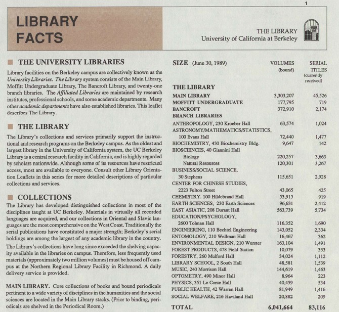
1) Library Facts, 1989: Interestingly, there were already 2 million volumes stored off site, even then!  And, I may have to try to hunt down pictures of the Entomology Library.

Library Facts handout from 1989; available at https://tinyurl.com/LNC-Historical

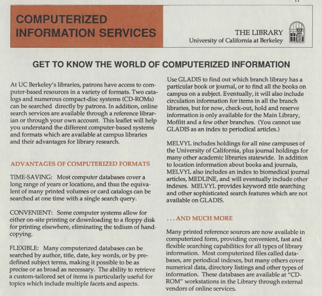
2) Computerized Information:

For those of us who are a certain age, CD-ROMs and floppy disks were once a fact of life—but this handout makes us realize how very revolutionary they were compared to looking at multiple volumes of books, and hand-copying.

Computerized Information handout; PDF available at https://tinyurl.com/LNC-Historical

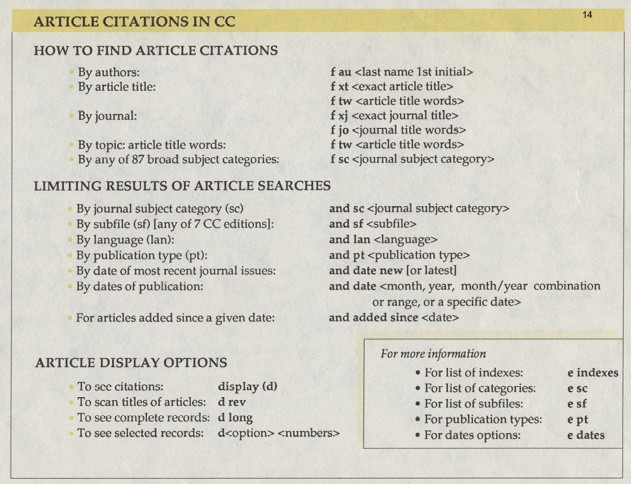
3) Finding Article Citations:

Finding articles using keywords has come a LONG way.  As librarians, we know that these types of commands may be called on behind the scenes of what the user sees, but even these are dying out as search algorithms become more sophisticated.  Today’s user doesn’t need to know any of these for a simple database citation search!  (But they may still help you with an advanced search—ask us librarians if you ‘d like to see how, we love this stuff.)

Finding Article Citations handout; PDF available at https://tinyurl.com/LNC-Historical

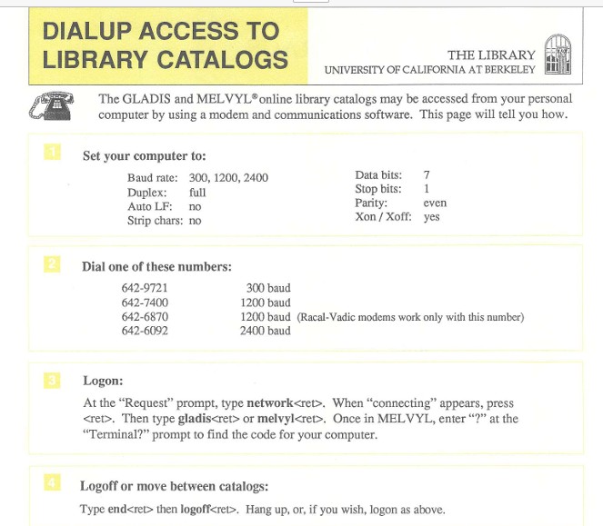
4) DialUp Access

First of all, note that there was MORE THAN ONE CATALOG.  As Corliss Lee mentioned in her interview for the project, “At some point we had Telnet GLADIS [and] Telnet MELVYL. I think [the web versions were called] Pathfinder and Web MELVYL… we couldn’t even agree how many catalogs we had! Did we have two catalogs each with two interfaces? Did we have three catalogs because the MELVYL’s [two platforms] were more alike than GLADIS and Pathfinder were? Or do we have four catalogs? And I think that’s a bad sign. Your staff can’t figure out how many catalogs you have. But those were the days, man.”

Secondly, even I can’t remember what a baud is, and that’s fine with me, but I do remember that to dial into the service, you had to use a long cord to connect a phone that looked like the one in the picture on the upper left, to a specialized outlet, or jack, in your wall.  Like ethernet is now, but WAY WAY WAY slower.

DialUp Access handout; PDF available at https://tinyurl.com/LNC-Historical

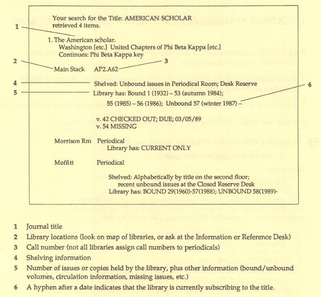
5) GLADIS Journal Search Result

The thing that strikes me about this diagram is how similar it is to the record you might look at today!  All of the essential categories and organizational guiding numbers and characters are still how we make sure our items are findable!  If you go to lib.berkeley.edu and do a journal search (by using the drop down menu to the right of the search box), you’ll find this record, and scrolling through, you’ll see it has similar information, similarly arranged!  The difference is that now we have online access, we aren’t tracking the locations of print volumes of the journal anymore.  Which is OK overall.

GLADIS Journal Search Result handout; PDF available at https://tinyurl.com/LNC-Historical

6) Moffitt Library Newsletter (back in the day!)

While we aren’t disseminating news in paper format anymore (for the most part), the message of welcome and support for undergraduate students remains the same.

Moffitt Library Newsletter; PDF available at https://tinyurl.com/LNC-Historical

7) Asian American Oral Histories

The UC Berkeley Library’s Oral History Center (formerly known as the Regional Oral History Office ) has collected a large and robust range of oral histories, many of which are now available online.  The important part here, in my opinion, is to note that oral histories can serve as “a starting point for research on a variety of subjects.”  And now that they are available online and therefore are searchable, it’s much easier to explore!

Asian American Oral History handout; PDF available at https://tinyurl.com/LNC-Historical

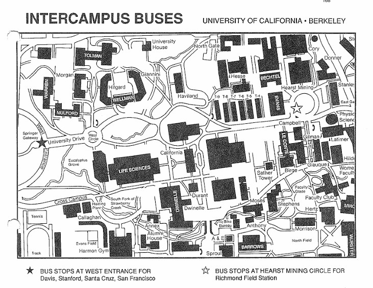
8) Campus Map

I love looking at old maps, and this one is no exception.  There are so many buildings that have gone up since the early ‘90s!  Most notable to me is the C.V. Starr East Asian Library, the one you can now see from Memorial Glade, with the façade that I think looks like stained glass.  Also, note that at this time, the Main Stacks which run underneath Memorial Glade, hadn’t even been built yet (the rectangles labeled T-4 through T-9 were temporary buildings built during World War II).  And you could take buses from campus to Davis, Stanford, Santa Cruz and SF.

Campus Map; PDF available at https://tinyurl.com/LNC-Historical

I hope you’ve enjoyed this trip down (institutional) memory lane!  Next up for this project—a presentation at the annual Oral History Association Conference in October, in Portland, Oregon, titled “ ‘Adventures You Can’t Even Begin to Imagine’: The Librarians Navigating Change Oral History Project”.  Onward!


May 2026 – Asian American and Pacific Islander Heritage Month

May 2026 Asian American and Pacific Islander Heritage Month

Celebrate Asian American and Pacific Islander Heritage Month this May with our featured collection of books by AAPI authors.


April 2026 Neurodiversity Celebration Month

Guide to April 2026 Neurodiversity Celebration Month

Celebrate Neurodiversity this April with our featured collection of books by neurodiverse authors.


February 2026 Black History Month

Guide to February 2026 Black History Month

In recognition of Black History Month this February, explore our collection of curated books by Black authors.


The Marriage Plot in Irish Literature

– This post is a guest post by Annabel Barry, Ph.D. candidate  at UC Berkeley and class.


Members of the spring 2025 class of English R1A: The Marriage Plot in Irish Literature, taught by Annabel Barry, worked together to curate a virtual exhibition of Irish rare books and manuscripts in the Bancroft Library’s Special Collections. The class explored how marriage in Irish literature from the nineteenth century to today represents not merely a private bond between individuals, but also a malleable metaphor that takes on public meanings, reflecting shared social aspirations and anxieties. While reading and discussing literary texts in which marriage straddles the boundary between private and public, students simultaneously explored the public humanities, or how humanistic research can be made accessible to audiences beyond the university.

Each student was assigned to research and draft an exhibition label for a unique object from the Bancroft Library related to an author from the course. Students were invited to use their interpretations of their objects to explore their individual interests—from economics to music. They then worked in small groups to revise and arrange their labels to create a coherent narrative arc. Along the way, they benefitted from the generous assistance of Bancroft Library Information and Instruction Specialist Lee Anne Titangos, who helped to select and present materials, and Literature and Digital Humanities Librarian Bee Lehman, who introduced students to using ArcGIS StoryMaps as a virtual exhibition platform.

Below are abridged versions of some of the exhibition labels featured in the virtual exhibition. The full exhibition is available to university affiliates with a CalNet ID at this link. To access the site, simply click “Your ArcGIS organization’s URL,” type “cal” in the text box, click continue, and input your CalNet ID and password.

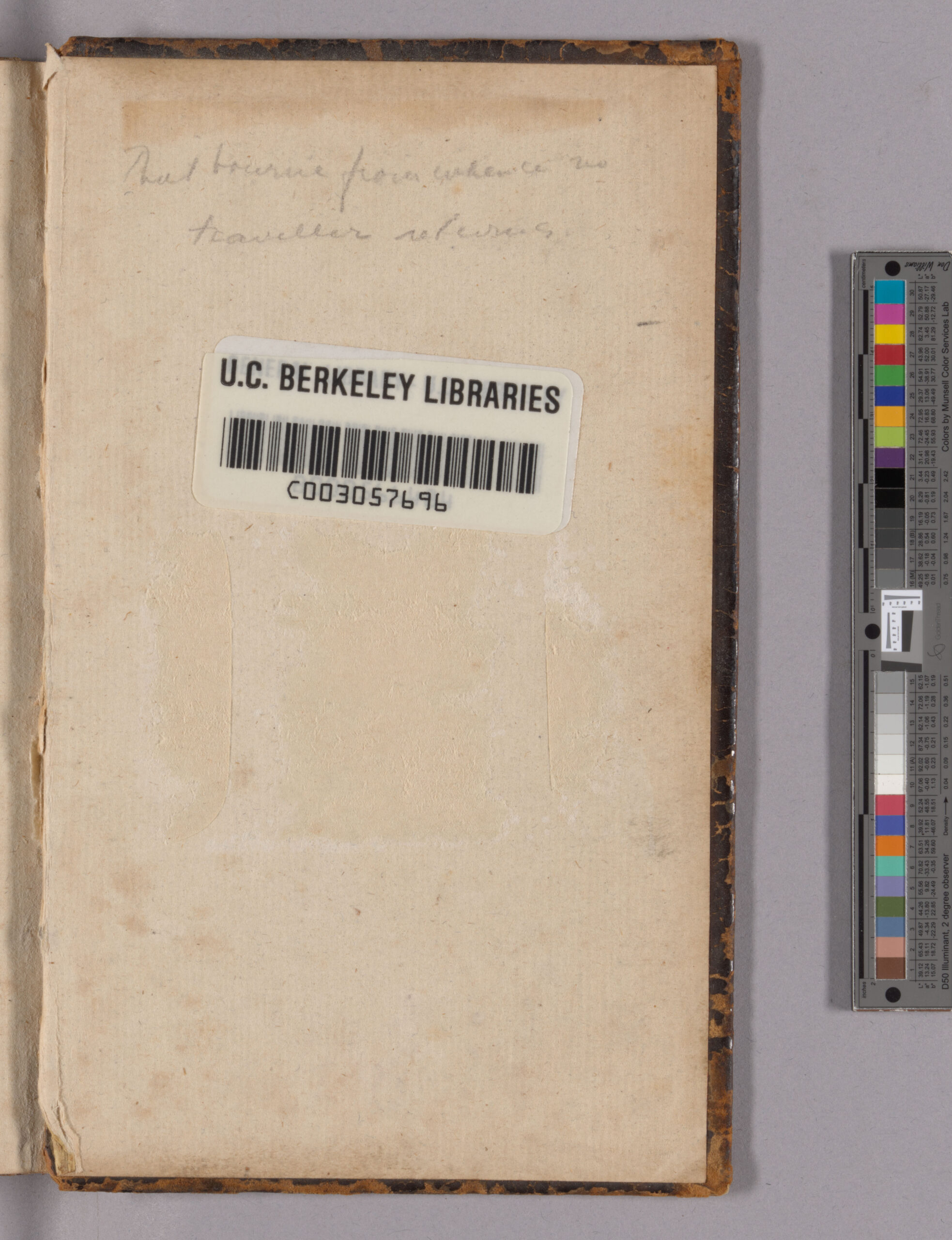
Photograph of library sticker

“That bourne from whence no traveller returns” by Naila Talib

Sydney Owenson, Lady Morgan (c.1781 – 1859) | The Wild Irish Girl first three-decker edition | 1806 | Published by Richard Phillips

When initially published in 1806 by Richard Phillips, Sydney Owenson’s The Wild Irish Girl was printed and distributed in a three-volume format, a strategy that was used to entice readers to buy multiple volumes to complete the story they started. The previous owner of this particular copy had to purchase the bindings with gold-laced engravings visible in the first and third volumes separately from the actual printed text itself. The intricate and high-quality design of the bindings indicates that they valued the text. The newer and simpler binding on the second volume is evidence of the Bancroft Library’s preservation efforts as the previous spine and binding may have been old and worn out, and so they replaced it with a newer, simpler binding. The yellowing and browning of the pages show that the volumes were viewed and handled by readers and researchers, causing the material to degrade overtime.

At the back of the book, an annotation written in pencil by a previous reader or owner reads “That bourne from whence no traveller returns.” This quote is uttered by Glorvina during a scene where the characters encounter a traditional Irish funeral; her remark is in reference to a famous Hamlet soliloquy where he says, “The undiscovered country from whose bourn / No traveler returns.” Through this phrase, Shakespeare both metaphorically and poetically communicates the idea that once someone has passed away, they can no longer come back into existence. In this context, the word “bourne” means “boundary” or “destination,” and thus Glorvina is recognizing the finality of death and a sentiment of uncertainty associated with what comes after death for the individual whose funeral they had just encountered.

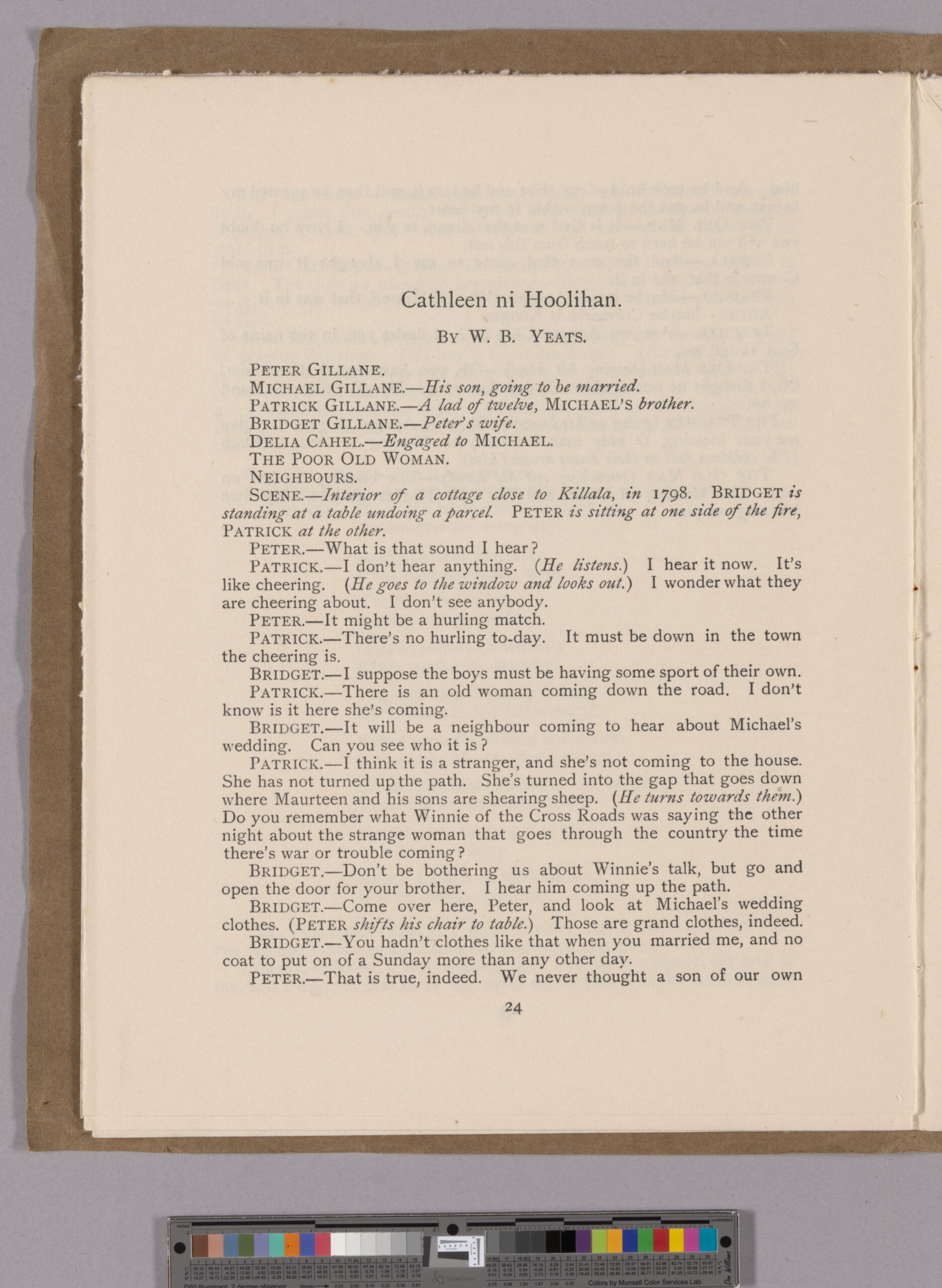
Photograph of Yeats play

“Samhain: Scarcity and Symbolism” by Sofia Aquino

Isabella Augusta, Lady Gregory (1852-1932) and William Butler Yeats (1865-1939) | First publication of Cathleen ni Houlihan in Samhain: An Occasional Review, issue 2 of 7 | October 1902 | Published by Sealy, Bryers, & Walker and T. Fisher Unwin

Samhain, an irregularly published theater magazine (1901-1908), was founded and edited by poet-playwright W.B. Yeats as part of his collaboration with Lady Gregory to promote Irish culture and nationalism through founding the Abbey Theatre. In its first issue, Yeats explains the title’s significance: “I have called this little collection of writings Samhain, the old name for the beginning of winter, because our plays this year are in October, and because our Theater is coming to an end in its present shape.”

Samhain’s binding—soft, thin cardboard stitched with thread—reflected the financial struggles of the Irish Literary Revival. The Irish Literary Theater, a precursor to the Abbey Theatre, had disbanded in 1902 due to a lack of funding, underscoring the need for a government-subsidized national theater. This goal was accomplished in 1925 when the Abbey Theatre became the first state-subsidized theatre in the English-speaking world.

Most notably, this issue featured the first publication of Cathleen ni Houlihan, a nationalist play co-written by Yeats and Lady Gregory, though only Yeats was credited upon publication—a reflection of how Gregory’s contributions to Irish drama were often overlooked despite her significant influence. The play’s exploration of economic sacrifice mirrors the circumstances of its own creation. Just as Michael must choose between financial security or sacrificing all for Irish nationalism, Yeats and Gregory, who worked with limited resources and no government support, staged the play despite financial hardship, believing in its necessity for a country in need of inspiration.

photograph of musical notation with text underneath

“Bound by Myth and Melody” by Chloe Yuan

Isabella Augusta, Lady Gregory (1852-1932) and William Butler Yeats (1865-1939) | The Hour-Glass, Cathleen ni Houlihan, The Pot of Broth: Volume Two of Plays for an Irish Theatre | 1904 | Published by A.H. Bullen

Published by A.H. Bullen in London, this 1904 edition compiles three of Yeats’s plays: The Hour-Glass, Cathleen ni Houlihan, and The Pot of Broth. The spine, inscribed with Yeats’s name and the publisher A.H. Bullen of London, reflects the intersection of Irish literary nationalism and the British publishing industry.

The musical annotations remind us that these plays were composed as living works, meant to be heard and felt, a fusion of Ireland’s literary and musical heritage. Among the printed words of Cathleen ni Houlihan and The Pot of Broth, a striking detail emerges: musical notation embedded within the text. These passages indicate that music was not merely an ornament in the plays of Yeats and Gregory but a vital storytelling device. The presence of melody within the printed script underscores the oral tradition of Irish folklore, where song carried historical memory, rebellion, and lamentation. In Cathleen ni Houlihan, the mysterious old woman begins to sing a haunting tune, recalling those who have died for Ireland. The inclusion of sheet music in the book suggests that the play’s performance was intended to be a multisensory experience, reinforcing the theme of national sacrifice through the emotional resonance of the song.

photograph of old syllabus

“Inside the Mind of Seamus Heaney” by Anonymous

Seamus Heaney (1939-2013) | Notebook with manuscript drafts of poems, with revisions and annotations | 1970-1971 | Seamus Heaney Poems Collection

This 1970–71 notebook written by Seamus Heaney reveals the layered and often nonlinear process behind his poetry. Heaney wrote during a moment of deep political unrest; the conflict in Northern Ireland was just beginning, and a civil war loomed. From Berkeley, California, Heaney grappled with the growing tension back home.

Pages 86 and 87 of this notebook contain early drafts of Seamus Heaney’s poem “The Other Side,” published in 1972. The poem’s central theme is a Protestant neighbor living across a river, physically close, yet socially and ideologically distant. The river functions as both a literal border and a symbolic divide, reflecting Heaney’s concerns with religious identity, land, and division in a fractured Ireland.
Heaney’s shift in title, from “Fordings” to “Dreamer at the Ford” to “The Other Side,” marks a change in emphasis. “Fordings” is pastoral and descriptive, while “The Other Side” introduces political weight. The final title gestures toward separation and opposition, making the poem’s political dimensions more legible. This produces a tension: while the framing becomes more political, the language within the poem retracts from directness. That dual movement, toward both clarity and obscurity, reflects Heaney’s position as a poet caught between intimacy and distance, between naming a boundary and refusing to cross it.

“A Spark of Inspiration” by Ryan Luftman

Seamus Heaney (1939-2013) | Manuscript draft of “Gifts of Rain,” on back of working syllabus for English 161: Recent British & American Poetry, and later typescript draft | 1971 | Seamus Heaney Poems Collection

Heaney’s syllabus for his course on British and American Poetry serves as a perfect physical representation of his time at Berkeley. At Berkeley, Heaney continued his poetic pursuits both as an artist and a learner. We can see this explicitly through the syllabus as Heaney adds readings by James Dickery and Elizabeth Bishop to his list, showing active exploration of poets. More interestingly, flipping over the syllabus reveals a spectacular insight into Heaney’s mind.

On the back of the syllabus is a working draft of a brand-new poem, “A Gift of Rain” (later published as “Gifts of Rain”). Here we see the original iterations of what ends up being the first and third stanza of the final poem. Across the manuscript and typescript drafts, we can see how Heaney moves from a very personal poem to one with a more general address. Heaney makes changes like “my skin” to “his pelt,” “your” to “their.” Examining the contents of the poem, it seems Heaney begins writing about personal experiences of places from his youth after rainfall and changes them to a more general experience, allowing him to build up the more metaphorical tone of the poem. This is a common theme in Heaney’s work: he takes personal experiences and beliefs and alters them to have greater appeal to a wider audience.

Image reproduction was supported by a Daniel E. Koshland, Jr. Course Development Grant (for more information, click here).


Celebrating 21st-century African Literatures online exhibit live!

arcgis screenshot of cover for exhibit
Screenshot of opening image in online exhibit

To my delight, we’ve made our online exhibit Celebrating 21-century African Literatures exhibit live online through an ArcGIS StoryMap!

map of Africa with aggregated publisher points
Thumbnail associated with publisher map, displaying some of the publishers we collect from. Link goes to interactive map on ArcGIS.

Alongside the celebration of the many, phenomenal books we display, we’ve also made material available about what kinds of publishers UC Berkeley Library has been collecting from across the continent.

Let me (Bee, the Lit Librarian) know if you have questions or note that there is information missing. Our thanks for to the many artists, authors, and magazine editors who’ve made this possible.


DH Faire 2025

Data Are Made, Not Found colorful representative image
Data Are Made, Not Found, April 23m 2025

Hello all!

We are delighted to provide information on the Spring 2025 Digital Humanities Faire at UC Berkeley. The continuation of more than a decade of tradition, these DH Faires are designed to celebrate the broad, interdisciplinary digital humanities projects at UC Berkeley.

Keynote

dana boyd is presenting “Data are Made, Not Found” on Wednesday, April 23, 2025 5-6:30pm, Jacobs Institute for Design Innovation, Studio 310 (for more on the talk).

Poster Display:

Tuesday and Wednesday, April 22 and 23, 2025, Poster Display, Doe Library 2nd floor Reference Hall (see attached image with star).

Star showing the location of the Doe, 2nd floor reference hall
The Gold Start shows the location of the Doe Library, 2nd floor Reference Hall

The event is sponsored by:

Bancroft Library ; Berkeley Center for New Media ; Berkeley Institute for Data Science ; (BIDS) ; Center for Interdisciplinary Critical Inquiry (CICI) ; D-Lab ; iSchool ; Master of Computational Social Science (MaCSS) ; UC Berkeley Library’s Data and Digital Scholarship Services


We hope to see you there!

Informational Poster for DH Faire 2025


PhiloBiblon 2025 n. 1 (enero): Final de una época

La semana pasada colgué las versiones últimas y finales de BETABITECA BITAGAP en la web de PhiloBiblon de la Universitat Pompeu Fabra. Desde este momento no habrá más cambios en los datos presentados allí. Dentro de unos meses, un PhiloBiblon nuevo y renovado aparecerá en FactGrid:PhiloBiblon en la universidad alemana de Jena, donde compartirá espacio virtual con otros cuarenta proyectos históricos, desde los estudios cuneiformes hasta la época nazi en Alemania.

Es el final de un largo periplo que empezó en 1975 con el proyecto Dictionary of the Old Spanish Language de la University of Wisconsin, encabezado por Lloyd Kasten, con quien había estudiado yo ecdótica unos diez años antes. Fue el primer proyecto de humanidades digitales en el ámbito hispanico. Kasten fue secundado por su joven colega John Nitti, el arquitecto del entorno informático del proyecto. Para garantizar la autenticidad del corpus de español antiguo, se necesitaba un repertorio de manuscritos españoles escritos antes de 1501. Tal repertorio no existió y pusieron a ayudantes de investigación a vaciar dos obras, el Catálogo de los manuscritos castellanos de la Real Biblioteca de El Escorial, del benemérito, y martirizado, padre Julián Zarco Cuevas; y la Bibliografía de la literatura hispánica del igualmente benemérito José Simón Díaz. Identificaron 966 obras y Kasten y Nitti imprimieron el resultado como Bibliography of Old Spanish Texts en 1975. Siguió una segunda edición en 1977, con 1869 fichas. Al año siguiente yo me encontraba en la Hispanic Society, redactando su catálogo de manuscritos medievales y enviando adiciones y correcciones a BOOST. En 1981 Kasten y Nitti me ofrecieron la dirección de BOOST como proyecto autónomo, y lo demás, como dicen, es historia.

Pronto tuve un colaborador, un jovencísimo Ángel Gómez Moreno (UCM), que acababa de pasar un año de estudios de posgrado en Wisconsin. Al volver a España se lanzó con entusiasmo a la tarea de repasar los ficheros y catálogos (en papel, por supuesto), de la BNE, la Biblioteca de Palacio, la RAE y la RAH, siempre en busca de nuevos manuscritos para BOOST. En los años 80 estudiantes de carrera y posgrado sirvieron como ayudantes de investigación, primero María Morrás (UPF), y en los 90 Ángela Moll Dexeus y Antonio Cortijo (UC Santa Barbara), durante su paso por las aulas de Berkeley.  Ya desde 1993 BOOST era BETA, la Bibliografía Española de Textos Antiguos en CD-ROM y en la red en 1997. En 2000 Ángel me mandó como becario por dos años a Óscar Perea Rodríguez; y desde entonces Óscar ha sido mi mano derecha en el proyecto, organizando los seminarios de PhiloBiblon, primero en San Millán de la Cogolla y luego en Madrid. Más recientemente ha trabajado como ayudante en Berkeley Heather Bamford (George Washington University), mientras que, en España, en la UCM, Álvaro Bustos ha participado en varias campañas de investigación conmigo y ha reclutado nuevos miembros del equipo de BETA.

Kasten y Nitti fueron responsables también de la Bibliography of Old Catalan Texts (BOOCT, 1985), base de datos gemela a BOOST, compilada por Beatrice Concheff (†), antigua alumna de la University of Wisconsin y que, en aquel tiempo, ejercía como profesora de inglés en una escuela de lenguas de Barcelona. Era una aficionada a la literatura catalana, pero no era experta en ella en términos académicos; por ello, la inmensa mayoría de sus citas a obras y manuscritos medievales provenía de fuentes secundarias. Y además, en el año de 1989, por desgracia, Concheff se encontraba con una salud muy delicada y era consciente de que no podría dedicarse a la compilación de una segunda edición de BOOCT.

En una de las sesiones de trabajo del congreso de la Asociación Internacional de Hispanistas de Barcelona de 1989, mi amigo Francisco Marcos Marín me presentó a Vicenç Beltrán. Expuesto el caso a Vicenç, vio inmediatamente la importancia de seguir adelante con BOOCT. En seguida Vicenç embarcó en el proyecto a su jovencísima alumna, doctoranda en aquel entonces, Gemma Avenoza i Vera (†). Fue Gemma la que enseguida quedó al cargo del mismo. Era ya una codicóloga consumada, como se puede comprobar en su tesis doctoral, Repertori dels manuscrits en llengües romàniques conservats a biblioteques barcelonines. Además, Gemma era de los escasos expertos en filología de la época que sabía manejar un ordenador, habilidad absolutamente necesaria para trabajar con PhiloBiblon. Ambos, Gemma y Vicenç, romanistas al estilo antiguo y expertos no sólo en las literaturas medievales ibéricas, sino también en las de Francia e Italia, comprobaron la utilidad del (entonces recién bautizado) PhiloBiblon,  pues podría facilitar la tarea de catalogación y descripción de los textos y testimonios del corpus de literatura medieval ibérica en lenguas castellana, catalana, portuguesa y gallego-portuguesa.

A los pocos meses de ese primer encuentro en Barcelona, en el otoño de 1989 Gemma ya pudo visitarme en Berkeley para adentrarse en el arcano mundo de PhiloBiblon y encargarse, junto con Vicenç, de BOOCT, que pronto cambiaría su nombre en BITECA (Bibliografia de Textos Catalans Antics), de forma paralela a BETA. Desde entonces hasta su demasiado temprana muerte en 2021, Gemma fue la mano directriz de BITECA, pronto secundada por Lourdes Soriano, alumna tanto de Gemma como de Vicenç. Durante casi 20 años, pues, Gemma, Lourdes y yo estuvimos en contacto constante. Las dos supieron atraer a más de medio centenar de colaboradores y ayudantes de investigacíon. Los miembros actuales del equipo de BITECA son Joan Mahiques Climent (Universitat Jaume I),  Joan M. Perujo  (Universitat d’Alacant), Helena Rovira Cerdà (Universidad de Murcia), Glòria Sabaté (Universitat de Barcelona) y Ferran Triadó Sales, (Universitat de Barcelona), todos ellos alumnos o antiguos alumnos de Gemma y Lourdes.

Ya por la misma época, en 1988, entablé discusiones con mi querido colega y vis-à-vis (literalmente) en el departamento de español y portugués de Berkeley, Arthur Askins, sobre la posibilidad de crear una base de datos paralalela a BOOST y BOOCT. Se llamaría Bibliography of Old Portuguese Texts (BOOPT) y formaría un nuevo tomo en la “Bibliographic Series” de la Hispanic Seminary of Medieval Studies. Pero ya la época de publicación en papel había pasado. Con una subvención de la Sociedad Estatal del Quinto Centenario, BETA, BITECA y el recien bautizado BITAP (Bibliografia de Textos Antigos Portugueses) saldría en disco CD-ROM en 1993. Más tarde, el nombre BITAP se cambiaría en BITAGAP (Bibliografia de Textos Antigos Galegos e Portugueses).

Arthur había sido testigo ocular de mis investigaciones con BOOST desde 1981 y se había dado cuenta de la utilidad de las bases de datos en sus propias investigaciones sobre la biblioteca de Fernando Colón. Estaba intrigado, pero se dio cuenta desde el principio que esto tendría que ser un proyecto de equipo. Reclutó a sus amigos y antiguos compañeros de estudios de Berkeley, Harvey Sharrer (†), profesor en la University of California, Santa Bárbara,  y Martha E. Schaffer, en aquel entonces profesora la University of Chicago y actualmente en la University of San Francisco.

Iniciados sus viajes de investigación anuales en Portugal, muy pronto los tres persuadieron a Aida Fernanda Dias (†), profesora de la Universidade de Coimbra, que se uniera al equipo. Luego, comenzando en 2008, se incorporaron Pedro Pinto (Universidade Nova de Lisboa), con su olfato extraordinario para encontrar manuscritos de interés, Cristina Sobral (Universidade de Lisboa), Filipe Alves Moreira (Universidade do Porto, actualmente Universidade Aberta), Maria de Lurdes Rosa (Universidade Nova de Lisboa),  Ricardo Pichel Gotérrez (Universidade de Santiago y actualmente Universidad de Educación a Distancia), Mariña  Arbor (Universidade de Santiago y Diana Fontão (Universidade de Porto / Universidad de Salamanca).

Como en los casos de BETA y BITECA, el equipo de BITAGAP ha contado con al menos una centena de buenos colaboradores, entre estudiantes y colegas del mundo entero.

PhiloBiblon no sólo ha sido creación de las personas mencionadas aquí, sino de todos aquellos colegas que nos han escrito pidiendo u ofreciendo información sobre tal o cual texto, manuscrito o persona. Por y para ellos hemos dedicado tanto esfuerzo durante más de cuarenta años, el mismo esfuerzo precisamente que todos los miembros del equipo vamos a continuar haciendo en esta nueva etapa que se abre ante nosotros.

Charles B. Faulhaber
University of California, Berkeley

Referencias:

Faulhaber, Charles B., PhiloBiblon, pasado, presente, futuro: Historia de un proyecto de investigación, San Millán de la Cogolla: Congreso Internacional. Códices literarios españoles (Edad media) 2007-11-29

_____, PhiloBiblon: Pasado y futuro, (Incipit 29 2009: pp. 191-200)

_____, PhiloBiblon, Information Technology, and Medieval Spanish Literature: A Balance Sheet, Bern: Humanitats a la Xarxa: Món Medieval – Humanities on the Web: The Medieval World 2014: pp. 15-43

_____, PhiloBiblon and the Semantic Web. Notes for a Future History, València: La Literatura Medieval Hispánica en la Imprenta (1475-1600) 2016: pp. 75-93

____. Harvey L. Sharrer (1940-2024). PhiloBiblon blog 2024-10-10

Dias, Aida Fernanda, Arthur Lee-Francis Askins, Harvey L. Sharrer, A ‘Bibliografia de Textos Antigos Galegos e Portugueses’ na Internet, Lisboa: Revista Portuguesa de História do Livro 1 n. 2 1998: pp. 173-80)

Martín Molares, Mónica PhiloBiblon 2020 n. 1 (febrero): Crónica del V Seminario Internacional PhiloBiblon-BNE-UCM (Madrid, junio de 2019), (PhiloBiblon Blog 2020-02-28)

Perea Rodríguez, Óscar, y Charles B. Faulhaber, Esbozos sobre la evolución y el futuro de un pionero de las humanidades digitales hispánicas: el proyecto de PhiloBiblon, Revista Digital Universitaria 18 n. 1 2017

Schaffer, Martha E. Homenagem a Aida Fernanda Dias oferecida pelos seus colegas de Philobiblon, eHumanista 31 2015: pp. i-v, 1-275) 

Sharrer, Harvey L., BITAGAP (Bibliografia de Textos Antigos Galegos e Portugueses): um armazém da memória histórica, Madrid: (Tenh’eu que mi fez el i mui gran ben. Estudos sobre cultura escrita medieval dedicados a Harvey L. Sharrer 2022: pp. 39-67)

_____, A BITAGAP no seu 30o aniversário: a expansão de dados e expectativas para o futuro, Berlin: O Medievalismo no século XXI 2020: pp. 157-68) 

_____, The BITAGAP project since 1988 – Expansion of the corpus of texts and important discoveries, Bern: Humanitats a la Xarxa: Món Medieval – Humanities on the Web: The Medieval World 2014: pp. 169-83


The Bias of Notability in Wikipedia

Let’s chat about Wikipedia as a source of general information. For many people, Wikipedia is a first stop to check on information about who’s who, genre overviews, lists of books, and more. In theory, as a place to find the “sum of all human knowledge” (Wikipedia: About), it should be a good place to get an overview of what’s out there to know. Yet, using Wikipedia’s coverage leads to a skewed understanding of what’s available. Instead of being a reliable source for all human knowledge, Wikipedia’s policies means it reproduces institutionalized biases related to gender, community groups, and other categories of identity and knowledge. Furthermore, those policies mean that the platform’s biases are very difficult to address despite Wikipedia’s calls for public contributions and claims to desire to be an unbiased source of information.

What do I mean by that?

Bluntly, I mean that Wikipedia’s coverage privileges white, male, English-speaking people in positions of power (Wikipedia: Gender Bias; Racial Bias). I personally think that having editors, having some checks, are incredibly important. There needs to be some level of standard, but there are problems with how the standards for things like notability are enforced.

But why?

The issue is partly one of Wikipedia’s focus on “Notability” (Wikipedia: Notability). Wikipedia’s guidelines claim that not everything needs an article. To be included within Wikipedia, contributing authors are expected to provide information that is “worthy” of notice. Yet, worth is a value judgement. So, who’s judging that worth and on what criteria?

The answer is that Wikipedia has an excellent team of employees and volunteer editors who are predominantly white men. Most humans are predominantly interested in things that, in some way or another, represent themselves (Hall ed., Representation, UC Library Search). Those white men with their particular interests then evaluate worth based on criteria of things like how many people have written about someone. Given historic inequalities and continued social bias, men in positions of power are more likely to be written about than other groups. Those “worthy of notice” end up being men.

Take, for example, the problem of a diplomat’s wife Varvara Dukhovskaia. For a person like this princess, we have a woman whose job is partly predicated on her husband’s, but she was part of his team (if you allow) and an essential part of the job. Particularly in a past when women were denied access to most official positions, women performed labor analogous to a man’s without the official acknowledgement. A diplomat’s wife, for example, was expected to host events, make connections, and spread good will for the state they represented … which was precisely what many diplomats were hired to do. The woman, however, was not socially or legally considered a diplomat in and of themselves – they were often the “wife,” “daughter,” or “mother.”

In this case, Varvara Dukhovskaia was an influential presence, known as a “first lady of Siberia.” She spearheaded efforts to establish schools, was part of problems with discussions of Russian government and nationalism, and wrote about her efforts. Dukhovskaia’s autobiography (on Project Gutenberg) has been translated into English but the majority of scholarship about her is in other languages (English language scholarship includes Katya Hokanson’s A Woman’s Empire: Russian Women and Imperial Expansion in Asia on JSTOR).

So, we have a highly influential woman in a position of power about whom multiple scholars have written. Yet, while Wikipedia has an article about her husband (Wikipedia), Wikipedia’s editors refused to publish an entry about her because writing a travel narrative is not notable.

This example is hardly the only one of its kind. There are multiple examples one could refer to about how Wikipedia’s editors refused an article because the person, the idea, the movement, the book, wasn’t important enough … but the problem was circular. The idea wasn’t “important” because of institutional bias, which meant it didn’t spread, which in turn meant Wikipedia didn’t value it.

For students and scholars in the humanities, that means Wikipedia isn’t necessarily a great place to find information about the people, the books, the media, the ideas, the groups, that they study. And, not only does the current content skew toward institutionalized forms of discrimination, but that imbalance is difficult to address because Wikipedia actively turns down material that could address some of those problems.

So what to do?

What can we currently do to address some of these considerations? One of the ways to increase notability is to scour scholarship for references to the different people/ideas that are important to include. Another way is to begin writing about the people, ideas, and things that are missing in related articles. For example, including a paragraph in the husband’s Wikipedia article about the person raises their “Notability” and leads toward Wikipedia’s viewing the person, the book, the event as worthy of having individual entries.

To get some experience with how to do this, join us for UC’s I Love Data Week’s Wikipedia Edit-a-Thon on Feb. 10! You can find out more about it on our guide.


A&H Data: Creating Mapping Layers from Historic Maps

Some of you know that I’m rather delighted by maps. I find them fascinating for many reasons, from their visual beauty to their use of the lie to impart truth, to some of their colors and onward. I think that maps are wonderful and great and superbulous even as I unhappily acknowledge that some are dastardly examples of horror.

What I’m writing about today is the process of taking a historical map (yay!) and pinning it on a contemporary street map in order to use it as a layer in programs like StoryMaps JS or ArcGIS, etc. To do that, I’m going to write about
Picking a Map from Wikimedia Commons
Wikimedia accounts and “map” markup
Warping the map image
Loading the warped map into ArcGIS Online as a layer

But! Before I get into my actual points for the day, I’m going to share one of my very favorite maps:

Stunning 16th century map from a northern projection with the continents spread out around the north pole in greens, blues, and reds. A black border with golds surround the circular maps.
Urbano Monte, Composite: Tavola 1-60. [Map of the World], World map, 40x51cm (Milan, Italy, 1587), David Rumsey Map Collection, http://www.davidrumsey.com.
Just look at this beauty! It’s an azimuthal projection, centered on the North Pole (more on Wikipedia), from a 16th century Italian cartographer. For a little bit about map projections and what they mean, take a look at NASA’s example Map Projections Morph. Or, take a look at the above map in a short video from David Rumsey to watch it spin, as it was designed to.

What is Map Warping

While this is in fact one of my favorite maps and l use many an excuse to talk about it, I did actually bring it up for a reason: the projection (i.e., azimuthal) is almost impossible to warp.

As stated, warping a map is when one takes a historical map and pins it across a standard, contemporary “accurate” street map following a Mercator projection, usually for the purpose of analysis or use in a GIS program, etc.

Here, for example, is the 1913 Sanborn fire insurance map layered in ArcGIS Online maps.

Image of historical Sandborn map warped across the streetmap
Screen capture of ArcGIS with rectified Sanborn map.

I’ll be writing about how I did that below. For the moment, note how the Sanborn map is a bit pinched at the bottom and the borders are tilted. The original map wasn’t aligned precisely North and the process of pinning it (warping it) against an “accurate” street map resulted in the tilting.

That was possible in part because the Sanborn map, for all that they’re quite small and specific, was oriented along a Mercator projection, permitting a rather direct rectification (i.e., warping).

In contrast, take a look at what happens in most GIS programs if one rectifies a map—including my favorite above—which doesn’t follow a Mercator projection:

Weird looking, pulled streams of reds, greens, and blues that are swept across the top and yanked down toward the bottom.
Warped version of the Monte map against a Mercator projection in David Rumsey’s Old Maps Online connection in 2024. You can play with it in Old Maps Online.

Warping a Mercator Map

This still leaves the question: How can one warp a map to begin with?

There are several programs that you can use to “rectify” a map. Among others, many people use QGIS (open access; Windows, macOS, Linux) or ArcGIS Pro (proprietary;Windows only).

Here, I’m going to use Wikimaps Warper (for more info), which connects up with Wikimedia Commons. I haven’t seen much documentation on the agreements and I don’t know what kind of server space the Wikimedia groups are working with, but recently Wikimedia Commons made some kind of agreement with Map Warper (open access, link here) and the resulting Wikimaps Warper is (as of the writing of this post in November 2024) in beta.

I personally think that the resulting access is one of the easiest to currently use.

And on to our steps!

Picking a Map from Wikimedia Commons

To warp a map, one has to have a map. At the moment, I recommend heading over to Wikimedia Commons (https://commons.wikimedia.org/) and selecting something relevant to your work.

Because I’m planning a multi-layered project with my 1950s publisher data, I searched for (san francisco 1950 map) in the search box. Wikimedia returned dozens of Sanborn Insurance Maps. At some point (22 December 2023) a previous user (Nowakki) had uploaded the San Francisco Sanborn maps from high resolution digital surrogates from the Library of Congress.

Looking through the relevant maps, I picked Plate 0000a (link) because it captured several areas of the city and not just a single block.

When looking at material on Wikimedia, it’s a good idea to verify your source. Most of us can upload material into Wikimedia Commons and the information provided on Wikimedia is not always precisely accurate. To verify that I’m working with something legitimately useful, I looked through the metadata and checked the original source (LOC). Here, for example, the Wikimedia map claims to be from 1950 and in the LOC, the original folder says its from 1913.

Feeling good about the legality of using the Sanborn map, I was annoyed about the date. Nonetheless, I decided to go for it.

Moving forward, I checked the quality. Because of how georecification and mapping software works, I wanted as high a quality of map as I could get so that it wouldn’t blur if I zoomed in.

If there wasn’t a relevant map in Wikimedia Commons already, I could upload a map myself (and likely will later). I’ll likely talk about uploading images into Wikimedia Commons in … a couple months maybe? I have so many plans! I find process and looking at steps for getting things done so fascinating.

Wikimedia Accounts and Tags

Form in whites and blacks with options for a username, password.
Signup form for the Wikimedia suite, including Wikimedia Commons and Wikimaps.

Before I can do much with my Sanborn map, I need to log in to Wikimedia Commons as a Wiki user. One can set up an account attached to one of one’s email accounts at no charge. I personally use my work email address.

Note: Wikimedia intentionally does not ask for much information about you and states that they are committed to user privacy. Their info pages (link) states that they will not share their users’ information.

I already had an account, so I logged straight in as “AccidentlyDigital” … because somehow I came up with that name when I created my account.

Once logged in, a few new options will appear on most image or text pages, offering me the opportunity to add or edit material.

Once I picked the Sanborn map, I checked

  1. Was the map already rectified?
  2. Was it tagged as a map?

If the specific map instance has already been rectified in Wikimaps, then there should be some information toward the end of the summary box that has a note about “Geotemporal data” and a linked blue bar at the bottom to “[v]iew the georeferenced map in the Wikimaps Warper.”

WikiMaps screen capture of the "Summary" with the geobox information showing the map's corner cordinants and a link to viewing it on Wikimaps.
Screen capture of “Summary” box with geocordinates from 2024.

If that doesn’t exist, then one might get a summary box that is limited to a description, links, dates, etc., and no reference to georeferencing.

In consequence, I needed to click the “edit” link next to “Summary” above the description. Wikimedia will then load the edit box for only the summary section, which will appear with all the text from the public-facing box surrounded by standard wiki-language markup.

Summary box showing a limited amount of information with purple headers to the left and information to the right on a grey background.
Screen capture of Wikimedia Commons box with limited information for an image.

All I needed to do was change the “{{Information” to “{{Map” and then hit the “Publish” button toward the bottom of the edit box to release my changes.

Screen capture of wikimedia commons edit screen showing what the text for updating a summary looks like.
Screen capture of Wikimedia Commons edit screen for the summary.

The updated, public-facing view will now have a blue button offering to let users “Georeference the map in Wikimaps Warper.”

Once the button appeared, I clicked that lovely, large, blue button and went off to have some excellent fun (my version thereof).

Summary box with map added as object type with blue box for options for georeferencing.
Example of Wikimedia Commons Summary box prior to georeferencing.

Warping the map

When I clicked the “Georefence” button, Wikimedia sent me away to Wikimaps Warper (https://warper.wmflabs.org/). The Wikimaps interface showed me a thumbnail of my chosen map and offered to let me “add this map.”

I, delighted beyond measure, clicked the button and then went and got some tea. Depending on how many users are in the Wikimaps servers and how big the image file for the map is, adding the file into the Wikimaps servers can take between seconds and minutes. I have little patience for uploads and almost always want more tea, so the upload time is a great tea break.

Once the map loaded (I can get back to the file through Wikimedia Commons if I leave), I got an image of my chosen map with a series of options as tabs above the map.

Most of the tabs attempt to offer options for precisely what they say. The “Show” tab offers an image of the loaded map.

Wikimaps Warper navigation tabs in beiges and white tabs showing the selected tabs.
2024 screen capture showing navigation tabs.

  • Edit allows me to edit the metadata (i.e., title, cartographer, etc.) associated with the map.
  • Rectify allows me to pin the map against a contemporary street map.
  • Crop allows me to clip off edges and borders of the map that I might not want to appear in my work.
  • Preview allows me to see where I’m at with the rectification process.
  • Export provides download options and HTML links for exporting the rectified map into other programs.
  • Trace would take me to another program with tracing options. I usually ignore the tab, but there are times when it’s wonderful.

The Sanborn map didn’t have any information I felt inclined to crop, so I clicked straight onto the “Rectify” tab and got to work.

As noted above, the process of rectification involves matching the historic map against a contemporary map. To start, one needs at least four pins matching locations on each map. Personally, I like to start with some major landmarks. For example, I started by finding Union Square and putting pins on the same location in both maps. Once I was happy with my pins’ placement on both maps, I clicked the “add control point” button below the two maps.

split screen showing a historic, streetmap on the left with a
Initial pins set in the historic map on the left and the OpenStreetMap on the right. note the navigation tools in the upper right corner of each panel.

Once I had four pins, I clicked the gray “warp image!” button. The four points were hardly enough and my map curled badly around my points.

To straighten out the map, I went back in and pinned the four corners of the map against the contemporary map. I also pinned several street corners because I wanted the rectified map to be as precisely aligned as possible.

All said, I ended up with more than 40 pins (i.e., control points). As I went, I warped the image every few pins in order to save it and see where the image needed alignment.

Split screen example showing dozens of aligned points in green, yellow, and red.
Screen capture of Wikimaps with example of pins for warping.

As I added control points and warped my map, the pins shifted colors between greens, yellows, and reds with the occasional blue. The colors each demonstrated where the two maps were in exact alignment and where they were being pinched and, well, warped, to match.

Loading the warped map into ArcGIS Online as a layer

Once I was happy with the Sanborn image rectified against the OpenStreetMap that Wikimaps draws in, I was ready to export my work.

In this instance, I eventfully want to have two historic maps for layers and two sets of publisher data (1910s and 1950s).

To work with multiple layers, I needed to move away from Google My Maps and toward a more complex GIS program. Because UC Berkeley has a subscription to ArcGIS Online, I headed there. If I hadn’t had access to that online program, I’d have gone to QGIS. For an access point to ArcGIS online or for more on tools and access points, head to the UC Berkeley Library Research Guide for GIS (https://guides.lib.berkeley.edu/gis/tools).

I’d already set up my ArcGIS Online (AGOL) account, so I jumped straight in at https://cal.maps.arcgis.com/ and then clicked on the “Map” button in the upper-left navigation bar.

Green and white navigation bar with map, screen, groups, content, and more
2024 Screen capture of ArcGIS Online Navigation Bar from login screen

ArcGIS Online add layer list in white and blacks, offering options for layer sourcing from URL, file, sketching, route, or other media.
2024 add layer list in ArcGIS Online

On the Map screen, ArcGIS defaulted to a map of the United States in a Mercator projection. ArcGIS also had the “Layers” options opened in the left-hand tool bars.

Because I didn’t yet have any layers except for my basemap, ArcGIS’s only option in “Layers” was “Add.”

Clicking on the down arrow to the right of “Add,” I selected “Add layer from URL.”

In response, ArcGIS Online gave me a popup box with a space for a URL.

I flipped back to my Wikimaps screen and copied the “Tiles (Google/OSM scheme),” which in this case read https://warper.wmflabs.org/maps/tile/7258/{z}/{x}/{y}.png.

Flipping back to ArcGIS Online, I pasted the tile link into the URL text box and made sure that the auto-populating “Type” information about the layer was accurate. I then hit a series of next to assure ArcGIS Online that I really did want to use this map.

Warning: Because I used a link, the resulting layer is drawn from Wikimaps every time I load my ArcGIS project. That does mean that if I had a poor internet connection, the map might take a hot minute to load or fail entirely. On UC Berkeley campus, that likely won’t be too much of an issue. Elsewhere, it might be.

Once my image layer loaded, I made sure I was aligned with San Francisco, and I saved my map with a relevant title. Good practice means that I also include a map description with the citation information to the Sanborn map layer so that viewers will know where my information is coming from.

Image of historical Sandborn map warped across the streetmap
2024 Screen capture of ArcGIS maps edit screen with rectified Sanborn map.

Once I’ve saved it, I can mess with share settings and begin offering colleagues and other publics the opportunity to see the lovely, rectified Sanborn map. I can also move toward adding additional layers.

Next Time

Next post, I plan to write about how I’m going to add my lovely 1955 publisher dataset on top of a totally different, 1950 San Francisco map as a new layer. Yay!