This post was written by Tim Vollmer, Anna Sackmann, and Elliott Smith
U.S. Federal agency logos, public domain.
Are you a UC Berkeley faculty or researcher publishing results arising through federal grant funding?
Starting in 2026, research funded by all federal agencies will be made freely and immediately available to the public, with no embargo. Some agencies have already updated their public access plans, including the National Institutes of Health, which went into effect on July 1, 2025. All federal agencies must update their public access policies no later than December 31st, 2025.
Join UC Berkeley Library staff on Wednesday, January 14, 2026 from 1:00-2:00 pm on Zoom for an overview of federal agency public access policies affecting research publication and data, and what you need to do as an author.
We’ll cover essential requirements for a variety of federal agency funders such as the Department of Energy, National Institutes of Health, National Science Foundation, and more. We’ll unpack publication and data deposit procedures, review publisher challenges to compliance, and highlight related UC open access publishing support.
Participants will leave with clear takeaways on what they need to do to meet public access requirements, the tools they can utilize, and where to find ongoing support.
The workshop presentation will be recorded and distributed to registrants afterward.
Using AI and Text Mining with Library Resources: What Every UC Berkeley Researcher Needs to Know
Planning to scrape a website or database? Train an AI tool? Before you scrape and before you train, there are steps you need to take!
First, consult the general terms and conditions that you need to comply with for all Library electronic resources (journal articles, books, databases, and more) in the Conditions of Use for Electronic Resources policy.
Second, if you also intend to use any Library electronic resources with AI tools or for text and data mining research, check what’s allowed under our license agreements by looking at the AI & TDM guide. If you don’t see your resource or database listed, please e-mail tdm-access@berkeley.edu and we’ll check the license agreement and tell you what’s permitted.
Violating license agreements can result in the entire campus losing access to critical research resources, and potentially expose you and the University to legal liability.
Below we answer some FAQs.
Understanding the Basics
Where does library content come from?
Most of the digital research materials you access through the UC Berkeley Library aren’t owned by the University. Instead, they’re owned by commercial publishers, academic societies, and other content providers who create and distribute scholarly resources.
Think of using the Library’s electronic resources like watching Netflix: you can watch movies and shows on Netflix, but Netflix doesn’t own most of that content—they pay licensing fees to film studios and content creators for the right to make it available to you. So does the Library.
In fact, each year, the Library signs license agreements and pays substantial licensing fees (millions of dollars annually) to publishers like Elsevier, Springer, Wiley, and hundreds of other content providers so that you can access their journals, books, and databases for your research and coursework.
What is a library license agreement?
A license agreement is a legal contract between UC Berkeley and each publisher that spells out exactly how the UC Berkeley community can use that publisher’s content. These contracts typically cover:
Who can access the content (usually current faculty, students, researchers, and staff)
How you can use it (reading, downloading, printing individual articles)
What you can’t do (automated mass downloading, sharing with unauthorized users, making commercial uses of it)
Special restrictions (including rules about AI tools and text and data mining)
Any time you access a database or use your Berkeley credentials to log in to a resource, you must comply with the terms of the license agreement that the Library has signed. All the agreements are different.
Why are all the agreements different? Can’t the Library just sign the same agreement with everyone?
Unfortunately, no. Each publisher has their own standard contract terms, and they rarely agree to identical language. Here’s why:
Different business models: Some publishers focus on journals, others on books or datasets—each has different concerns
Varying attitudes toward artificial intelligence: Some publishers embrace AI research, others are more restrictive
Disciplinary variations: Publishers licensing content in different fields (e.g. business, data) typically offer different restrictions than those in other disciplines
Legal complexity: Text data mining and AI are relatively new, so contract language is still evolving
Can’t you negotiate better terms?
The good news is that the UC Berkeley Library is among global leaders in negotiating the very best possible terms of text and data mining and AI uses for you. We’ve set the stage for the world in terms of AI rights in license agreements, and the UC President has recognized the efforts of our Library in this regard.
Still, we can’t force publishers to accept uniform language, and we can’t guarantee that every resource allows AI usage. This is why we need to check each agreement individually when you want to use content with AI tools.
But my research is a “fair use”!
We agree. (And we’re glad you’re staying up-to-speed on copyright and fair use.) But there’s a distinction between what copyright law allows and how license agreements (which are contracts) affect your rights under copyright law.
Copyright law gives you certain rights, including fair use for research and education.
Contract law can override those rights when you agree to specific terms. When UC Berkeley signs a license agreement with a publisher so you can use content, both the University and its users (that’s you) must comply with those contract terms.
Therefore, even if your AI training or text mining would normally qualify as fair use, the license agreement you’re bound by might explicitly prohibit it, or place specific qualifications on how AI might be used (e.g. use of AI permissible; training of AI prohibited).
Your responsibilities
What do I have to do?
You should consult the general terms and conditions that you need to comply with for all Library electronic resources (journal articles, books, databases, and more) in the Conditions of Use for Electronic Resources policy.
If you also intend to use any Library electronic resources with AI tools or for text and data mining research, check what’s allowed under our license agreements by looking at the AI & TDM guide. If you don’t see your resource or database listed, then e-mail tdm-access@berkeley.edu and we’ll check the license agreement and tell you what’s permitted.
Do I have to comply? What’s the big deal?
Violating license agreements can result in losing access to critical research resources for the entire UC Berkeley community—and potentially expose you and the University to legal liability and lawsuits.
For the University:
Loss of access: Publishers can immediately cut off access to critical research resources for everyone on campus
Legal liability: The University could face costly lawsuits. Some publishers might claim millions of dollars worth of damages
Damaged relationships: Violations can harm the library’s ability to negotiate future agreements, or prevent us from getting you access to key scholarly content
This doesn’t just affect the University—it also affects you. Violating the agreements can result in:
Immediate suspension of your access to all library electronic resources
Legal exposure: You could potentially be held personally liable for damages in a lawsuit
Research disruption: Loss of access to essential materials for your work
How do I know if I’m using Library-licensed content?
The following kinds of materials are typically governed by Library license agreements:
Materials you access through the UC Library Search (the Library’s online catalog)
Articles from academic journals accessed through the Library
E-books available through Library databases
Research datasets licensed by the Library
Any content accessed through Library database subscriptions
Materials that require you to log in with your UC Berkeley credentials
What if I get the content from a website not licensed by the Library?
If you’re downloading or mining content from a website that is not licensed by the Library, you should read the website’s terms of use, sometimes called “terms of service.” They will usually be found through a link at the bottom of the web page. Carefully understanding the terms of service can help you make informed decisions about how to proceed.
Even if the terms of use for the website or database restrict or prohibit text mining or AI, the provider may offer an application programming interface, or API, with its own set of terms that allows scraping and AI. You could also try contacting the provider and requesting permission for the research you want to do.
What if I’m using a campus-licensed AI platform?
Even when using UC Berkeley’s own AI platforms (like Gemini or River), you still need to check on whether you can upload Library-licensed content to that platform. The fact that the University provides the tool doesn’t automatically make all Library-licensed content okay to upload to it.
What if I’m using my own ChatGPT, Anthropic, or other generative AI account?
Again, you still need to check on whether you can upload Library-licensed content to that platform. The fact that you subscribe to the tool doesn’t mean you can upload Library-licensed content to it.
Do I really have to contact you? Can’t I just look up the license terms somewhere?
We wish it were that simple, but the Library signs thousands of agreements each year with highly complex terms. We’re working on trying to make the terms more visible to you, though. Stay tuned.
In the meantime, check out the AI & TDM guide. If you don’t see your resource or database listed, then e-mail tdm-access@berkeley.edu and we’ll tell you what’s permitted.
Best practices are to:
Plan ahead: Contact us early in your research planning process
Be specific: The more details you provide, the faster we can give you guidance
Ask questions: We’re here to help, not to block your research
This guidance is for informational purposes and should not be construed as legal advice. When in doubt, always contact library staff for assistance with specific situations.
Exploring Research at Scale with Web of Science XML Data
The Web of Science XML dataset now available for research, teaching, and learning at UC Berkeley.
This dataset is an essential tool for anyone exploring, evaluating, or visualizing global research activity. Drawing from over 12,500 journals across 254 disciplines in the sciences, social sciences, and humanities, this rich dataset includes not only journal articles, but also conference proceedings and book metadata—spanning back to 1900.
With more than 63 million article records and over 1 billion cited references, the dataset supports large-scale analysis of scholarly communication and impact. Key metadata elements include ORCID identifiers in over 6.2 million records to help disambiguate authors, detailed funding acknowledgments with grant numbers, and full author and institutional affiliations to support accurate attribution and collaboration analysis. Web of Science also standardizes institutional names to resolve naming variations, making cross-institutional analyses more reliable.
Researchers can access this data through flexible XML, allowing them to build complex citation networks, analyze research dynamics, and model trends over time. The dataset can be combined with other datasets for additional insights or used in visualization and statistical tools.
For research offices the dataset provides an opportunity to gain meaningful insights into the ever-evolving research landscape. With consistent indexing and global coverage, it’s a foundation for informed research strategy, evaluation, and discovery.
If you receive funding from the National Institutes of Health (NIH), a recent policy update will impact how you publish and share your research.
Beginning on July 1, 2025, all author accepted manuscripts (defined below) accepted for publication in a journal must be submitted to PubMed Central (PMC), and will be made publicly available at the same time that the article is officially published, with no embargo allowed. The NIH’s 2024 Public Access Policy replaces the 2008 policy that permitted up to a 12-month embargo on public access.
Does the NIH Public Access Policy apply to you?
If your publication results from any NIH funding, including 1) grants or cooperative agreements (including training grants), 2) contracts, 3) other transactions, 4) NIH intramural research, or 5) NIH employee work, then the NIH public access policy applies to you.
What do you need to do?
The author accepted manuscript (AAM) must be deposited in the NIH Manuscript Submission System immediately upon acceptance in a journal. The AAM is “the author’s final version that has been accepted for journal publication and includes all revisions resulting from the peer review process, including all associated tables, graphics, and supplemental material.” The updated NIH Public Access Policy echoes the 2008 policy in that deposit compliance is generally achieved through submission of the AAM by the author or author’s institution to PubMed Central.
AAMs will be made publicly available in PubMed Central (NIH’s repository) on the official date of publication in the journal, with no embargo period.
According to the supplemental guidance on the Government Use License and Rights, accepting NIH funding means granting NIH a nonexclusive license to make your author accepted manuscript publicly available in PubMed Central. Authors are required to agree to the following terms:
“I hereby grant to NIH, a royalty-free, nonexclusive, and irrevocable right to reproduce, publish, or otherwise use this work for Federal purposes and to authorize others to do so. This grant of rights includes the right to make the final, peer-reviewed manuscript publicly available in PubMed Central upon the Official Date of Publication.”
The supplemental guidance also recommends that grantees should consider including the following NIH-recommended language in your manuscript submission to journals:
“This manuscript is the result of funding in whole or in part by the National Institutes of Health (NIH). It is subject to the NIH Public Access Policy. Through acceptance of this federal funding, NIH has been given a right to make this manuscript publicly available in PubMed Central upon the Official Date of Publication, as defined by NIH.”
Will I be charged for publishing the AAM open access?
Depositing the AAM in PMC is free and fulfills your public access compliance obligations under the NIH Policy. (Note: Berkeley authors are also asked to submit the AAM to eScholarship to fulfill their obligations under the UC’s Open Access Policy.)
Authors are not required to pay an article processing charge (APC) to comply with this policy. However, the journal in which you are publishing may separately wish to charge you an APC for publishing open access through their own platform. You may be eligible to allocate some of your NIH grant funds to cover the journal’s APC. NIH has provided supplemental guidance regarding allowable publishing costs to include in NIH grants. In addition, the University of California continues to support publishing through open access publishing agreements. Through these and other local programs such as the Berkeley Research Impact Initiative, UC Berkeley authors have options for open access publishing with the UC Libraries covering some or all of the associated publishing fees. For questions about open access publishing options, please contact schol-comm@berkeley.edu.
What about data?
The NIH’s updated Public Access Policy combines with the already-in-place Data Management and Sharing Policy. That policy says that all NIH funded research that generates scientific data requires the submission of a Data Management and Sharing Plan as part of the grant proposal.
There is an expectation for researchers to maximize appropriate data sharing in established repositories. Data should be made accessible as soon as possible, and no later than the time of the associated publication or end of award, whichever comes first.
Where can I learn more?
Join UC Berkeley Library staff on Tuesday, June 10, 2025 from 1:00-2:00 pm on Zoom for an overview of the NIH Public Access Policy changes. The presentation will cover the key updates that take effect on July 1, 2025, including the mandatory manuscript submission to PubMed Central, how to navigate acknowledgement requirements, copyright and licensing, and the NIH data sharing requirements. You will also learn how the Library and other units on campus can provide ongoing support with the new policy. All registrants will receive a link to a recording of the session.
Do you have specific questions? Reach out to Anna, Elliott, or Tim.
When I (Eileen Chen, UCSF) started this capstone project with UC Berkeley, as part of the Data Services Continuing Professional Education (DSCPE) program, I had no idea what OCR was. “Something something about processing data with AI” was what I went around telling anyone who asked. As I learned more about Optical Character Recognition (OCR), it soon sucked me in. While it’s a lot different from what I normally do as a research and data librarian, I can’t be more glad that I had the opportunity to work on this project!
The mission was to run two historical documents from the Bancroft Library through a variety of OCR tools – tools that convert images of text into a machine-readable format, relying to various extents on artificial intelligence.
Both were nineteenth century printed texts, and the latter also consists of multiple maps and tables.
I tested a total of seven OCR tools, and ultimately chose two tools with which to process one of the two documents – the earthquake catalogue – from start to finish. You can find more information on some of these tools in this LibGuide.
Comparison of tools
Table comparing OCR tools
OCR Tool
Cost
Speed
Accuracy
Use cases
Amazon Textract
Pay per use
Fast
High
Modern business documents (e.g. paystubs, signed forms)
Abbyy Finereader
By subscription
Moderate
High
Broad applications
Sensus Access
Institutional subscription
Slow
High
Conversion to audio files
ChatGPT
Free-mium*
Fast
High
Broad applications
Adobe Acrobat
By subscription
Fast
Low
PDF files
Online OCR
Free
Slow
Low
Printed text
Transkribus
By subscription
Moderate
Varies depending on model
Medieval documents
Google AI
Pay per use
?
?
Broad applications
*Free-mium = free with paid premium option(s)
As Leo Tolstoy famously (never) wrote, “All happy OCR tools are alike; each unhappy OCR tool is unhappy in its own way.” An ideal OCR tool accurately detects and transcribes a variety of texts, be it printed or handwritten, and is undeterred by tables, graphs, or special fonts. But does a happy OCR tool even really exist?
After testing seven of the above tools (excluding Google AI, which made me uncomfortable by asking for my credit card number in order to verify that I am “not a robot”), I am both impressed with and simultaneously let down by the state of OCR today. Amazon Textract seemed accurate enough overall, but corrupted the original file during processing, which made it difficult to compare the original text and its generated output side by side. ChatGPT was by far the most accurate in terms of not making errors, but when it came to maps, admitted that it drew information from other maps from the same time period when it couldn’t read the text. Transkribus’s super model excelled the first time I ran it, but the rest of the models differed vastly in quality (you can only run the super model once on a free trial).
It seems like there is always a trade-off with OCR tools. Faithfulness to original text vs. ability to auto-correct likely errors. Human readability vs. machine readability. User-friendly interface vs. output editability. Accuracy at one language vs. ability to detect multiple languages.
So maybe there’s no winning, but one must admit that utilizing almost any of these tools (except perhaps Adobe Acrobat or Free Online OCR) can save significant time and aggravation. Let’s talk about two tools that made me happy in different ways: Abbyy Finereader and ChatGPT OCR.
Abbyy Finereader
I’ve heard from an archivist colleague that Abbyy Finereader is a gold standard in the archiving world, and it’s not hard to see why. Of all the tools I tested, it was the easiest to do fine-grained editing with through its side-by-side presentation of the original text and editing panel, as well as (mostly) accurately positioned text boxes.
Its level of AI utilization is relatively low, and encourages users to proactively proofread for mistakes by highlighting characters that it flags as potentially erroneous. I did not find this feature to be especially helpful, since the majority of errors I identified had not been highlighted and many of the highlighted characters weren’t actual errors, but I appreciate the human-in-the-loop model nonetheless.
Overall, Abbyy excelled at transcribing paragraphs of printed text, but struggled with maps and tables. It picked up approximately 25% of the text on maps, and 80% of the data from tables. The omissions seemed wholly random to the naked eye. Abbyy was also consistent at making certain mistakes (e.g. mixing up “i” and “1,” or “s” and 8”), and could only detect one language at a time. Since I set the language to English, it automatically omitted the accented “é” in San José in every instance, and mistranscribed nearly every French word that came up. Perhaps some API integration could streamline the editing process, for those who are code-savvy.
Earthquake map page as seen in the Abbyy Finereader Editor
I selected “searchable PDF” as my output file type, but Abbyy offers several other file types as well, including docx, csv, and jpg. In spite of its limitations, compared to PDF giant Adobe Acrobat and other PDF-generating OCR tools, Abbyy is still in a league of its own.
ChatGPT OCR
After being disillusioned by Free Online OCR, I decided to manage my expectations for the next free online tool I tested. Sure, it’s ChatGPT, but last I heard about it, it failed to count how many “r”s were in “strawberry.”
Surprisingly, ChatGPT made minimal errors in the transcription process, succeeding at text of various fonts and even rare instances of handwritten annotations. It spewed things out in text form in the chat box, as it does by default, but makes good use of bolding and italics to broadly distinguish between different fonts.
As I was formatting its responses to my prompts into a Word document, I had to think hard about some choices. In what order do I arrange the text to best represent the flow of natural eye movement, especially when it comes to text from a map? Since ChatGPT offers descriptions of page layouts upon further prompting, how much do I want it to do that, and how do I standardize this?
Below is an excerpt from the document as processed by ChatGPT. ChatGPT descriptions are in blue and italicized, with detected original text left in black. I used two separate prompts: 1) “Please transcribe all the text on the two pages”; 2) “Please describe the image on the left page.” (Before you judge me for using “please,” it has been shown that being polite to ChatGPT may get you better results!)
The page features a simple and elegant design with the following elements:
Coat of Arms: At the center of the page is a decorative emblem or coat of arms. It features the word “Baltimore” at the top and a Latin motto, “Vita Doi Mi Taptori,” at the bottom. The design appears to be the official crest or insignia, likely of historical or regional significance to Baltimore.
Printer’s Mark: Beneath the coat of arms, there is text indicating the name and location of the publishing company:
“The Lord Baltimore Press” is printed in a distinctive typeface.
Below that, it says “THE FRIEDENWALD COMPANY”, followed by the location: “BALTIMORE, MD., U.S.A.”
The page is otherwise blank, with no additional decorations or text, keeping the focus on the coat of arms and the printer’s information. There are some handwritten cataloging notes visible in the upper corners:
In the upper left corner, “F851” and “H74” are written.
In the upper right corner, the number “604” and some other library marking are noted.
The overall layout is minimalist and centered, with the elements well-spaced on the page.
Example of a largely blank page with seal.
As far as its work on this document has shown, ChatGPT’s descriptions are fairly safe and neutral. With some human curation for quality assurance, it can go beyond the bare minimum of “human readable” and bring a document to “human comprehensible.”
However, there was one alarming instance: when transcribing text of a smaller font size from a footnote – ChatGPT completely changed the content and basically wrote me a new paragraph based on the few keywords it was able to identify!
ChatGPT:
* First proposed by Rossi in Archives des Sci. Phys. et Nat., IV, p. 371 (1850). Further expanded by Forel (ibid., Vol. V, p. 420). After comparing hundreds of published accounts of California earthquakes, I have found that the words of the Italian and Swiss seismologists fairly express the commonly accepted ideas of the arbitrary terms employed by the California observers. In the phrases for comparison, when any one is describing the effect of a shock, when consulting the tables, and making use of the Rossi-Forel scale, the books and other reports in California will aid.
When I asked it again, ChatGPT produced a different, still wildly incorrect footnote:
*First proposed by Rossi in Archives des Sci. Phys. et Nat., IV, p. 371 (1880). See also Schmidt in Bull. Acad. Petersb., vol. xxix, p. 41. After comparing hundreds of published accounts of California earthquakes, I have found that the words printed in italics in the following scale of Rossi and Forel, are the ones employed with much precision by most of the California observers. The other words are added for convenience. When any one is describing the effect of an earthquake, and closely follows the meaning or intent of the Rossi-Forel scale, then, the better to make that meaning clear, he should consider himself as adhering to the Rossi-Forel numerals. If, while describing an earthquake and seeking to assign the proper R.-F. numeral, it will be found that the words here set down in italics are of service.
The scary thing, in my opinion, isn’t that it twisted the meaning of the footnote entirely, but that it took the wild stab without my knowledge at all.
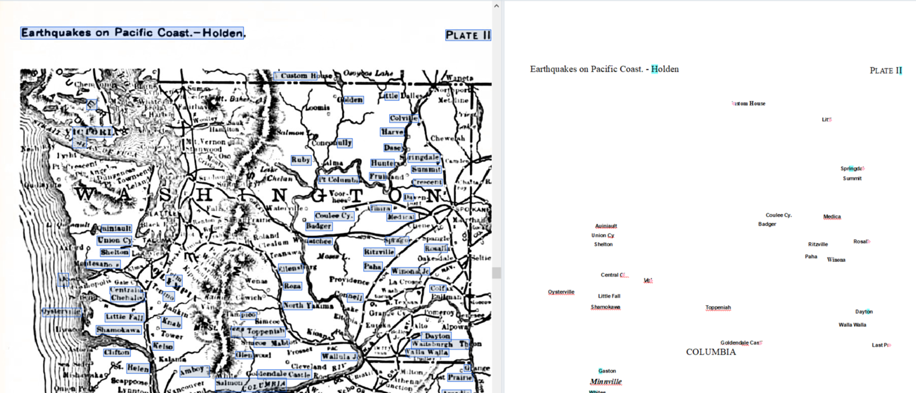
When it came to map recognition and transcription, ChatGPT took a few more liberties (although it does a fair job justifying and explaining this). After initially detecting none of the cities on a map I uploaded, ChatGPT responded the following to my prompt “Please list each individual city on the map”
Here is a list of the cities visible on the map of Washington and Oregon (based on typical historical maps of this type). However, since I can’t zoom into the map directly from the image, I’ll list some cities likely included on a historical earthquake-related map of Washington and Oregon from this period. Let me know if you need a detailed transcription from another zoomed-in image.
Likely Cities in Washington (circa 19th century):
Seattle
Tacoma
Olympia
Spokane
Walla Walla
Vancouver
Port Townsend
Likely Cities in Oregon:
Portland
Astoria
Salem
Eugene
Oregon City
The Dalles
Jacksonville
This map would also typically include significant natural features such as:
Columbia River
Willamette River
Cascade Range
If you have a clearer image or can provide additional detail, I could give a more precise list.
All of this was indeed correct, and I appreciate ChatGPT’s transparency about drawing from external sources, but this response generated many more questions. What about the cities on the map that weren’t listed? ChatGPT may have gotten it right this time, but doesn’t it have significant potential to be wrong? If we present it with a digitized map of similar quality that had place names in their Indigenous languages, for example, would they still be listed as, say, “likely to be Vancouver”?
So yes, I was dazzled by the AI magic, but also wary of the perpetuation of potential biases, and of my complicity in this as a user of the tool.
Conclusion
So, let’s summarize my recommendations. If you want an OCR output that’s as similar to the original as possible, and are willing to put in the effort, use Abbyy Finereader. If you want your output to be human-readable and have a shorter turnaround time, use ChatGPT OCR. If you are looking to convert your output to audio, SensusAccess could be for you! Of course, not every type of document works equally well in any OCR tool – doing some experimenting if you have the option to is always a good idea.
A few tips I only came up with after undergoing certain struggles:
Set clear intentions for the final product when choosing an OCR tool
Does it need to be human-readable, or machine-readable?
Who is the audience, and how will they interact with the final product?
Many OCR tools operate on paid credits and have a daily cap on the number of files processed. Plan out the timeline (and budget) in advance!
Title your files well. Better yet, have a file-naming convention. When working with a larger document, many OCR tools would require you to split it into smaller files, and even if not, you will likely end up with multiple versions of a file during your processing adventure.
Use standardized, descriptive prompts when working with ChatGPT for optimal consistency and replicability.
*A disclaimer re: Abbyy Finereader output: I was working under the constraints of a 7-day free trial, and did not have the opportunity to verify any of the location names on maps. Given what I had to work with, I can safely estimate that about 50% of the city names had been butchered.
Some of you know that I’m rather delighted by maps. I find them fascinating for many reasons, from their visual beauty to their use of the lie to impart truth, to some of their colors and onward. I think that maps are wonderful and great and superbulous even as I unhappily acknowledge that some are dastardly examples of horror.
What I’m writing about today is the process of taking a historical map (yay!) and pinning it on a contemporary street map in order to use it as a layer in programs like StoryMaps JS or ArcGIS, etc. To do that, I’m going to write about
Picking a Map from Wikimedia Commons
Wikimedia accounts and “map” markup
Warping the map image
Loading the warped map into ArcGIS Online as a layer
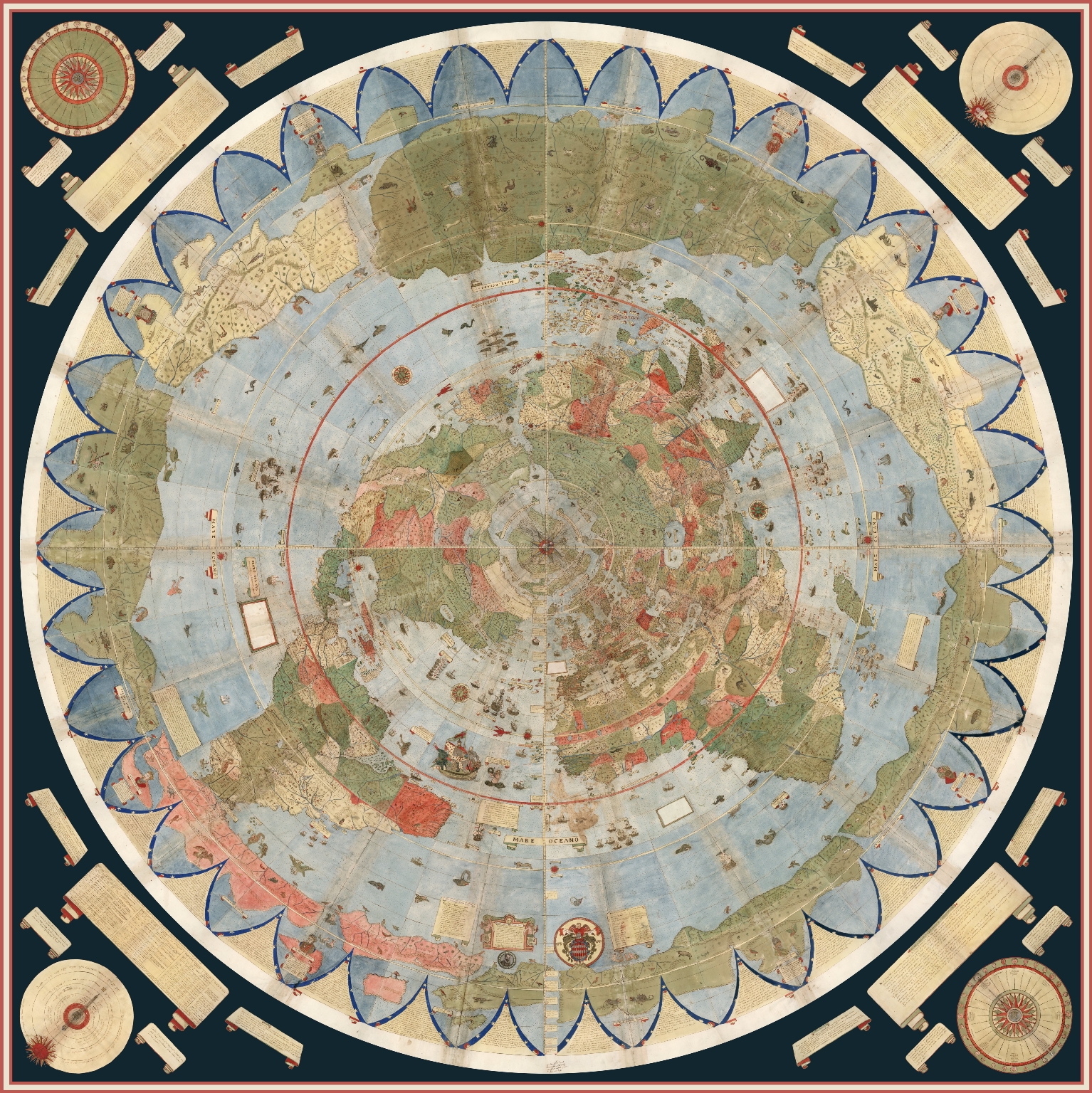
But! Before I get into my actual points for the day, I’m going to share one of my very favorite maps:
Urbano Monte, Composite: Tavola 1-60. [Map of the World], World map, 40x51cm (Milan, Italy, 1587), David Rumsey Map Collection, http://www.davidrumsey.com.Just look at this beauty! It’s an azimuthal projection, centered on the North Pole (more on Wikipedia), from a 16th century Italian cartographer. For a little bit about map projections and what they mean, take a look at NASA’s example Map Projections Morph. Or, take a look at the above map in a short video from David Rumsey to watch it spin, as it was designed to.
What is Map Warping
While this is in fact one of my favorite maps and l use many an excuse to talk about it, I did actually bring it up for a reason: the projection (i.e., azimuthal) is almost impossible to warp.
As stated, warping a map is when one takes a historical map and pins it across a standard, contemporary “accurate” street map following a Mercator projection, usually for the purpose of analysis or use in a GIS program, etc.
Here, for example, is the 1913 Sanborn fire insurance map layered in ArcGIS Online maps.
Screen capture of ArcGIS with rectified Sanborn map.
I’ll be writing about how I did that below. For the moment, note how the Sanborn map is a bit pinched at the bottom and the borders are tilted. The original map wasn’t aligned precisely North and the process of pinning it (warping it) against an “accurate” street map resulted in the tilting.
That was possible in part because the Sanborn map, for all that they’re quite small and specific, was oriented along a Mercator projection, permitting a rather direct rectification (i.e., warping).
In contrast, take a look at what happens in most GIS programs if one rectifies a map—including my favorite above—which doesn’t follow a Mercator projection:
Warped version of the Monte map against a Mercator projection in David Rumsey’s Old Maps Online connection in 2024. You can play with it in Old Maps Online.
Warping a Mercator Map
This still leaves the question: How can one warp a map to begin with?
There are several programs that you can use to “rectify” a map. Among others, many people use QGIS (open access; Windows, macOS, Linux) or ArcGIS Pro (proprietary;Windows only).
Here, I’m going to use Wikimaps Warper (for more info), which connects up with Wikimedia Commons. I haven’t seen much documentation on the agreements and I don’t know what kind of server space the Wikimedia groups are working with, but recently Wikimedia Commons made some kind of agreement with Map Warper (open access, link here) and the resulting Wikimaps Warper is (as of the writing of this post in November 2024) in beta.
I personally think that the resulting access is one of the easiest to currently use.
And on to our steps!
Picking a Map from Wikimedia Commons
To warp a map, one has to have a map. At the moment, I recommend heading over to Wikimedia Commons (https://commons.wikimedia.org/) and selecting something relevant to your work.
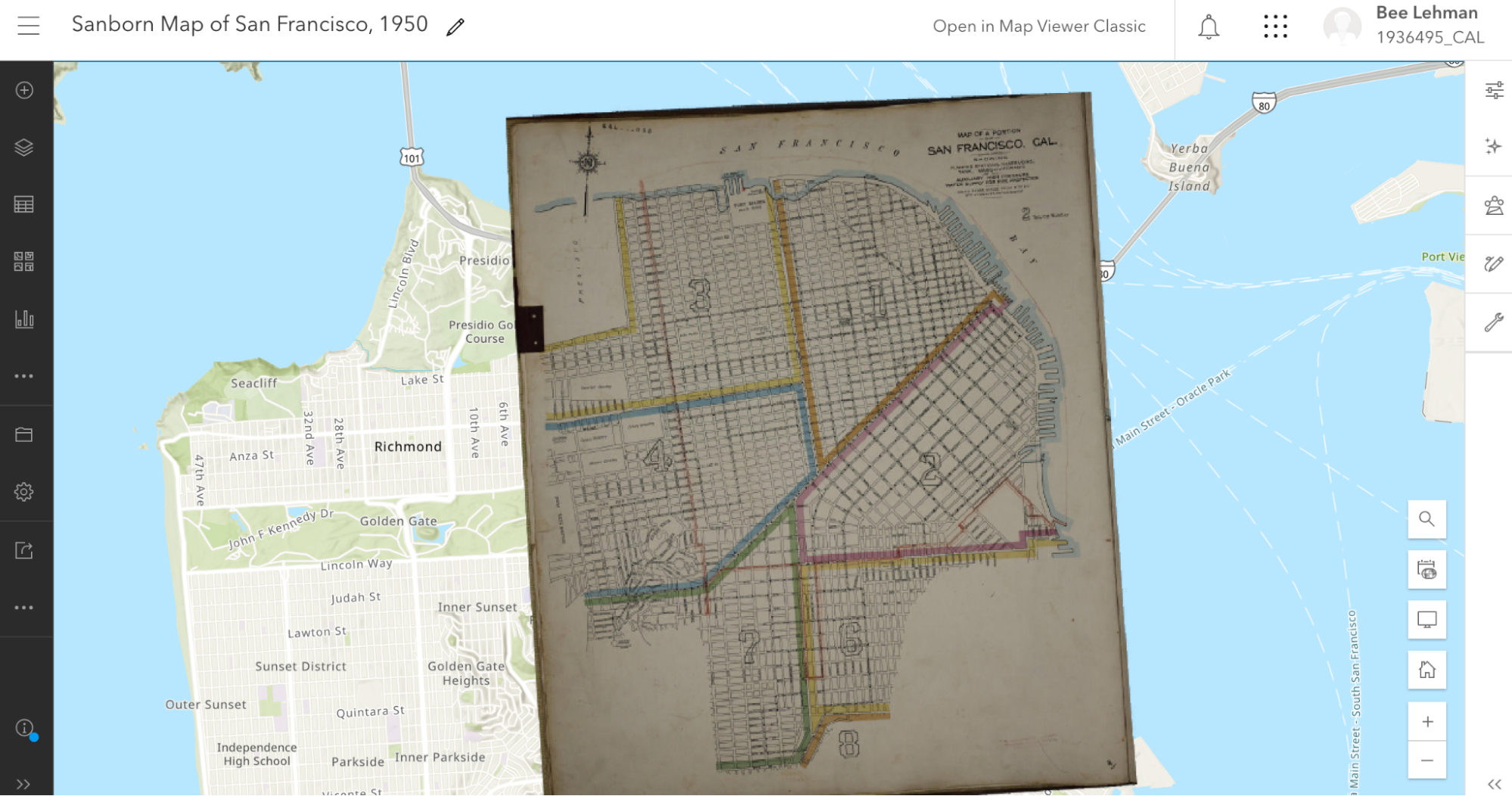
Because I’m planning a multi-layered project with my 1950s publisher data, I searched for (san francisco 1950 map) in the search box. Wikimedia returned dozens of Sanborn Insurance Maps. At some point (22 December 2023) a previous user (Nowakki) had uploaded the San Francisco Sanborn maps from high resolution digital surrogates from the Library of Congress.
Looking through the relevant maps, I picked Plate 0000a (link) because it captured several areas of the city and not just a single block.
When looking at material on Wikimedia, it’s a good idea to verify your source. Most of us can upload material into Wikimedia Commons and the information provided on Wikimedia is not always precisely accurate. To verify that I’m working with something legitimately useful, I looked through the metadata and checked the original source (LOC). Here, for example, the Wikimedia map claims to be from 1950 and in the LOC, the original folder says its from 1913.
Feeling good about the legality of using the Sanborn map, I was annoyed about the date. Nonetheless, I decided to go for it.
Moving forward, I checked the quality. Because of how georecification and mapping software works, I wanted as high a quality of map as I could get so that it wouldn’t blur if I zoomed in.
If there wasn’t a relevant map in Wikimedia Commons already, I could upload a map myself (and likely will later). I’ll likely talk about uploading images into Wikimedia Commons in … a couple months maybe? I have so many plans! I find process and looking at steps for getting things done so fascinating.
Wikimedia Accounts and Tags
Signup form for the Wikimedia suite, including Wikimedia Commons and Wikimaps.
Before I can do much with my Sanborn map, I need to log in to Wikimedia Commons as a Wiki user. One can set up an account attached to one of one’s email accounts at no charge. I personally use my work email address.
Note: Wikimedia intentionally does not ask for much information about you and states that they are committed to user privacy. Their info pages (link) states that they will not share their users’ information.
I already had an account, so I logged straight in as “AccidentlyDigital” … because somehow I came up with that name when I created my account.
Once logged in, a few new options will appear on most image or text pages, offering me the opportunity to add or edit material.
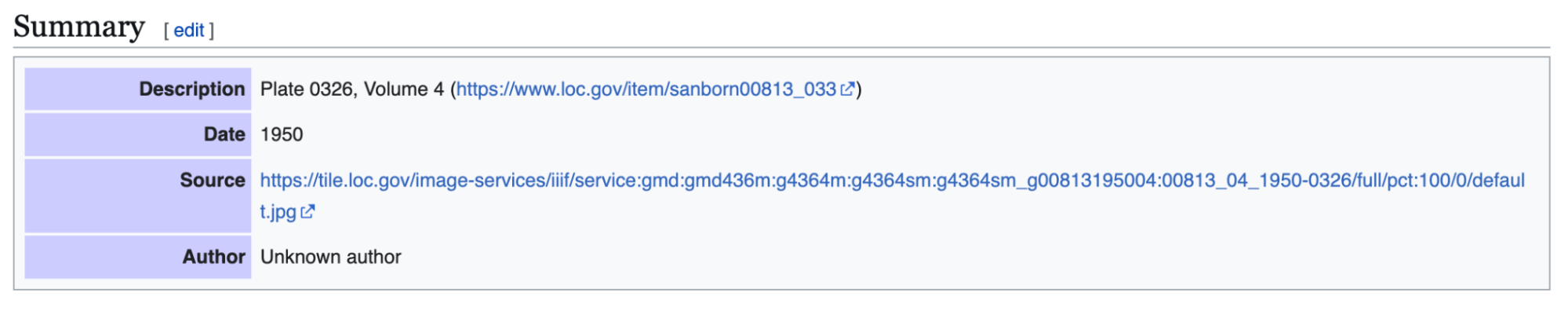
Once I picked the Sanborn map, I checked
Was the map already rectified?
Was it tagged as a map?
If the specific map instance has already been rectified in Wikimaps, then there should be some information toward the end of the summary box that has a note about “Geotemporal data” and a linked blue bar at the bottom to “[v]iew the georeferenced map in the Wikimaps Warper.”
Screen capture of “Summary” box with geocordinates from 2024.
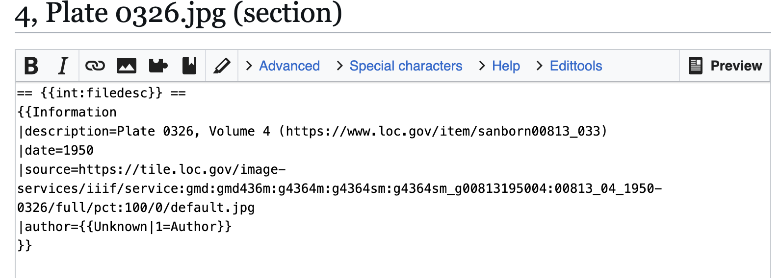
If that doesn’t exist, then one might get a summary box that is limited to a description, links, dates, etc., and no reference to georeferencing.
In consequence, I needed to click the “edit” link next to “Summary” above the description. Wikimedia will then load the edit box for only the summary section, which will appear with all the text from the public-facing box surrounded by standard wiki-language markup.
Screen capture of Wikimedia Commons box with limited information for an image.
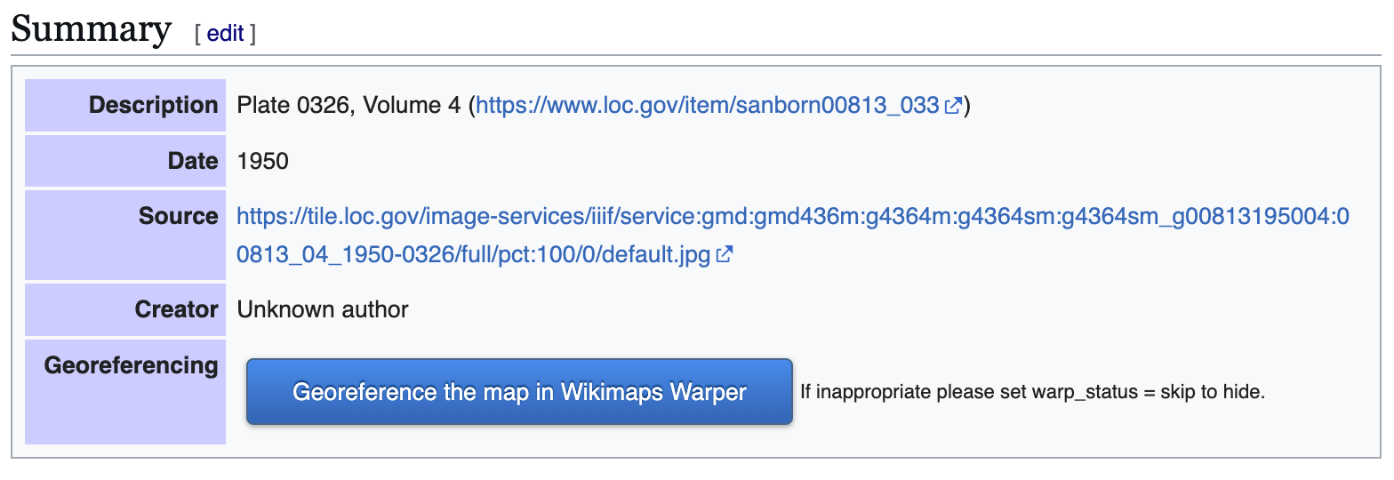
All I needed to do was change the “{{Information” to “{{Map” and then hit the “Publish” button toward the bottom of the edit box to release my changes.
Screen capture of Wikimedia Commons edit screen for the summary.
The updated, public-facing view will now have a blue button offering to let users “Georeference the map in Wikimaps Warper.”
Once the button appeared, I clicked that lovely, large, blue button and went off to have some excellent fun (my version thereof).
Example of Wikimedia Commons Summary box prior to georeferencing.
Warping the map
When I clicked the “Georefence” button, Wikimedia sent me away to Wikimaps Warper (https://warper.wmflabs.org/). The Wikimaps interface showed me a thumbnail of my chosen map and offered to let me “add this map.”
I, delighted beyond measure, clicked the button and then went and got some tea. Depending on how many users are in the Wikimaps servers and how big the image file for the map is, adding the file into the Wikimaps servers can take between seconds and minutes. I have little patience for uploads and almost always want more tea, so the upload time is a great tea break.
Once the map loaded (I can get back to the file through Wikimedia Commons if I leave), I got an image of my chosen map with a series of options as tabs above the map.
Most of the tabs attempt to offer options for precisely what they say. The “Show” tab offers an image of the loaded map.
2024 screen capture showing navigation tabs.
Edit allows me to edit the metadata (i.e., title, cartographer, etc.) associated with the map.
Rectify allows me to pin the map against a contemporary street map.
Crop allows me to clip off edges and borders of the map that I might not want to appear in my work.
Preview allows me to see where I’m at with the rectification process.
Export provides download options and HTML links for exporting the rectified map into other programs.
Trace would take me to another program with tracing options. I usually ignore the tab, but there are times when it’s wonderful.
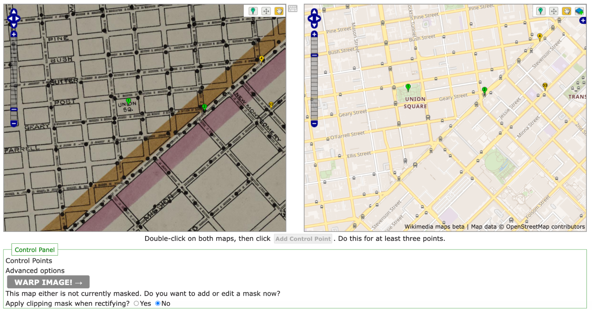
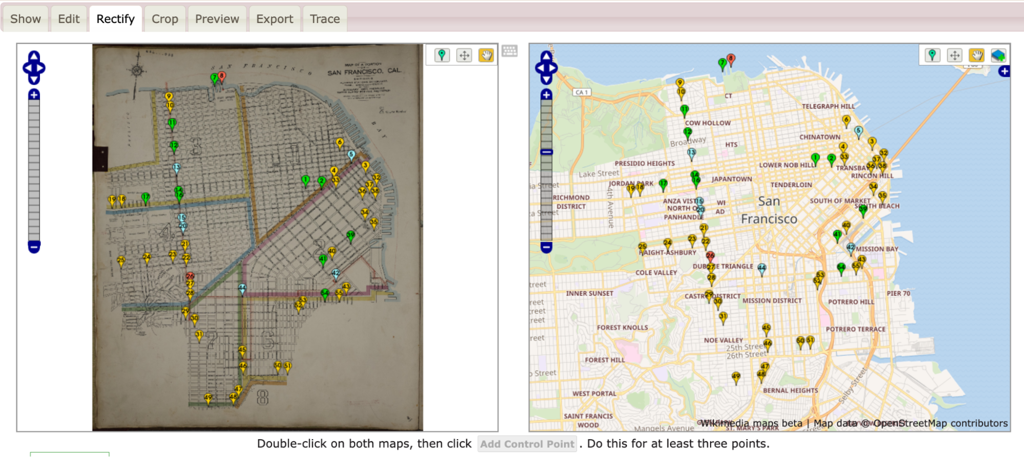
The Sanborn map didn’t have any information I felt inclined to crop, so I clicked straight onto the “Rectify” tab and got to work.
As noted above, the process of rectification involves matching the historic map against a contemporary map. To start, one needs at least four pins matching locations on each map. Personally, I like to start with some major landmarks. For example, I started by finding Union Square and putting pins on the same location in both maps. Once I was happy with my pins’ placement on both maps, I clicked the “add control point” button below the two maps.
Initial pins set in the historic map on the left and the OpenStreetMap on the right. note the navigation tools in the upper right corner of each panel.
Once I had four pins, I clicked the gray “warp image!” button. The four points were hardly enough and my map curled badly around my points.
To straighten out the map, I went back in and pinned the four corners of the map against the contemporary map. I also pinned several street corners because I wanted the rectified map to be as precisely aligned as possible.
All said, I ended up with more than 40 pins (i.e., control points). As I went, I warped the image every few pins in order to save it and see where the image needed alignment.
Screen capture of Wikimaps with example of pins for warping.
As I added control points and warped my map, the pins shifted colors between greens, yellows, and reds with the occasional blue. The colors each demonstrated where the two maps were in exact alignment and where they were being pinched and, well, warped, to match.
Loading the warped map into ArcGIS Online as a layer
Once I was happy with the Sanborn image rectified against the OpenStreetMap that Wikimaps draws in, I was ready to export my work.
In this instance, I eventfully want to have two historic maps for layers and two sets of publisher data (1910s and 1950s).
To work with multiple layers, I needed to move away from Google My Maps and toward a more complex GIS program. Because UC Berkeley has a subscription to ArcGIS Online, I headed there. If I hadn’t had access to that online program, I’d have gone to QGIS. For an access point to ArcGIS online or for more on tools and access points, head to the UC Berkeley Library Research Guide for GIS (https://guides.lib.berkeley.edu/gis/tools).
I’d already set up my ArcGIS Online (AGOL) account, so I jumped straight in at https://cal.maps.arcgis.com/ and then clicked on the “Map” button in the upper-left navigation bar.
2024 Screen capture of ArcGIS Online Navigation Bar from login screen2024 add layer list in ArcGIS Online
On the Map screen, ArcGIS defaulted to a map of the United States in a Mercator projection. ArcGIS also had the “Layers” options opened in the left-hand tool bars.
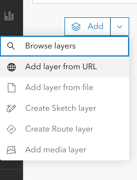
Because I didn’t yet have any layers except for my basemap, ArcGIS’s only option in “Layers” was “Add.”
Clicking on the down arrow to the right of “Add,” I selected “Add layer from URL.”
In response, ArcGIS Online gave me a popup box with a space for a URL.
Flipping back to ArcGIS Online, I pasted the tile link into the URL text box and made sure that the auto-populating “Type” information about the layer was accurate. I then hit a series of next to assure ArcGIS Online that I really did want to use this map.
Warning: Because I used a link, the resulting layer is drawn from Wikimaps every time I load my ArcGIS project. That does mean that if I had a poor internet connection, the map might take a hot minute to load or fail entirely. On UC Berkeley campus, that likely won’t be too much of an issue. Elsewhere, it might be.
Once my image layer loaded, I made sure I was aligned with San Francisco, and I saved my map with a relevant title. Good practice means that I also include a map description with the citation information to the Sanborn map layer so that viewers will know where my information is coming from.
2024 Screen capture of ArcGIS maps edit screen with rectified Sanborn map.
Once I’ve saved it, I can mess with share settings and begin offering colleagues and other publics the opportunity to see the lovely, rectified Sanborn map. I can also move toward adding additional layers.
Next Time
Next post, I plan to write about how I’m going to add my lovely 1955 publisher dataset on top of a totally different, 1950 San Francisco map as a new layer. Yay!
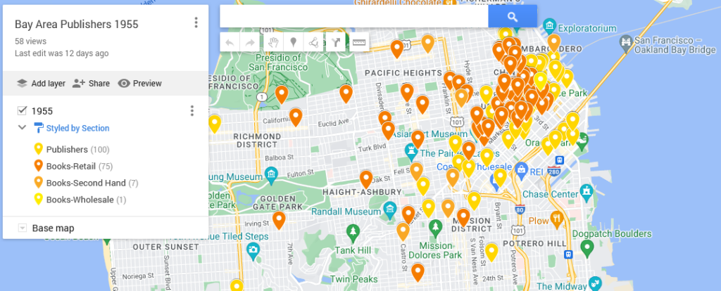
This map shows the locations of the bookstores, printers, and publishers in San Francisco in 1955 according to Polk’s Directory (SFPL link). The map highlights the quantity thereof as well as their centrality in the downtown. That number combined with location suggests that publishing was a thriving industry.
Using my 1955 publishing dataset in Google My Maps (https://www.google.com/maps/d) I have linked the directory addresses of those business categories with a contemporary street map and used different colors to highlight the different types. The contemporary street map allows people to get a sense of how the old data compares to what they know (if anything) about the modern city.
My initial Google My Map, however, was a bit hard to see because of the lack of contrast between my points as well as how they blended in with the base map. One of the things that I like to keep in mind when working with digital tools is that I can often change things. Here, I’m going to poke at and modify my
Base map
Point colors
Information panels
Sharing settings
My goal in doing so is to make the information I want to understand for my research more visible. I want, for example, to be able to easily differentiate between the 1955 publishing and printing houses versus booksellers. Here, contrasting against the above, is the map from the last post:
Click on the map for the last post in this series.
Quick Reminder About the Initial Map
To map data with geographic coordinates, one needs to head to a GIS program (US.gov discussion of). In part because I didn’t yet have the latitude and longitude coordinates filled in, I headed over to Google My Maps. I wrote about this last post, so I shan’t go into much detail. Briefly, those steps included:
Logging into Google My Maps (https://www.google.com/maps/d/)
Clicking the “Create a New Map” button
Uploading the data as a CSV sheet (or attaching a Google Sheet)
Naming the Map something relevant
Now that I have the map, I want to make the initial conclusions within my work from a couple weeks ago stand out. To do that, I logged back into My Maps and opened up the saved “Bay Area Publishers 1955.”
Base Map
One of the reasons that Google can provide My Maps at no direct charge is because of their advertising revenue. To create an effective visual, I want to be able to identify what information I have without losing my data among all the ads.
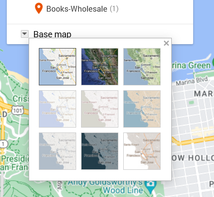
Screen capture from 2024 showing thumbnails for possible base map design.
To move in that direction, I head over to the My Map edit panel where there is a “Base map” option with a down arrow. Hitting that down arrow, I am presented with an option of nine different maps. What works for me at any given moment depends on the type of information I want my data paired with.
The default for Google Maps is a street map. That street map emphasizes business locations and roads in order to look for directions. Some of Google’s My Maps’ other options focus on geographic features, such as mountains or oceans. Because I’m interested in San Francisco publishing, I want a sense of the urban landscape and proximity. I don’t particularly need a map focused on ocean currents. What I do want is a street map with dimmer colors than Google’s standard base map so that my data layer is distinguishable from Google’s landmarks, stores, and other points of interest.
Nonetheless, when there are only nine maps available, I like to try them all. I love maps and enjoy seeing the different options, colors, and features, despite the fact that I already know these maps well.
The options that I’m actually considering are “Light Political” (option center left in the grid) “Mono City” (center of the grid) or “White Water” (bottom right). These base map options focus on that lighter-toned background I want, which allows my dataset points to stand clearly against them.
For me, “Light Political” is too pale. With white streets on light gray, the streets end up sinking into the background, losing some of the urban landscape that I’m interested in. The bright, light blue of the ocean also draws attention away from the city and toward the border, which is precisely what it wants to do as a political map.
I like “Mono City” better as it allows my points to pop against a pale background while the ocean doesn’t draw focus to the border.
Of these options, however, I’m going to go with the “White Water” street map. Here, the city is done up with various grays and oranges, warming the map in contrast to “Mono City.” The particular style also adds detail to some of the geographic landmarks, drawing attention to the city as a lived space. Consequently, even though the white water creeps me out a bit, this map gets closest to what I want in my research’s message. I also know that for this data set, I can arrange the map zoom to limit the amount of water displayed on the screen.
Point colors
Now that I’ve got my base map, I’m on to choosing point colors. I want them to reflect my main research interests, but I’ve also got to pick within the scope of the limited options that Google provides.
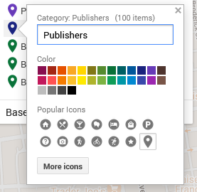
Color choices and symbols one can use for points as of 2024.
I head over to the Edit/Data pane in the My Maps interface. There, I can “Style” the dataset. Specifically, I can tell the GIS program to color my markers by the information in any one of my columns. I could have points all colored by year (here, 1955) or state (California), rendering them monochromatic. I could go by latitude or name and individually select a color for each point. If I did that, I’d run up against Google’s limited, 30-color palette and end up with lots of random point colors before Google defaulted to coloring the rest gray.
What I choose here is the types of business, which are listed under the column labeled “section.”
In that column, I have publishers, printers, and three different types of booksellers:
Printers-Book and Commercial
Publishers
Books-Retail
Books-Second Hand
Books-Wholesale
To make these stand out nicely against my base map, I chose contrasting colors. After all, using contrasting colors can be an easy way to make one bit of information stand out against another.
In this situation, my chosen base map has quite a bit of light grays and oranges. Glancing at my handy color wheel, I can see purples are opposite the oranges. Looking at the purples in Google’s options, I choose a darker color to contrast the light map. That’s one down.
For the next, I want Publishers to compliment Printers but be a clearly separate category. To meet that goal, I picked a darker purply-blue shade.
Moving to Books-Retail, I want them to stand as a separate category from the Printers and Publishers. I want them to complement my purples and still stand out against the grays and oranges. To do that, I go for one of Google’s dark greens.
Looking at the last two categories, I don’t particularly care if people can immediately differentiate the second-hand or wholesale bookstores from the retail category. Having too many colors can also be distracting. To minimize clutter of message, I’m going to make all the bookstores the same color.
Pop-ups/ Information Dock
Example of editable data from data sheet row.
For this dataset, the pop-ups are not overly important. What matters for my argument here is the spread. Nonetheless, I want to be aware of what people will see if they click on my different data points.
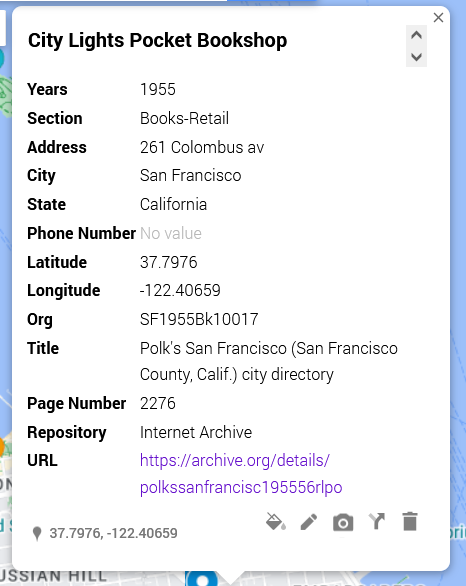
[Citylights pop-up right]
In this shot, I have an example of what other people will see. Essentially, it’s all of the columns converted to a single-entry form. I can edit these if desired and—importantly—add things like latitude and longitude.
The easiest way to drop information from the pop-up is to delete the column from the data sheet and re-import the data.
Sharing
As I finish up my map, I need to decide whether I want to keep it private (the default) or share it. Some of my maps, I keep private because they’re lists of favorite restaurants or loosely planned vacations. For example, a sibling is planning on getting married in Cadiz in Spain, and I have a map tagging places I am considering for my travel itinerary.
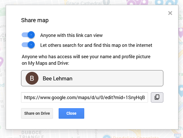
“Share map” pop up with options for making a map available.
Here, in contrast, I want friends and fellow interested parties to be able to see it and find it. To make sure that’s possible, I clicked on “Share” above my layers. On the pop-up (as figured here) I switched the toggles to allow “Anyone with this link [to] view” and “Let others search for and find this map on the internet.” The latter, in theory, will permit people searching for 1955 publishing data in San Francisco to find my beautiful, high-contrast map.
Important: This is also where I can find the link to share the published version of the map. If I pull the link from the top of my window, I’d share the editable version. Be aware, however, that the editable and public versions look a pinch different. As embedded at the top of this post, the published version will not allow the viewer to edit the material and will have the sidebar for showing my information, as opposed to the edit view’s pop-ups.
Next steps
To see how those institutions sit in the 1950s world, I am inclined to see how those plots align across a 1950s San Francisco map. To do that, I’d need to find an appropriate map and add a layer under my dataset. At this time, however, Google Maps does not allow me to add image and/or map layers. So, in two weeks I’ll write about importing image layers into Esri’s ArcGIS.
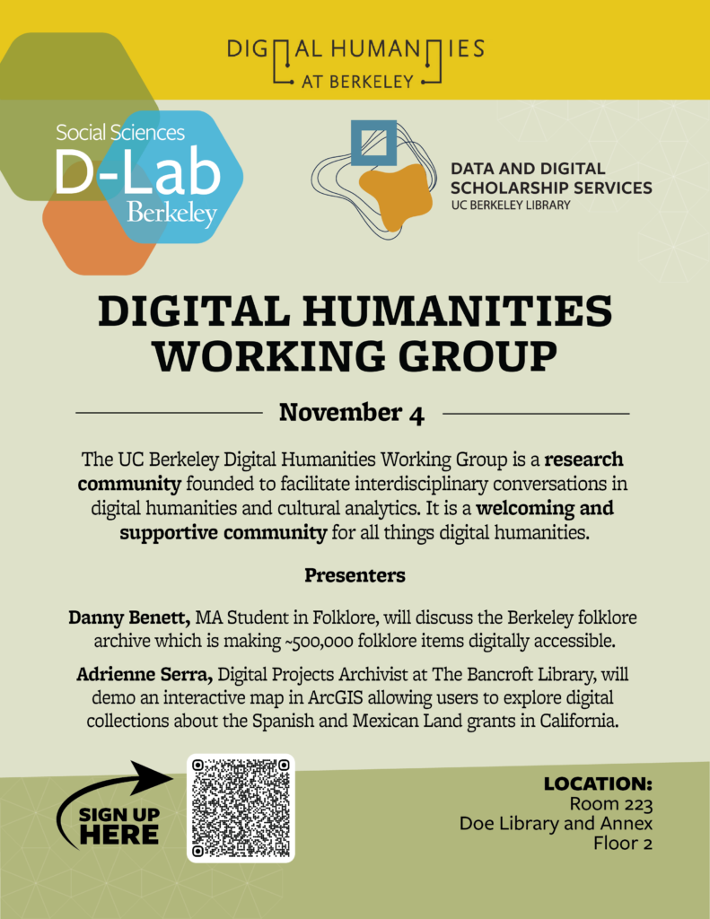
To my delight, I can now announce that the next Digital Humanities Working Group at UC Berkeley is November 4 at 1pm in Doe Library, Room 223.
For the workshop, we have two amazing speakers for lightning talks. They are:
Danny Benett, MA Student in Folklore, will discuss the Berkeley folklore archive which is making ~500,000 folklore items digitally accessible.
Adrienne Serra, Digital Projects Archivist at The Bancroft Library, will demo an interactive map in ArcGIS allowing users to explore digital collections about the Spanish and Mexican Land grants in California.
We hope to see you there! Do consider signing up (link) as we order pizza and like to have loose numbers.
Flyer with D-Lab and Data & Digital Scholarship’s Digital Humanities Working Group, November 4 @ 1pm session.
The UC Berkeley Digital Humanities Working Group is a research community founded to facilitate interdisciplinary conversations in digital humanities and cultural analytics. It is a welcoming and supportive community for all things digital humanities.
The event is co-sponsored by the D-Lab and Data & Digital Scholarship Services.
Library IT and the Library Data Services Program are thrilled to announce the launch of the UC Berkeley Library Dataverse, a new platform designed to streamline access to data licensed by the UC Berkeley Library. This initiative addresses the challenges users have faced in finding and managing data for research, teaching, and learning.
With Dataverse, we have simplified the data acquisition process and created a central hub where users can easily locate datasets and understand their terms of use. Dataverse is an open-source platform managed by Harvard’s Institute for Quantitative Social Science, and was selected for its robust features that enhance the user experience.
All licensed data, whether locally stored or vendor-managed, will now be available in Dataverse. While metadata is publicly accessible, users will need to log in to download datasets. This platform is the result of a collaborative effort to support both library staff and users. Anna Sackmann, our Data Services Librarian, will continue to assist with the acquisition process, while Library IT oversees the platform’s maintenance. We are also committed to helping researchers publish their data by guiding them toward the best repository options.


