A&H Data: Designing Visualizations in Google Maps

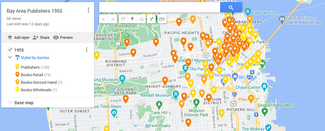
This map shows the locations of the bookstores, printers, and publishers in San Francisco in 1955 according to Polk’s Directory (SFPL link). The map highlights the quantity thereof as well as their centrality in the downtown. That number combined with location suggests that publishing was a thriving industry.

Using my 1955 publishing dataset in Google My Maps (https://www.google.com/maps/d) I have linked the directory addresses of those business categories with a contemporary street map and used different colors to highlight the different types. The contemporary street map allows people to get a sense of how the old data compares to what they know (if anything) about the modern city.

My initial Google My Map, however, was a bit hard to see because of the lack of contrast between my points as well as how they blended in with the base map. One of the things that I like to keep in mind when working with digital tools is that I can often change things. Here, I’m going to poke at and modify my

  • Base map
  • Point colors
  • Information panels
  • Sharing settings

My goal in doing so is to make the information I want to understand for my research more visible. I want, for example, to be able to easily differentiate between the 1955 publishing and printing houses versus booksellers. Here, contrasting against the above, is the map from the last post:
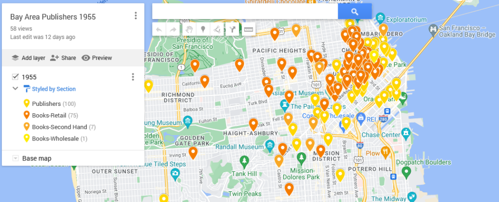
Image of the My Mpas backend with pins from the 1955-56 polk directory, colors indicating publishers or booksellers.
Click on the map for the last post in this series.

Quick Reminder About the Initial Map

To map data with geographic coordinates, one needs to head to a GIS program (US.gov discussion of). In part because I didn’t yet have the latitude and longitude coordinates filled in, I headed over to Google My Maps. I wrote about this last post, so I shan’t go into much detail. Briefly, those steps included:

    1. Logging into Google My Maps (https://www.google.com/maps/d/)
    2. Clicking the “Create a New Map” button
    3. Uploading the data as a CSV sheet (or attaching a Google Sheet)
    4. Naming the Map something relevant

Now that I have the map, I want to make the initial conclusions within my work from a couple weeks ago stand out. To do that, I logged back into My Maps and opened up the saved “Bay Area Publishers 1955.”

Base Map

One of the reasons that Google can provide My Maps at no direct charge is because of their advertising revenue. To create an effective visual, I want to be able to identify what information I have without losing my data among all the ads.
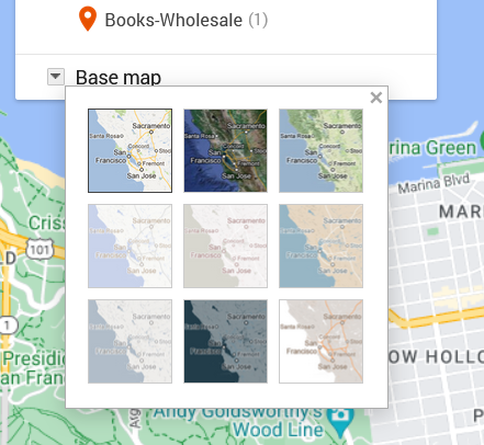
Grid of nine possible base maps for use in Google Maps. The small squares suggest different color balances and labels.
Screen capture from 2024 showing thumbnails for possible base map design.

To move in that direction, I head over to the My Map edit panel where there is a “Base map” option with a down arrow. Hitting that down arrow, I am presented with an option of nine different maps. What works for me at any given moment depends on the type of information I want my data paired with.

The default for Google Maps is a street map. That street map emphasizes business locations and roads in order to look for directions. Some of Google’s My Maps’ other options focus on geographic features, such as mountains or oceans. Because I’m interested in San Francisco publishing, I want a sense of the urban landscape and proximity. I don’t particularly need a map focused on ocean currents. What I do want is a street map with dimmer colors than Google’s standard base map so that my data layer is distinguishable from Google’s landmarks, stores, and other points of interest.

Nonetheless, when there are only nine maps available, I like to try them all. I love maps and enjoy seeing the different options, colors, and features, despite the fact that I already know these maps well.

The options that I’m actually considering are “Light Political” (option center left in the grid) “Mono City” (center of the grid) or “White Water” (bottom right). These base map options focus on that lighter-toned background I want, which allows my dataset points to stand clearly against them.

For me, “Light Political” is too pale. With white streets on light gray, the streets end up sinking into the background, losing some of the urban landscape that I’m interested in. The bright, light blue of the ocean also draws attention away from the city and toward the border, which is precisely what it wants to do as a political map.

I like “Mono City” better as it allows my points to pop against a pale background while the ocean doesn’t draw focus to the border.

Of these options, however, I’m going to go with the “White Water” street map. Here, the city is done up with various grays and oranges, warming the map in contrast to “Mono City.” The particular style also adds detail to some of the geographic landmarks, drawing attention to the city as a lived space. Consequently, even though the white water creeps me out a bit, this map gets closest to what I want in my research’s message. I also know that for this data set, I can arrange the map zoom to limit the amount of water displayed on the screen.

Point colors

Now that I’ve got my base map, I’m on to choosing point colors. I want them to reflect my main research interests, but I’ve also got to pick within the scope of the limited options that Google provides.
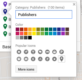
Google My Map 30 color options above grid of symbols one can use for data points across map.
Color choices and symbols one can use for points as of 2024.

I head over to the Edit/Data pane in the My Maps interface. There, I can “Style” the dataset. Specifically, I can tell the GIS program to color my markers by the information in any one of my columns. I could have points all colored by year (here, 1955) or state (California), rendering them monochromatic. I could go by latitude or name and individually select a color for each point. If I did that, I’d run up against Google’s limited, 30-color palette and end up with lots of random point colors before Google defaulted to coloring the rest gray.

What I choose here is the types of business, which are listed under the column labeled “section.”

In that column, I have publishers, printers, and three different types of booksellers:

  • Printers-Book and Commercial
  • Publishers
  • Books-Retail
  • Books-Second Hand
  • Books-Wholesale

To make these stand out nicely against my base map, I chose contrasting colors. After all, using contrasting colors can be an easy way to make one bit of information stand out against another.

In this situation, my chosen base map has quite a bit of light grays and oranges. Glancing at my handy color wheel, I can see purples are opposite the oranges. Looking at the purples in Google’s options, I choose a darker color to contrast the light map. That’s one down.

For the next, I want Publishers to compliment Printers but be a clearly separate category. To meet that goal, I picked a darker purply-blue shade.

Moving to Books-Retail, I want them to stand as a separate category from the Printers and Publishers. I want them to complement my purples and still stand out against the grays and oranges. To do that, I go for one of Google’s dark greens.

Looking at the last two categories, I don’t particularly care if people can immediately differentiate the second-hand or wholesale bookstores from the retail category. Having too many colors can also be distracting. To minimize clutter of message, I’m going to make all the bookstores the same color.

Pop-ups/ Information Dock
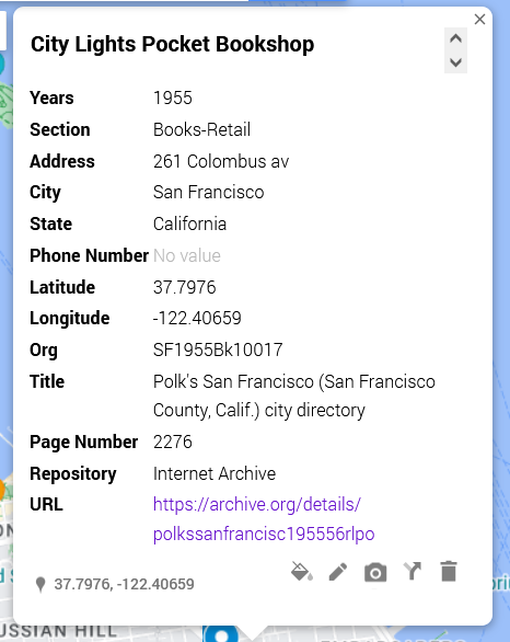
Google My Map editing popup showing rows from dataset as a form.
Example of editable data from data sheet row.

For this dataset, the pop-ups are not overly important. What matters for my argument here is the spread. Nonetheless, I want to be aware of what people will see if they click on my different data points.

[Citylights pop-up right]

In this shot, I have an example of what other people will see. Essentially, it’s all of the columns converted to a single-entry form. I can edit these if desired and—importantly—add things like latitude and longitude.

The easiest way to drop information from the pop-up is to delete the column from the data sheet and re-import the data.

Sharing

As I finish up my map, I need to decide whether I want to keep it private (the default) or share it. Some of my maps, I keep private because they’re lists of favorite restaurants or loosely planned vacations. For example, a sibling is planning on getting married in Cadiz in Spain, and I have a map tagging places I am considering for my travel itinerary.
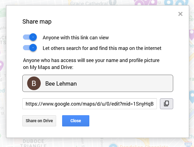
Toggles toward the top in blue and a close button toward the bottom for saving changes.
“Share map” pop up with options for making a map available.

Here, in contrast, I want friends and fellow interested parties to be able to see it and find it. To make sure that’s possible, I clicked on “Share” above my layers. On the pop-up (as figured here) I switched the toggles to allow “Anyone with this link [to] view” and “Let others search for and find this map on the internet.” The latter, in theory, will permit people searching for 1955 publishing data in San Francisco to find my beautiful, high-contrast map.

Important: This is also where I can find the link to share the published version of the map. If I pull the link from the top of my window, I’d share the editable version. Be aware, however, that the editable and public versions look a pinch different. As embedded at the top of this post, the published version will not allow the viewer to edit the material and will have the sidebar for showing my information, as opposed to the edit view’s pop-ups.

Next steps

To see how those institutions sit in the 1950s world, I am inclined to see how those plots align across a 1950s San Francisco map. To do that, I’d need to find an appropriate map and add a layer under my dataset. At this time, however, Google Maps does not allow me to add image and/or map layers. So, in two weeks I’ll write about importing image layers into Esri’s ArcGIS.
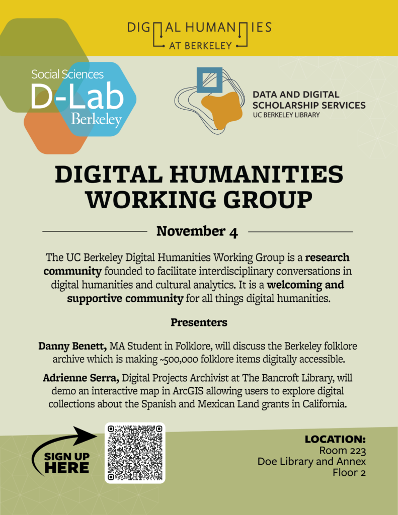
Digital Archives and the DH Working Group on Nov. 4

To my delight, I can now announce that the next Digital Humanities Working Group at UC Berkeley is November 4 at 1pm in Doe Library, Room 223.

For the workshop, we have two amazing speakers for lightning talks. They are:

Danny Benett, MA Student in Folklore, will discuss the Berkeley folklore archive which is making ~500,000 folklore items digitally accessible.

Adrienne Serra, Digital Projects Archivist at The Bancroft Library, will demo an interactive map in ArcGIS allowing users to explore digital collections about the Spanish and Mexican Land grants in California.

We hope to see you there! Do consider signing up (link) as we order pizza and like to have loose numbers.

The UC Berkeley Digital Humanities Working Group is a research community founded to facilitate interdisciplinary conversations in digital humanities and cultural analytics. It is a welcoming and supportive community for all things digital humanities. Presenters Danny Benett, MA Student in Folklore, will discuss the Berkeley folklore archive which is making ~500,000 folklore items digitally accessible. Adrienne Serra, Digital Projects Archivist at The Bancroft Library, will demo an interactive map in ArcGIS allowing users to explore digital collections about the Spanish and Mexican Land grants in California. SIGN UP
Flyer with D-Lab and Data & Digital Scholarship’s Digital Humanities Working Group, November 4 @ 1pm session.

The UC Berkeley Digital Humanities Working Group is a research community founded to facilitate interdisciplinary conversations in digital humanities and cultural analytics. It is a welcoming and supportive community for all things digital humanities.

The event is co-sponsored by the D-Lab and Data & Digital Scholarship Services.


Harvey L. Sharrer (1940 – 2024)

It is with deep sadness that we share the news that Harvey Sharrer, our dear friend and colleague and co-director of the Bibliografia de Textos Antigos Galegos e Portugueses (BITAGAP) for more than thirty-five years, died unexpectedly last month.

Harvey, Professor Emeritus at the University of California Santa Barbara, passed away at his home in Santa Barbara on September 12, 2024. His life was dedicated to teaching, academic research, and world exploration.

Born in Oakland, California in 1940 to Ruth Morehouse and Harvey Sharrer, he spent his formative years in Oakland and Danville, California, graduating from San Ramon Valley High School in 1958. His passion for foreign languages was ignited by his high school Spanish teacher, who inspired him to pursue language studies in college.  After graduating from high school, Harvey took a summer course at the Monterey Institute of Foreign Studies and spent Fall quarter at the University of San Francisco. He then took a gap year to work with his father’s remodeling business, saving money for a transformative month’s-long European trip with a high school friend—an experience that kindled his lifelong love for world travel.

Returning to the U.S., Harvey earned his bachelor’s and master’s degrees in Spanish from UC Berkeley in 1963 and 1965, respectively, followed by a doctorate in Hispanic and Luso-Brazilian Literature from UCLA in 1970, with a dissertation on “The Legendary History of Britain from its Founding by Brutus to the Death of King Arthur in Lope García de Salazar’s Libro de las bienandanzas e fortunas.”  Even before finishing his dissertation he had published a Critical Bibliography of Hispanic Arthurian Material, I: Texts: The Prose Romance Cycles (London: Grant & Cutler, 1977) in Alan Deyermond’s fundamental series of Research Bibliographies & Checklists. He spent his entire academic career at UC Santa Barbara, starting in 1968 as an Acting Assistant Professor and progressing steadily through the canonical ranks to full professor in 1981. He served as chair of the UCSB Department of Spanish & Portuguese in 1978-1981 and then again 2002-2003.

Dr. Sharrer was universally admired for his scholarship and the impressive breadth of his knowledge of medieval literature and culture, encompassing Arthurian literature, the medieval Romance lyric, and, increasingly, the digital humanities—a field in which he was a pioneer. He made significant scholarly contributions to our knowledge of medieval and early modern Portuguese, Galician, Spanish, and Catalan literatures. His expertise in Catalan was honed by the two years (1984-1986) he spent as the director of the Barcelona Study Center (U. of California and U. of Illinois), where he enjoyed the friendship of Vicenç Beltran and Gemma Avenoza, who would become colleagues in PhiloBiblon as the directors of the Bibliografia de Textos Antics Catalans (BITECA).

He collaborated on BITAGAP with his friends Arthur Askins and Martha Schaffer from its beginning in 1989 as one of PhiloBiblon‘s three constituent bibliographies, all three dedicated to uncovering and documenting the primary sources of the medieval Romance literatures of the Iberian Peninsula:

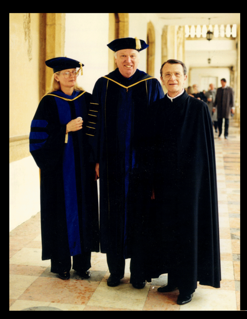
Martha Schaffer and Arthur Askins with Harvey Sharrer in Coimbra in 1999, on the occasion of the investiture of Askins as Doctor <em>honoris causa</em> of the Universidade de Coimbra.
Martha Schaffer and Arthur Askins with Harvey Sharrer in Coimbra in 1999, on the occasion of the investiture of Askins as Doctor honoris causa of the Universidade de Coimbra.
 

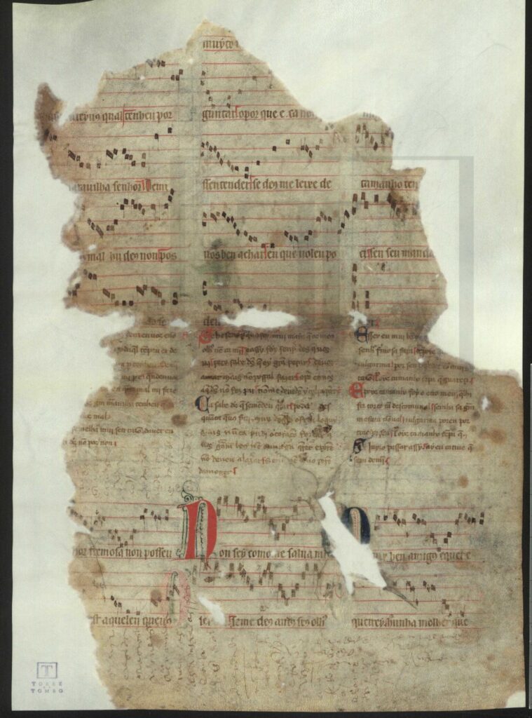
The three colleagues were indefatigable ratones de bibliotecas, systematically quartering Portugal, from Bragança in the north to Lagos in the south, in search of new manuscripts of medieval Portuguese and Galician texts. They found the richest collections, however, in Lisbon: the Biblioteca Nacional de Portugal, the Ajuda library, and Arquivo Nacional da Torre do Tombo.  They and their Portuguese collaborators, especially Pedro Pinto and Filipe Alves Moreira, combed through those collections assiduously. Harvey’s most spectacular discovery, in 1990, was the eponymous  Pergaminho Sharrer, a parchment fragment with seven lyric poems in Galician-Portuguese, with music, by King Dinis of Portugal (1278-1325) . It had been used as the cover of a bundle of 16th-c. documents in the Torre do Tombo, a not  uncommon practice during the period.

Harvey described his discovery in “Fragmentos de Sete Cantigas d’Amor de D. Dinis, musicadas –uma descoberta” (Actas do IV Congresso da Associação Hispânica de Literatura Medieval, Lisboa: Edições Cosmos, 1991: I:13-29).

Pergaminho Sharrer, with seven poems by King Dinis of Portugal, with music

Retirement came in 2011, but it did little to slow Harvey down. He continued to participate in conferences worldwide and, at UCSB, generously proofread articles for his former department. He remained a respected and admired scholar, mentor, and colleague throughout his life.

Harvey at the XXXX Congress
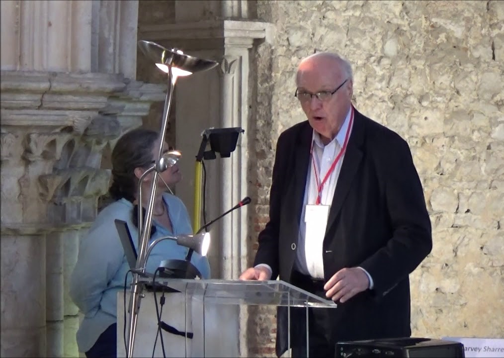
Harvey at the microphone

Harvey’s career was commemorated by a splendid volume of homage studies edited by Ricardo Pichel, “Tenh’eu que mi fez el i mui gran ben”. Estudos sobre cultura escrita medieval dedicados a Harvey L. Sharrer (Madrid: Silex, 2022): 

Homage presentation
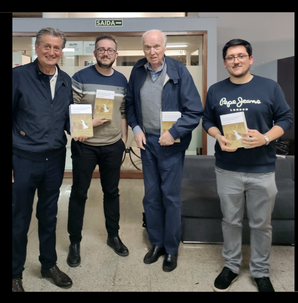
Presentation of the homage volume in Santiago de Compostela: (from left): Xavier Varela Barreiro, Ricardo Pichel, Harvey Sharrer, Miguel García-Fernández

Harvey Sharrer will be deeply missed for his extraordinary scholarship, his remarkable mentorship of and generosity toward students and young scholars, and his courteous and congenial personality, um cavaleiro da escola antiga. His work will continue to influence future generations of students and scholars.  In recognition of his scholarly career and lasting impact on the Santa Barbara campus, the campus flag was lowered to half-staff on Wednesday, October 2.

Harvey, who never married and considered his scholarly career to be his life’s work, is survived by a sister, Elizabeth Porter, in Upland, California, a brother, William Sharrer, in Louisville, Kentucky, and several cousins, nieces, and nephews who will miss him dearly.

Harvey did not wish to have a formal memorial service, but rather planned to create an endowment in his name at UC Santa Barbara, to be called the “Harvey L. Sharrer Dissertation Travel Grants.”  Plans for this endowment are going forward actively, and we will announce them opportunely. It will support future scholars in their research endeavors, particularly in the field of Ibero-Romance languages, reflecting Harvey’s lifelong passion and areas of expertise. 

William L. Sharrer
Elide V. Oliver
Charles B. Faulhaber


A&H Data: Bay Area Publishing and Structured Data

Last post, I promised to talk about using structured data with a dataset focused on 1950s Bay Area publishing. To get into that topic, I’m going to talk about 1) setting out with a research question as well as 2) data discovery, and 3) data organization, in order to do 4) initial mapping.

Background to my Research

When I moved to the Bay Area, I (your illustrious Literatures and Digital Humanities Librarian) started exploring UC Berkeley’s collections. I wandered through the Doe Library’s circulating collections and started talking to our Bancroft staff about the special library and archive’s foci. As expected, one of UC Berkeley’s collecting areas is California publishing, with a special emphasis on poetry.

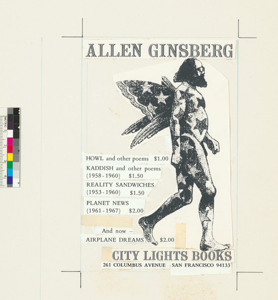
Allen Ginsberg depicted with wings in copy for a promotional piece.
Mock-up of ad for books by Allen Ginsberg, City Lights Books Records, 1953-1970, Bancroft Library.

In fact, some of Bancroft’s oft-used materials are the City Light Books collections (link to finding aids in the Online Archive of California) that include some of Allen Ginsberg’s pre-publication drafts of “Howl” and original copies of Howl and Other Poems. You may already know about that poem because you like poetry, or because you watch everything with Daniel Radcliffe in it (IMDB on the 2013 Kill your Darlings). This is, after all, the very poem that led to the seminal trial that influenced U.S. free speech and obscenity laws (often called The Howl Obscenity Trial) . The Bancroft collections have quite a bit about that trial as well as some of Ginsberg’s correspondence with Lawrence Ferlinghetti (poet, bookstore owner, and publisher) during the harrowing legal case. (You can a 2001 discussion with Ferlinghetti on the subject here.)

Research Question

Interested in learning more about Bay Area publishing in general and the period in which Ginsberg’s book was written in particular, I decided to look into the Bay Area publishing environment during the 1950s and now (2020s), starting with the early period. I wanted a better sense of the environment in general as well as public access to books, pamphlets, and other printed material. In particular, I wanted to start with the number of publishers and where they were.

Data Discovery

For a non-digital, late 19th and 20th century era, one of the easiest places to start getting a sense of mainstream businesses is to look in city directories. There was a sweet spot in an era of mass printing and industrialization in which city directories were one of the most reliable sources of this kind of information, as the directory companies were dedicated to finding as much information as possible about what was in different urban areas and where men and businesses were located. The directories, as a guide to finding business, people, and places, were organized in a clear, columned text, highly standardized and structured in order to promote usability.

Raised in an era during which city directories were still a normal thing to have at home, I already knew these fat books existed. Correspondingly, I set forth to find copies of the directories from the 1950s when “Howl” first appeared. If I hadn’t already known, I might have reached out to my librarian to get suggestions (for you, that might be me).

I knew that some of the best places to find material like city directories were usually either a city library or a historical society. I could have gone straight to the San Francisco Public Library’s website to see if they had the directories, but I decided to go to Google (i.e., a giant web index) and search for (historic san francisco city directories). That search took me straight to the SFPL’s San Francisco City Directories Online (link here).

On the site, I selected the volumes I was interested in, starting with Polk’s Directory for 1955-56. The SFPL pages shot me over to the Internet Archive and I downloaded the volumes I wanted from there.

Once the directory was on my computer, I opened it and took a look through the “yellow pages” (i.e., pages with information sorted by business type) for “publishers.”

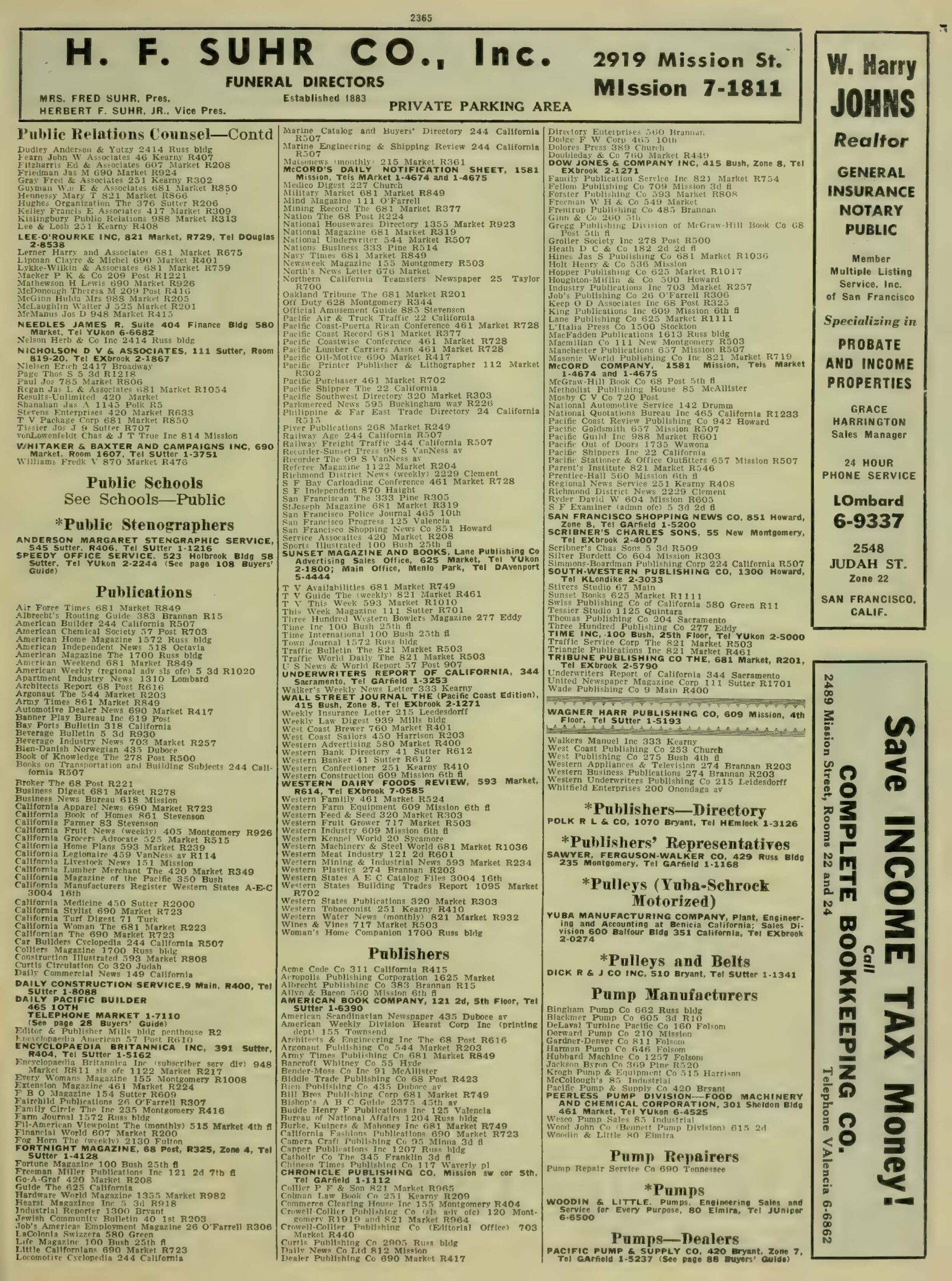
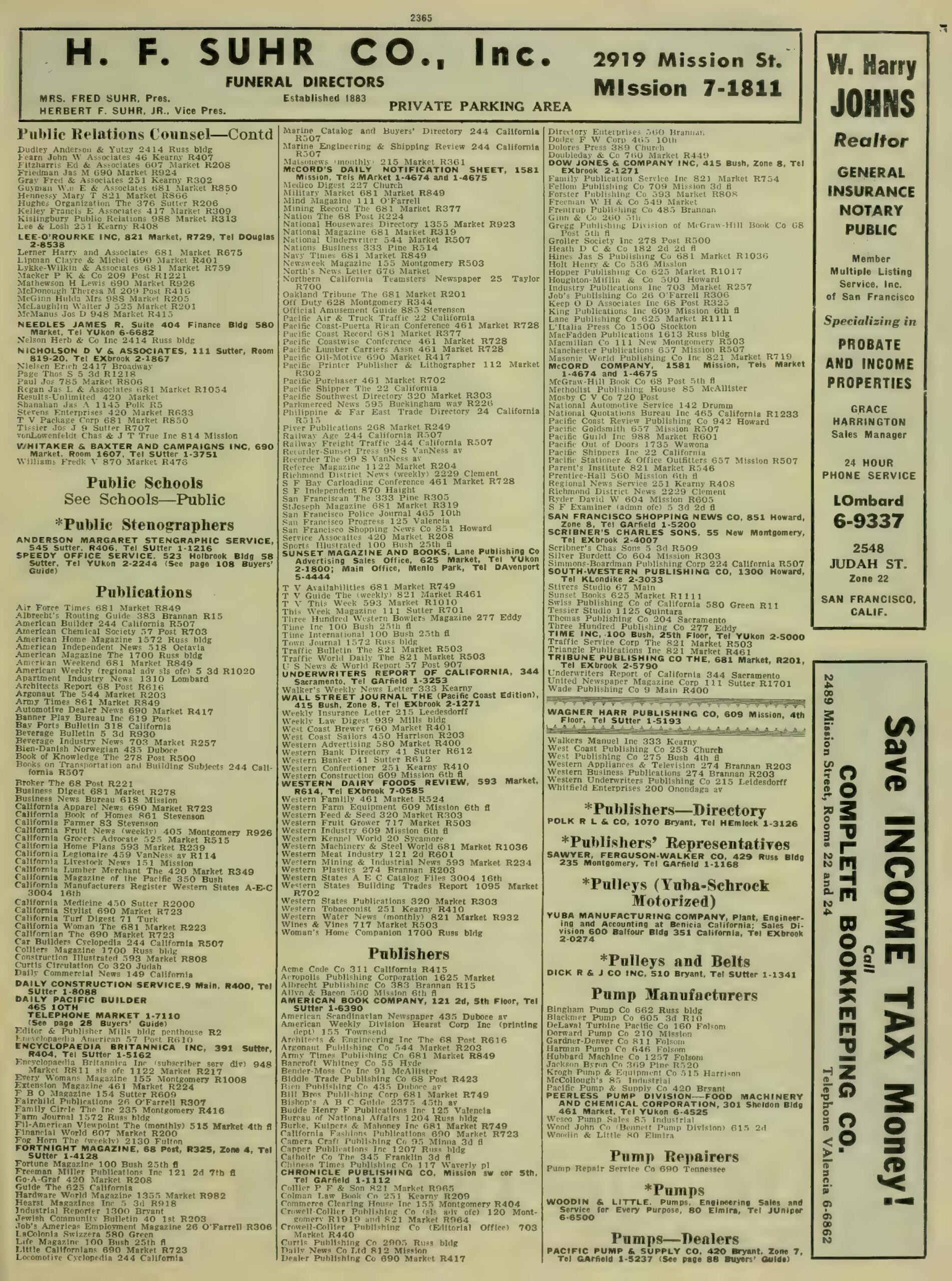
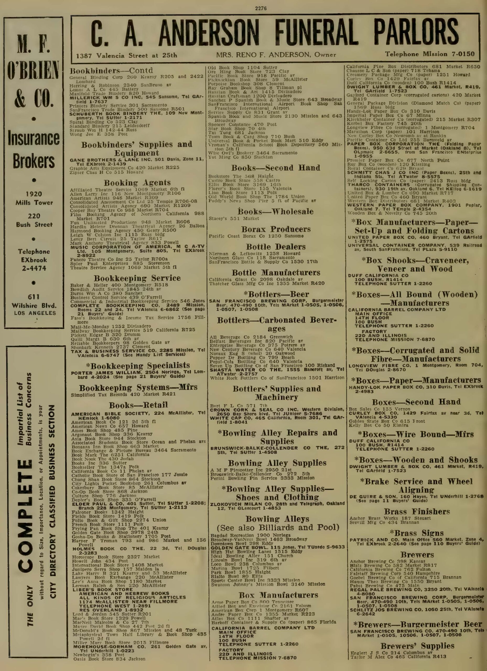
Page from a city directory with columns of company names and corresponding addresses.
Note the dense columns of text almost overlap. From R.L. Polk & Co, Polk’s San Francisco City Directory, vol. 1955–1956 (San Francisco, Calif. : R.L. Polk & Co., 1955), Internet Archive. | Public Domain.

Glancing through the listings, I noted that the records for “publishers” did not list City Light Books. Flipped back to “book sellers,” I found it. That meant that other booksellers could be publishers as well. And, regardless, those booksellers were spaces where an audience could acquire books (shocker!) and therefore relevant. Considering the issue, I also looked at the list for “printers,” in part to capture some of the self-publishing spaces.

I now had three structured lists from one directory with dozens of names. Yet, the distances within the book and inability to reorganize made them difficult to consider together. Furthermore, I couldn’t map them with the structure available in the directory. In order to do what I wanted with them (i.e., meet my research goals), I needed to transform them into a machine readable data set.

Creating a Data Set

Machine Readable

I started by doing a one-to-one copy. I took the three lists published in the directory and ran OCR across them in Adobe Acrobat Professional (UC Berkeley has a subscription; for OA access I recommend Transkribus or Tesseract), and then copied the relevant columns into a Word document.

Data Cleaning

The OCR copy of the list was a horrifying mess with misspellings, cut-off words, Ss understood as 8s, and more. Because this was a relatively small amount of data, I took the time to clean the text manually. Specifically, I corrected typos and then set up the text to work with in Excel (Google Sheets would have also worked) by:

  • creating line breaks between entries,
  • putting tabs between the name of each institution and corresponding address

Once I’d cleaned the data, I copied the text into Excel. The line breaks functioned to tell Excel where to break rows and the tabs where to understand columns. Meaning:

  • Each institution had its own row.
  • The names of the institutions and their addresses were in different columns.

Having that information in different spaces would allow me to sort the material either by address or back to its original organization by company name.

Adding Additional Information

I had, however, three different types of institutions—Booksellers, Printers, and Publishers—that I wanted to be able to keep separate. With that in mind, I added a column for EntryType (written as one word because many programs have issues with understanding column headers with spaces) and put the original directory headings into the relevant rows.

Knowing that I also wanted to map the data, I also added a column for “City” and another for “State” as the GIS (i.e., mapping) programs I planned to use wouldn’t automatically know which urban areas I meant. For these, I wrote the name of the city (i.e., “San Francisco”) and then the state (i.e., “California”) in their respective columns and autofilled the information.

Next, for record keeping purposes, I added columns for where I got the information, the page I got it from, and the URL for where I downloaded it. That information simultaneously served for me as a reminder but also as a pointer for anyone else who might want to look at the data and see the source directly.

I put in a column for Org/ID for later, comparative use (I’ll talk more about this one in a further post,) and then added columns for Latitude and Longitude for eventual use.

Page from a city directory with columns of company names and corresponding addresses.
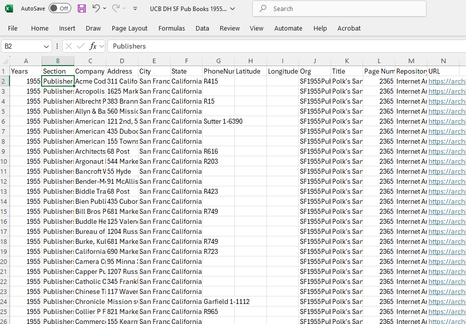
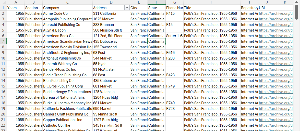
The column headers here are: Years; Section; Company; Address; City; State; PhoneNumber; Latitude; Longitude; Org; Title; PageNumber; Repository; URL. Click on the chart to see the file.

Finally, I saved my data with a filename that I could easily use to find the data again. In this case, I named it “BayAreaPublishers1955.” I made sure to save the data as an Excel file (i.e., .xmlx) and Comma Separated Value file (i.e., .csv) for use and preservation respectively. I also uploaded the file into Google Drive as a Google Sheet so you could look at it.

Initial Mapping of the Data

With that clean dataset, I headed over to Google’s My Maps (mymaps.google.com) to see if my dataset looked good and didn’t show locations in Los Angeles or other spaces. I chose Google Maps for my test because it is one of the easiest GIS programs to use

  1. because many people are already used to the Google interface
  2. the program will look up latitude and longitude based on address
  3. it’s one of the most restrictive, meaning users don’t get overwhelmed with options.

Heading to the My Maps program, I created a “new” map by clicking the “Create a new map” icon in the upper, left hand corner of the interface.

From there, I uploaded my CSV file as a layer. Take a look at the resulting map:

Image of the My Mpas backend with pins from the 1955-56 polk directory, colors indicating publishers or booksellers.
Click on the map for an interactive version. Note that I’ve set the pins to differ in column by “type.”

The visualization highlights the centrality of the 1955 San Francisco publishing world, with its concentration of publishing companies and bookstores around Mission Street. Buying books also necessitated going downtown, but once there, there was a world of information at one’s fingertips.

Add in information gleaned from scholarship and other sources about book imports, custom houses, and post offices, and one can start to think about international book trades and how San Francisco was hooked into it.

I’ll talk more about how to use Google’s My Maps in the next post in two weeks!


A&H Data: What even is data in the Arts & Humanities?

This is the first of a multi-part series exploring the idea and use of data in the Arts & Humanities. For more information, check out the UC Berkeley Library’s Data and Digital Scholarship page.

Arts & Humanities researchers work with data constantly. But, what is it?

Part of the trick in talking about “data” in regards to the humanities is that we are already working with it. The books and letters (including the one below) one reads are data, as are the pictures we look at and the videos we watch. In short, arts and humanities researchers are already analyzing data for the essays, articles, and books that they write. Furthermore, the resulting scholarship is data.

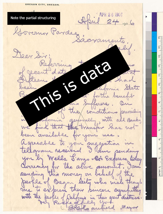
For example, the letter below from Bancroft Library’s 1906 San Francisco Earthquake and Fire Digital Collection on Calisphere is data.

blue ink handwriting with sepia toned paper; semi-structuring seen in data, addressee, etc. organization

George Cooper Pardee, “Aid for San Francisco: Letter from the Mayor in Oregon,”
April 24, 1906, UC Berkeley, Bancroft Library on Calisphere.


One ends up with the question “what isn’t data?”

The broad nature of what “data” is means that instead of asking if something is data, it can be more useful to think about what kind of data one is working with. After all, scholars work with geographic information; metadata (e.g., data about data); publishing statistics; and photographs differently.

Another helpful question is to consider how structured it is. In particular, you should pay attention to whether the data is:

  • unstructured
  • semi-structured
  • structured

The level of structure informs us how to treat the data before we analyze it. If, for example, you have hundreds of of images, you want to work with, it’s likely you’ll have to do significant amount of work before you can analyze your data because most photographs are unstructured.

photograph of adorable ceramic hedgehog

For example, with this picture of a ceramic hedgehog, the adorable animal, the photograph, and the metadata for the photograph are all different kinds of data. Image: Zde, Ceramic Rhyton in the Form of a Hedgehog, 14. to 13. century BCE, Photograph, March 15, 2014, Wikimedia Commons. | Creative Commons Attribution-Share Alike 3.0 Unported.


In contrast, the letter toward the top of this post is semi-structured. It is laid out in a typical, physical letter style with information about who, where, when, and what was involved. Each piece of information, in turn, is placed in standardized locations for easy consumption and analysis. Still, to work with the letter and its fellows online, one would likely want to create a structured counterpart.

Finally, structured data is usually highly organized and, when online, often in machine-readable chart form. Here, for example, are two pages from the Polk San Francisco City Directory from 1955-1956 with a screenshot of the machine-readable chart from a CSV (comma separated value) file below it. This data is clearly structured in both forms. One could argue that they must be as the entire point of a directory is for easy of information access and reading. The latter, however, is the one that we can use in different programs on our computers.

Page from San Francisco city directory with columns listing businesses with their addresses.
Screenshot of excell sheet with publisher addresses in columns R.L. Polk & Co, Polk’s San Francisco City Directory, vol. 1955–1956 (San Francisco, Calif. : R.L. Polk & Co., 1955),
Internet Archive. | Public Domain.


This post has provided a quick look at what data is for the Arts&Humanities.

The next will be looking at what we can do with machine-readable, structured data sets like the publisher’s information. Stay tuned! The post should be up in two weeks.


Hispanic Heritage Month 2024

2024 Hispanic Heritage Month

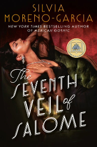
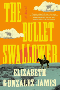
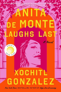
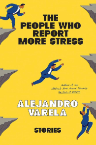
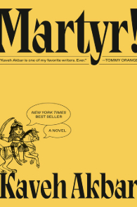
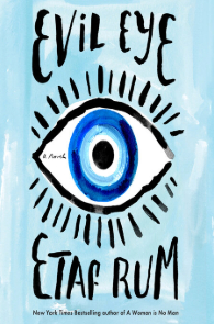
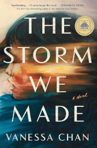
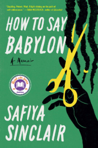
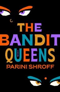
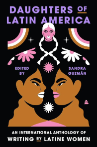
Beginning September 15th, Hispanic Heritage Month kicks off, a time to honor and celebrate the remarkable contributions and achievements of the Hispanic community. Explore a selection of inspiring recommendations by Hispanic authors below, and discover additional titles in the UC Berkeley Library’s Overdrive collection.


Follow Lit at the Library!
Subscribe by email
Instagram: @doe_lit
RSS

Pride Month 2024

Happy Pride Month 2024

Celebrate Pride Month with our handpicked selection of books by LGBTQ+ authors and characters! Discover powerful stories that shine a light on diverse identities and experiences in the LGBTQ+ community and check out more at our Overdrive.


Arab-American Heritage Month 2024

Arab American Heritage Month 2024

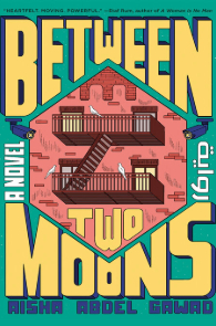
Hey there, bookworms! Ready to celebrate Arab American Heritage Month with a literary twist? Join us as we dive into the captivating world of Arab-American authors and characters and their vibrant stories, both fiction and nonfiction. Explore more at UCB Overdrive today!


Women’s History Month 2024

2024 Women's History Month

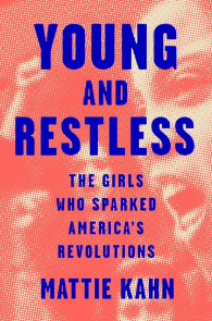
Empowerment, inspiration, and a dash of magic: Celebrating Women’s History Month with a collection that bridges worlds, both real and imagined, penned by fierce women who redefine history, one page at a time! Check out UCB Overdrive for more great finds.


Graphic Narrative Art by Emily Ehlen from OHC’s Japanese American Intergenerational Narratives Oral History Project

Below are ten graphic narrative illustrations created by artist Emily Ehlen that she drew from stories and themes in the Japanese American Intergenerational Narratives Oral History Project, or JAIN project, recorded by the Oral History Center, or OHC.

The OHC’s JAIN project documents and disseminates the ways in which intergenerational trauma and healing occurred after the United States government’s mass incarceration of Japanese Americans during World War II. The OHC team interviewed twenty-three Japanese American survivors and descendants of the World War II incarceration to investigate the impacts of healing and trauma, how this informs collective memory, and how these narratives change across generations. Initial interviews in the JAIN project focused on the Manzanar and Topaz prison camps in California and Utah, respectively. The JAIN project began at the OHC in 2021 with funding from the National Park Service’s Japanese American Confinement Sites Grant. The grant provided for 100 hours of new oral history interviews, as well as funding for a new season of The Berkeley Remix podcast and for Emily Ehlen’s unique artwork below, all based on the JAIN project oral histories.

We encourage you to use and share Emily Ehlen’s artwork, along with the JAIN project oral history interviews, especially in classrooms when teaching the history and legacy of the World War II incarceration of Japanese Americans. When using these images, please credit Emily Ehlen as the artist (for example, Fig. 1, Ehlen, Emily, WAVE, digital art, 2023, Oral History Center, The Bancroft Library, University of California, Berkeley), and see the OHC website for more on permissions when using our oral histories. To save a digital copy of any illustration below for fair use, right click on the image and select “Save Image As…” The text description that accompanies each illustration below aims to provide accessibility for the visually impaired in lieu of Alt-Text limitations, which does not easily accommodate graphic narrative images. In a separate blog post, you can learn more about the artist Emily Ehlen and her processes while creating these dynamic illustrations drawn from the memories and reflections of JAIN oral history narrators.

Artist’s statement

Emily Ehlen’s illustrations for the Japanese American Intergenerational Narratives Oral History Project convey compelling narratives and imagery, with impactful shapes and color, by crafting traditionally and translating images into digital pieces. She uses text and imagery to balance the composition and support storytelling elements. Her work encompasses themes of identity and belonging, intergenerational connections, and healing. The collection navigates the impact and experiences of Japanese American incarceration during World War II and its effects on future generations.

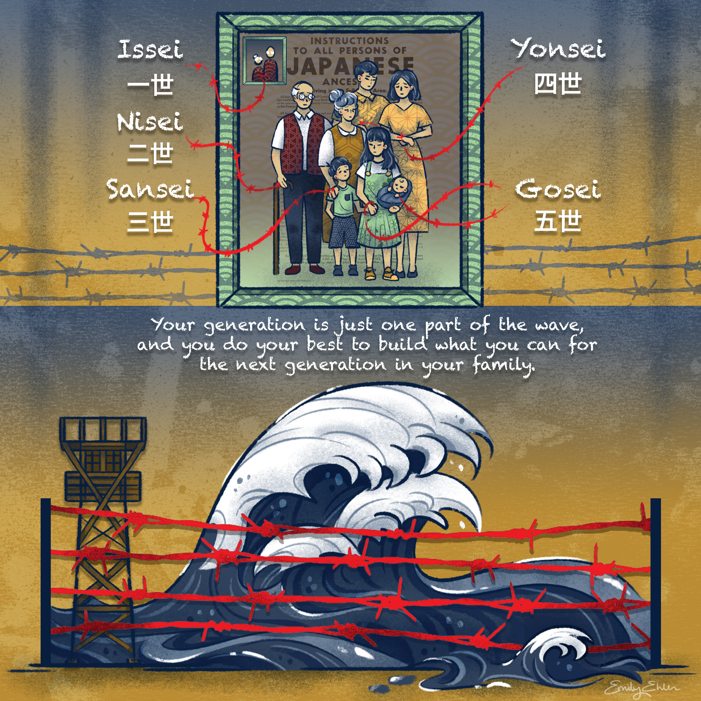
WAVE by Emily Ehlen

Please read the text below this image, which describes this graphic narrative illustration with more detail than Alternative Text allows.

This image titled WAVE consists of two panels. The top panel depicts text that relates to the number of generations of Japanese descents surrounding a family portrait using barbed wires as arrows. The text is in romanized Japanese and kanji. It reads: “Issei,” meaning first generation; “Nisei,” meaning second generation; “Sansei,” meaning third generation; “Yonsei,” meaning fourth generation; and “Gosei,” meaning fifth generation. The bottom panel depicts a large wave and guard tower behind barbed wire with text above that reads, “Your generation is just one part of the wave, and you do your best to build what you can for the next generation in your family.”


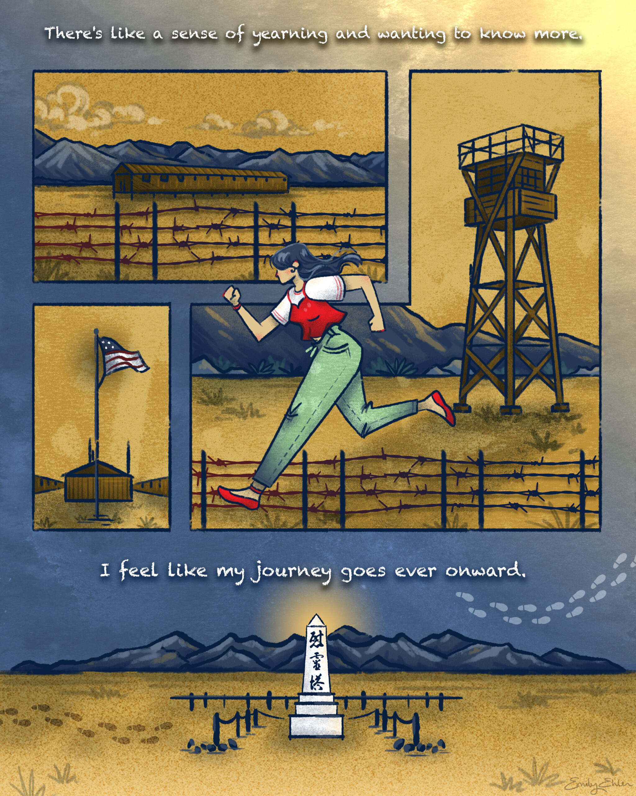
MANZANAR by Emily Ehlen

Please read the text below this image, which describes this graphic narrative illustration with more detail than Alternative Text allows.

This image titled MANZANAR consists of four different panels. Each panel depicts a part of an incarceration camp and features barbed wire, the American flag, and the buildings in the camp. Above the top panel there is text that reads, “There’s like a sense of yearning and wanting to know more.” In the middle right panel, a woman in a red top layered over a white T-shirt and green pants runs towards the left of the image. The bottom panel depicts the cemetery monument at Manzanar National Historic Site, with Japanese kanji written on top, which reads, “I REI TO,” or “soul consoling tower.” Below the bottom panel there is text that reads, “I feel like my journey goes ever onward.”


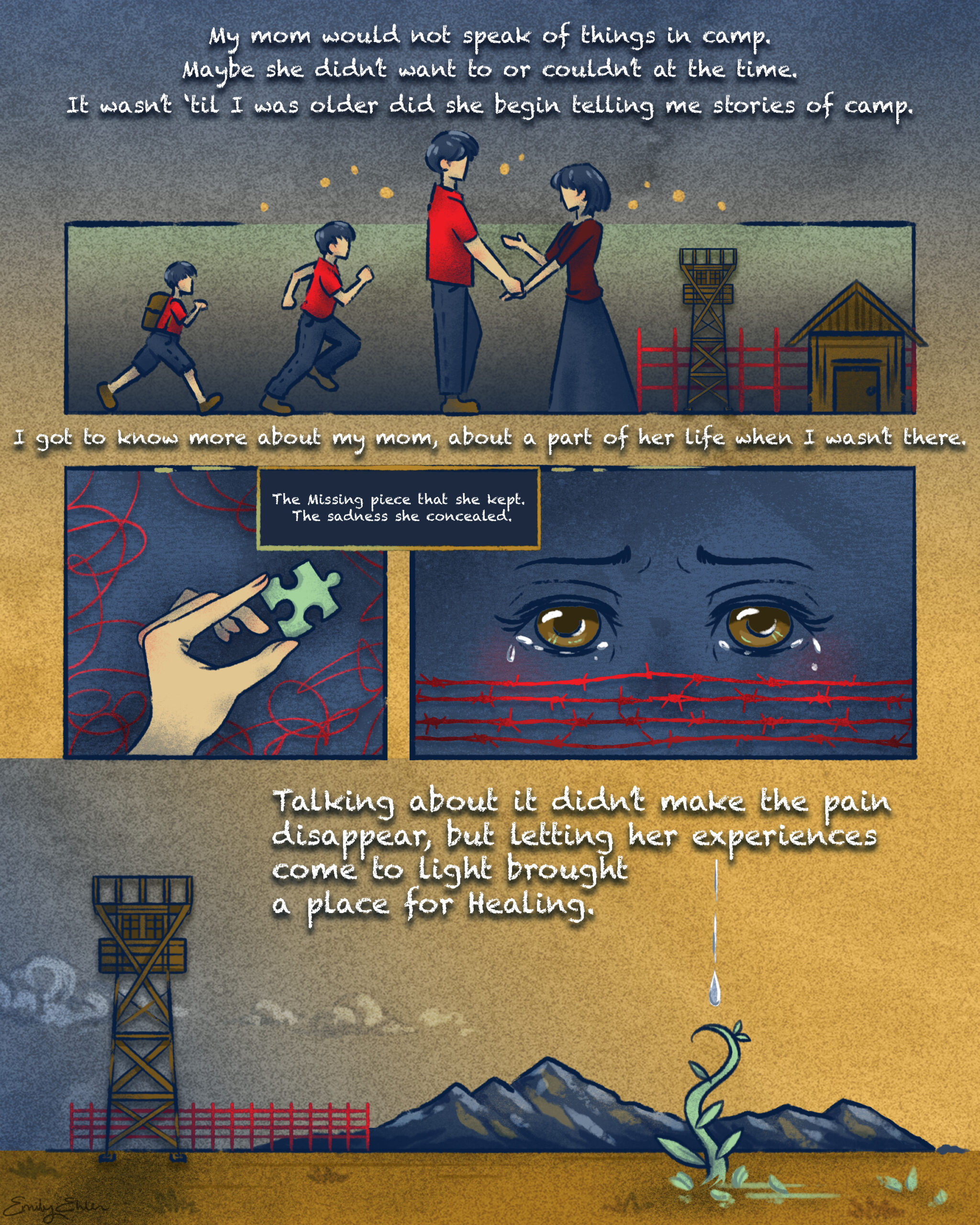
STORIES by Emily Ehlen

Please read the text below this image, which describes this graphic narrative illustration with more detail than Alternative Text allows.

This image titled STORIES consists of four panels. The top panel depicts a growing boy talking to his mother. An incarceration camp appears behind the mother. Above this top panel, the text reads, “My mom would not speak of things in camp. Maybe she didn’t want to or couldn’t at the time. It wasn’t ’til I was older did she begin telling me stories of camp.” Under this top panel, the text reads, “I got to know more about my mom, about a part of her life when I wasn’t there.” Two middle panels follow, depicting a green puzzle piece and crying eyes behind barbed wire. The text between these panels reads, “The missing piece she kept. The sadness she concealed.” In the bottom panel, tears from the eyes above fall into a plant on the ground that is growing. The text on this panel reads, “Talking about it didn’t make the pain disappear, but letting her experiences come to light brought a place for healing.”


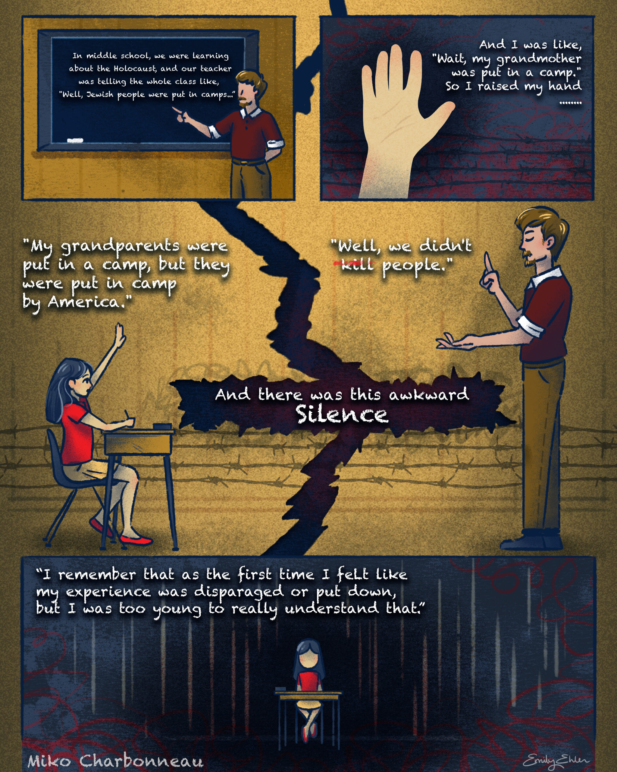
TEACHER by Emily Ehlen

Please read the text below this image, which describes this graphic narrative illustration with more detail than Alternative Text allows.

This image titled TEACHER consists of four panels. The top left panel shows a male teacher next to a chalkboard. The text on the chalkboard reads, “In middle school, we were learning about the Holocaust, and our teacher was telling the whole class like, ‘Well, Jewish people were put in camps…'” The top right panel depicts a raised hand with text that reads,  “And I was like, ‘Wait, my grandmother was put in a camp.’ So I raised my hand.” The middle panel depicts a girl sitting at a desk, a male teacher standing, and a large crack between them. On the left of the panel, the girl says, “My grandparents were put in a camp, but they were put in a camp by America.” The text in the large crack reads, “And there was this awkward silence.” The teacher responds, “Well, we didn’t kill people.” The word “kill” has a red strikethrough on it. The bottom panel depicts the girl at the desk alone in the dark. The text reads, “I remember that as the first time I felt like my experience was disparaged or put down, but I was too young to really understand that.” Text on the bottom left indicates these quotations are from Miko Charbonneau’s oral history for the Japanese American Intergenerational Narratives Oral History Project.


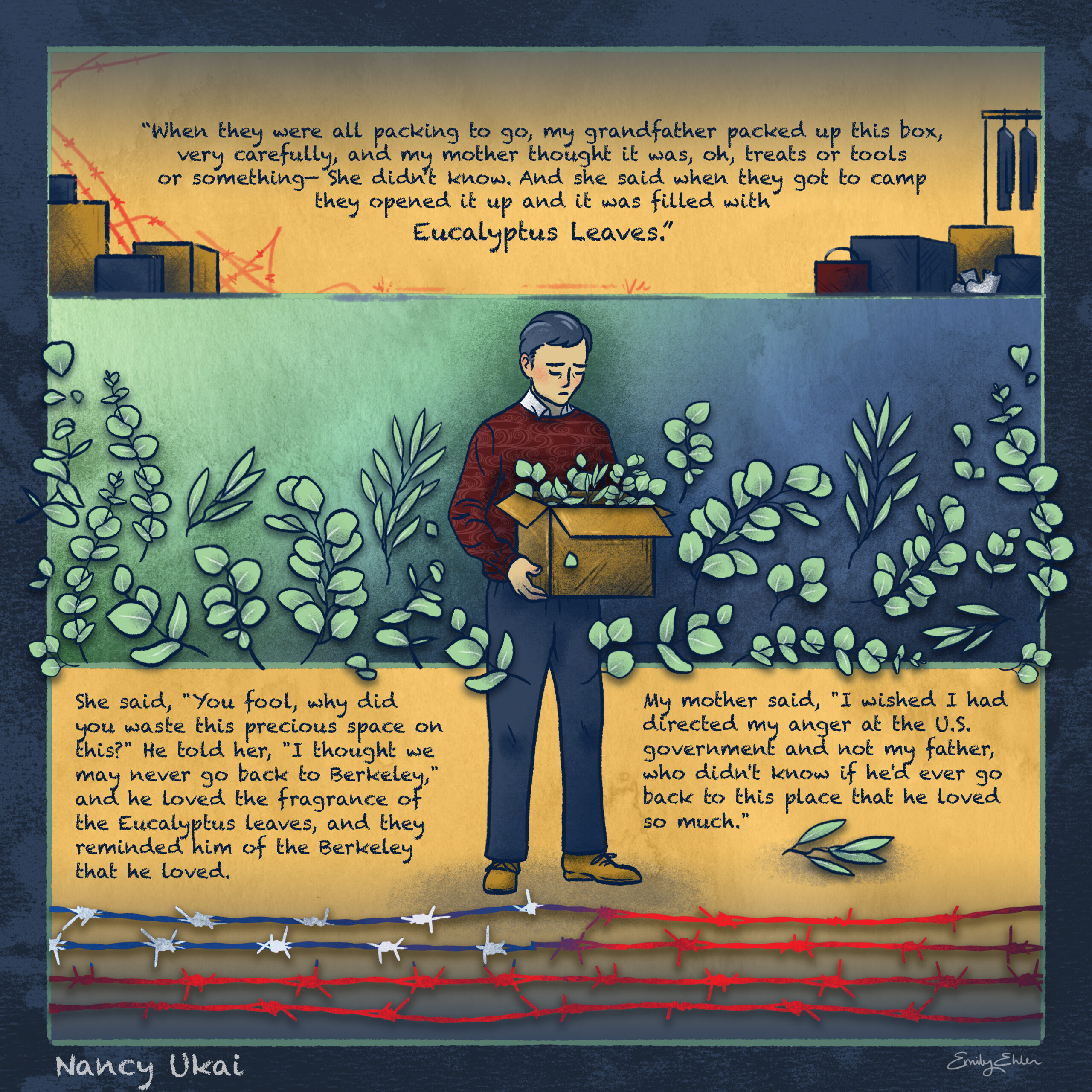
EUCALYPTUS by Emily Ehlen

Please read the text below this image, which describes this graphic narrative illustration with more detail than Alternative Text allows.

This image titled EUCALYPTUS consists of three panels. The top panel depicts suitcases and boxes of various sizes, and includes text which reads, “When they were all packing to go, my grandfather packed up this box, very carefully, and my mother thought it was, oh, treats or tools, or something—she didn’t know. And she said when they got to camp and opened it up and it was filled with Eucalyptus Leaves.” The words “eucalyptus leaves” are larger than the other words. In the center, the grandfather stands in front of all of the panels with a box of eucalyptus leaves. He is looking down with a sad expression. The bottom panel depicts some eucalyptus leaves as well as barbed wire that mimics the red, white, and blue of an American flag. This panel includes text which reads, “She said, ‘You fool, why did you waste this precious space on this?’ He told her, ‘I thought we may never go back to Berkeley,’ and he loved the fragrance of the Eucalyptus leaves, and they reminded him of the Berkeley he loved. My mother said, ‘I wished I had directed my anger at the U.S. government and not my father, who didn’t know if he’d ever go back to this place that he loved so much.'” Text on the bottom left indicates these quotations are from Nancy Ukai’s oral history for the Japanese American Intergenerational Narratives Oral History Project.


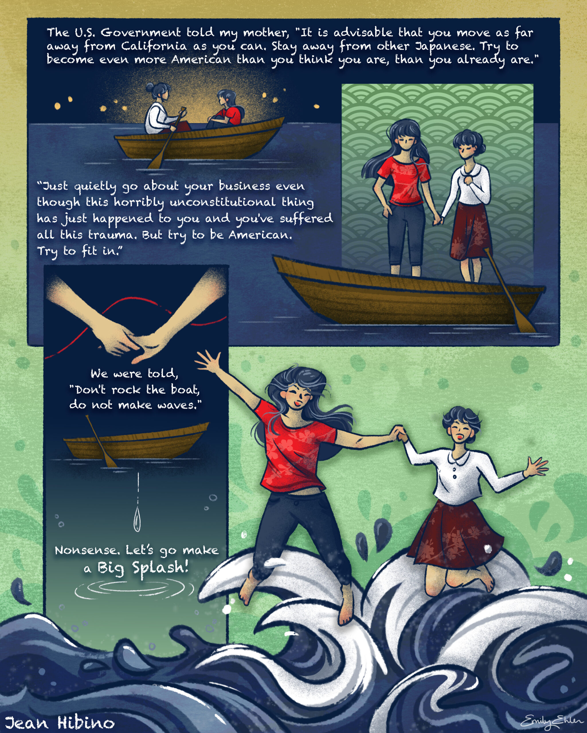
SPLASH by Emily Ehlen

Please read the text below this image, which describes this graphic narrative illustration with more detail than Alternative Text allows.

This image titled SPLASH consists of two panels on the top and two on the bottom. The top left panel depicts a younger woman and an older woman in a boat.  Text above the top two panels reads, “The U.S. Government told my mother, ‘It is advisable that you move as far away from California as you can. Stay away from other Japanese. Try to become even more American than you think you are, than you already are.'” The top right panel depicts the two women holding hands and standing in the boat. The text below these panels reads,”‘Just quietly go about your business even though this horribly unconstitutional thing has just happened to you and you’ve suffered all this trauma. But try to be American. Try to fit in.'” The bottom left panel depicts a close-up of the women holding hands above the boat and a ripple in the water. Beneath the hands, the text reads, “We were told, ‘Don’t rock the boat, do not make waves.” Beneath the boat, the text reads, “Nonsense. Let’s go make a Big Splash!” The bottom right panel depicts the two women holding hands and jumping into a sea of waves. Text on the bottom left indicates these quotations are from Jean Hibino’s oral history for the Japanese American Intergenerational Narratives Oral History Project.


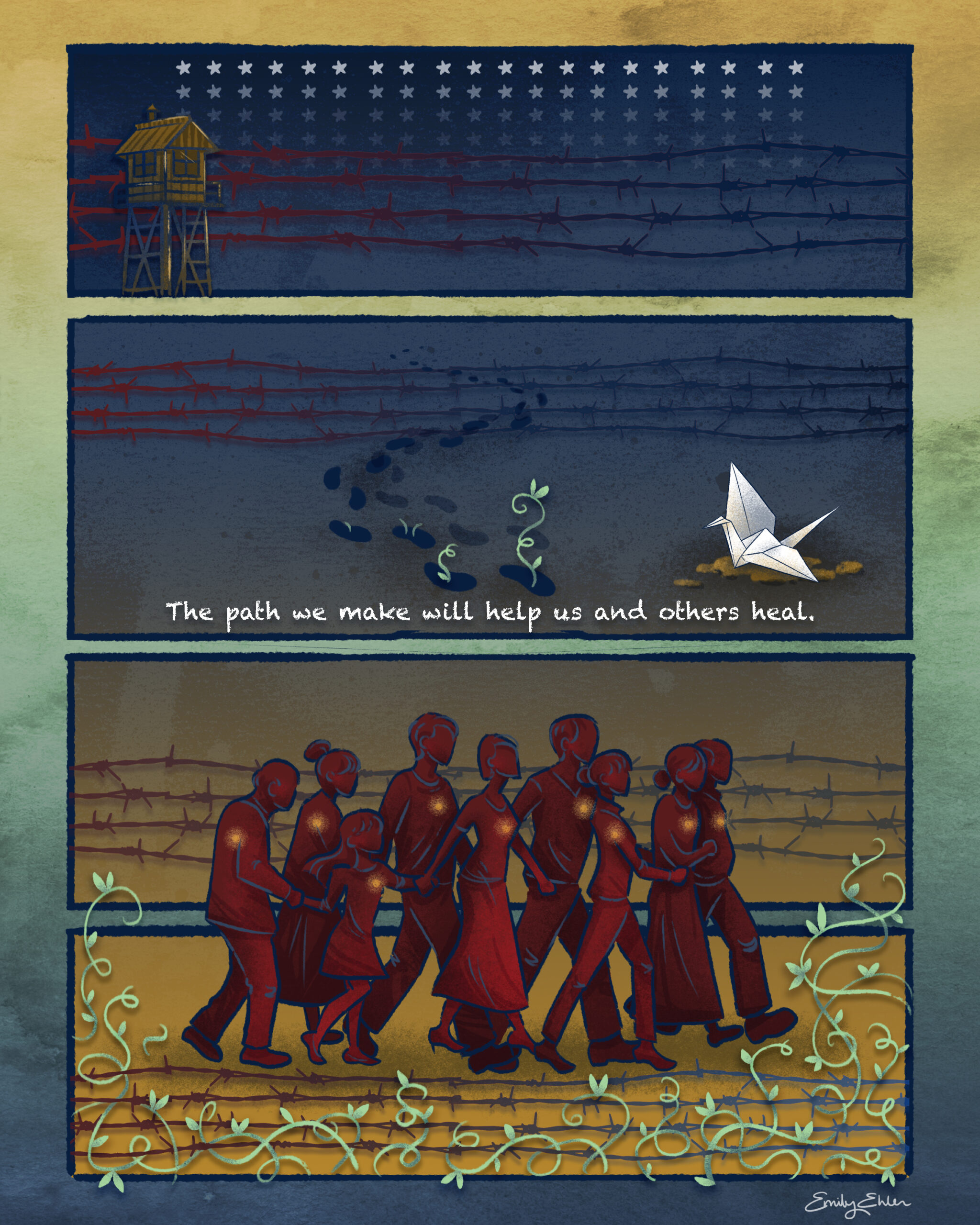
TOPAZ by Emily Ehlen

Please read the text below this image, which describes this graphic narrative illustration with more detail than Alternative Text allows.

This image titled TOPAZ consists of four panels. The top panel depicts white stars behind barbed wire in red and blue that mimics the American flag, as well as a guard tower. The next panel depicts footsteps with plants sprouting from the final four steps. To the right of the footsteps, a white paper crane rests on soil. Red and blue barbed wire appears in the background. Text at the bottom of this panel reads, “The path we make will help us and others heal.” The bottom two panels depict barbed wire at the top and bottom, which frame a group of people all holding hands walking to the right. The group of people, which includes a range of ages, spans both panels. The individuals have glowing lights over their hearts. Plants sprout from the bottom of this panel.


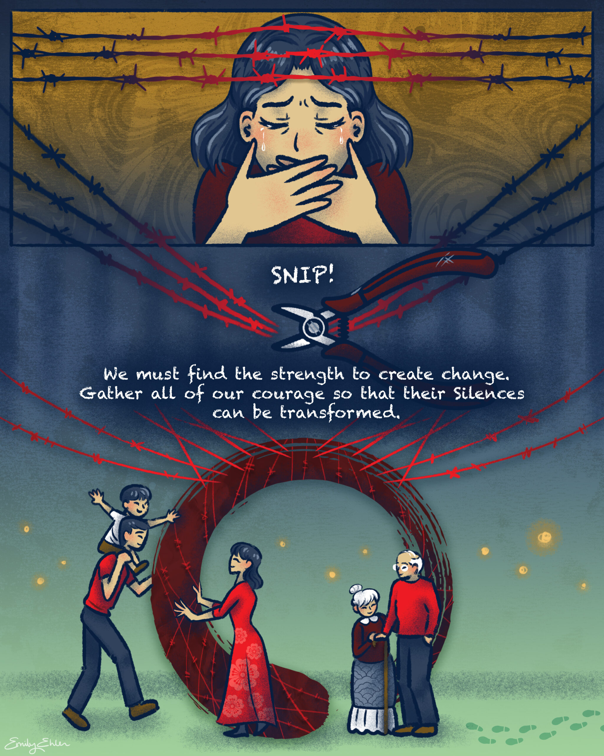
SILENCES by Emily Ehlen

Please read the text below this image, which describes this graphic narrative illustration with more detail than Alternative Text allows.

This image titled SILENCES consists of two panels. In the top panel, a woman cries while framed by red barbed wire. The bottom panel depicts wire cutters snipping the red barbed wire. Text reads, “SNIP!” Beneath the barbed wire is text that reads, “We must find the strength to create change. Gather all of our courage so that their silences can be transformed.” Beneath this text is a scene depicting a man with a child on his shoulders moving toward a woman with open arms. To the right of them are an elderly woman and man. Behind the group of people, there is a large, red circular ensō formed from the barbed wire. Glowing lights also appear in the background.


TREE by Emily Ehlen

Please read the text below this image, which describes this graphic narrative illustration with more detail than Alternative Text allows.

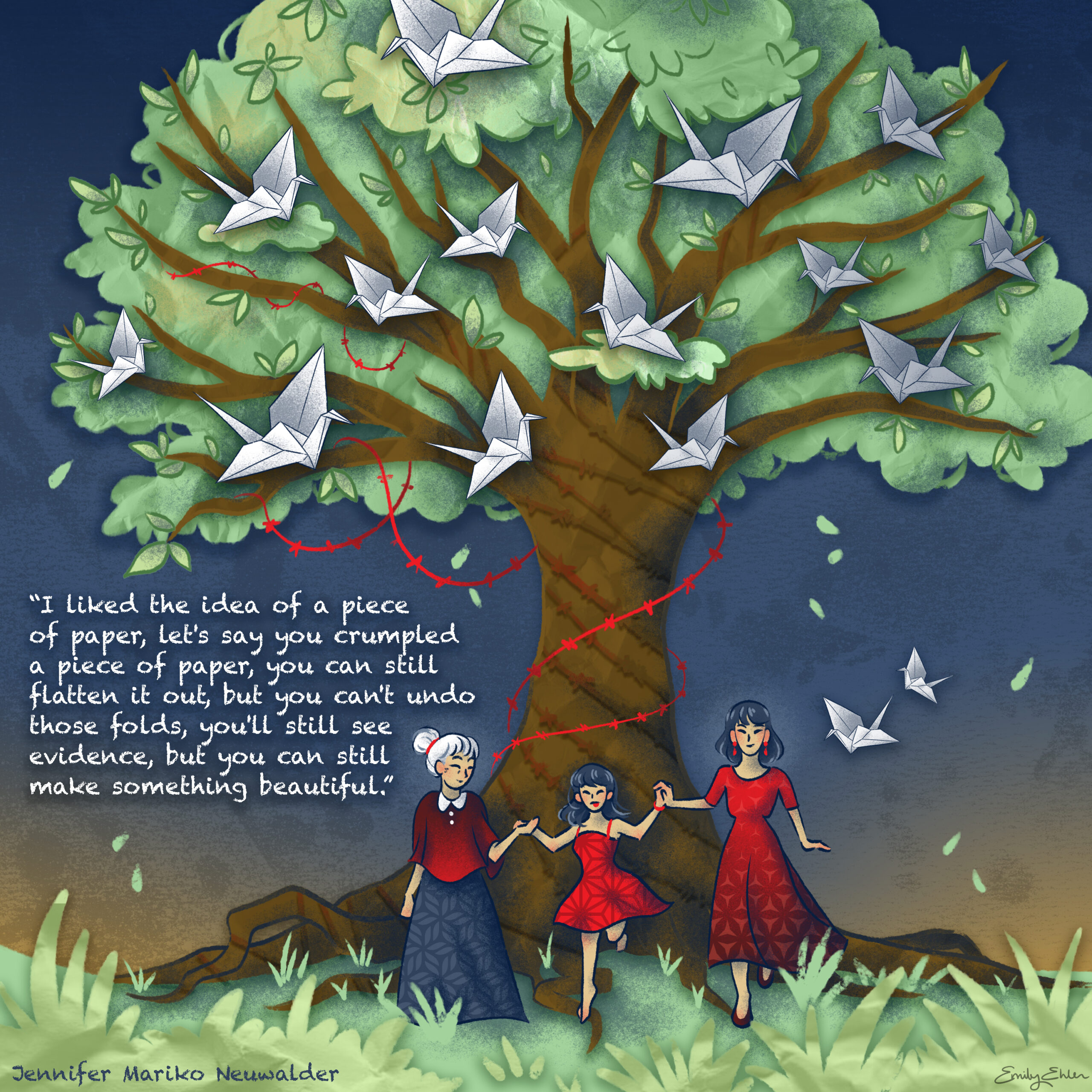
This image titled TREE consists of one panel, depicting three women of different generations holding hands in front of a large tree wrapped in red barbed wire and filled with white paper cranes. This image includes text which reads, “‘I liked the idea of a piece of paper, let’s say you crumpled a piece of paper, you can still flatten it out, but you can’t undo those folds, you’ll still see evidence, but you can still make something beautiful.” Text on the bottom left indicates these quotations are from Jennifer Mariko Neuwalder’s oral history for the Japanese American Intergenerational Narratives Oral History Project.


FEAST by Emily Ehlen

Please read the text below this image, which describes this graphic narrative illustration with more detail than Alternative Text allows.

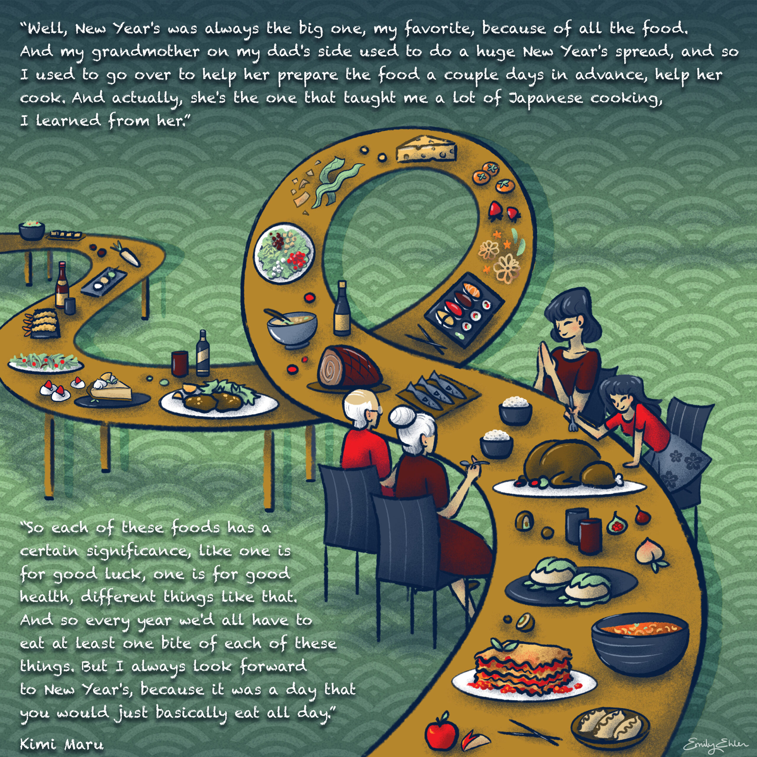
This image titled FEAST consists of one panel that depicts a long table that stretches from the left side to the bottom right which loops before reaching four people of different generations eating. The food on the table includes a variety of foods like sushi, lasagna, salad, turkey, and dumplings. Text at the top of the image reads, “‘Well, New Year’s was always the big one, my favorite, because of all the food. And my grandmother on my dad’s side used to do a huge New Year’s spread, and so I used to go over to help her prepare the food a couple days in advance, help her cook. And actually, she’s the one that taught me a lot of Japanese cooking, I learned from her.'” Text on the bottom left of the image reads,, “‘So each of these foods has a certain significance, like one is for good luck, one is for good health, different things like that. And so every year we’d all have to eat at least one bite of each of these things. But I always look forward to New Year’s, because it was a day that you would just basically eat all day.'” Text on the bottom left indicates these quotations are from Kimi Maru’s oral history for the Japanese American Intergenerational Narratives Oral History Project.

Explore the oral history interviews in the Japanese American Intergenerational Narratives Oral History Project, listen to The Berkeley Remix podcast season “’From Generation to Generation’: The Legacy of Japanese American Incarceration,” and discover related resources on the Oral History Center website.

Acknowledgments for the Japanese American Intergenerational Narratives Oral History Project

This project was funded, in part, by a grant from the U.S. Department of the Interior, National Park Service, Japanese American Confinement Sites Grant Program. The views and conclusions contained in this document are those of the authors and should not be interpreted as representing the opinions or policies of the U.S. government. Mention of trade names or commercial products does not constitute their endorsement by the U.S. Government.

This material received federal financial assistance for the preservation and interpretation of U.S. confinement sites where Japanese Americans were detained during World War II. Under Title VI of the Civil Rights Act of 1964, Section 504 of the Rehabilitation Act of 1973, and the Age Discrimination Act of 1975, as amended, the U.S. Department of the Interior prohibits discrimination on the basis of race, color, national origin, disability or age in its federally funded assisted projects. If you believe you have been discriminated against in any program, activity, or facility as described above, or if you desire further information, please write to:

Office of Equal Opportunity
National Park Service
1201 Eye Street, NW (2740)
Washington, DC 20005

ABOUT THE ORAL HISTORY CENTER

The Oral History Center of The Bancroft Library preserves voices of people from all walks of life, with varying political perspectives, national origins, and ethnic backgrounds. We are committed to open access and our oral histories and interpretive materials are available online at no cost to scholars and the public. You can find our oral histories from the search feature on our home page. Search by name, keyword, and several other criteria. Sign up for our monthly newsletter  featuring think pieces, new releases, podcasts, Q&As, and everything oral history. Access the most recent articles from our home page or go straight to our blog home.

Please consider making a tax-deductible donation to the Oral History Center if you’d like to see more work like this conducted and made freely available online. The Oral History Center is a predominantly self-funded research unit of The Bancroft Library. As such, we must raise the funds to cover the cost of all the work we do, including each oral history. You can give online, or contact us at ohc@berkeley.edu for more information about our funding needs for present and future projects.