This map shows the locations of the bookstores, printers, and publishers in San Francisco in 1955 according to Polk’s Directory (SFPL link). The map highlights the quantity thereof as well as their centrality in the downtown. That number combined with location suggests that publishing was a thriving industry.
Using my 1955 publishing dataset in Google My Maps (https://www.google.com/maps/d) I have linked the directory addresses of those business categories with a contemporary street map and used different colors to highlight the different types. The contemporary street map allows people to get a sense of how the old data compares to what they know (if anything) about the modern city.
My initial Google My Map, however, was a bit hard to see because of the lack of contrast between my points as well as how they blended in with the base map. One of the things that I like to keep in mind when working with digital tools is that I can often change things. Here, I’m going to poke at and modify my
- Base map
- Point colors
- Information panels
- Sharing settings
My goal in doing so is to make the information I want to understand for my research more visible. I want, for example, to be able to easily differentiate between the 1955 publishing and printing houses versus booksellers. Here, contrasting against the above, is the map from the last post:
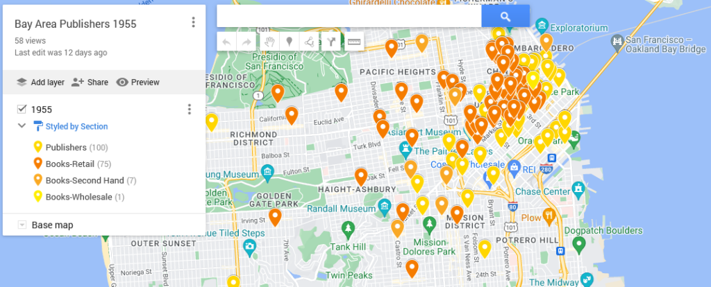
Quick Reminder About the Initial Map
To map data with geographic coordinates, one needs to head to a GIS program (US.gov discussion of). In part because I didn’t yet have the latitude and longitude coordinates filled in, I headed over to Google My Maps. I wrote about this last post, so I shan’t go into much detail. Briefly, those steps included:
-
- Logging into Google My Maps (https://www.google.com/maps/d/)
- Clicking the “Create a New Map” button
- Uploading the data as a CSV sheet (or attaching a Google Sheet)
- Naming the Map something relevant
Now that I have the map, I want to make the initial conclusions within my work from a couple weeks ago stand out. To do that, I logged back into My Maps and opened up the saved “Bay Area Publishers 1955.”
Base Map
One of the reasons that Google can provide My Maps at no direct charge is because of their advertising revenue. To create an effective visual, I want to be able to identify what information I have without losing my data among all the ads.
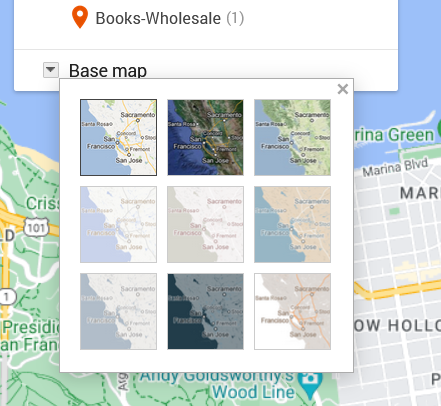
To move in that direction, I head over to the My Map edit panel where there is a “Base map” option with a down arrow. Hitting that down arrow, I am presented with an option of nine different maps. What works for me at any given moment depends on the type of information I want my data paired with.
The default for Google Maps is a street map. That street map emphasizes business locations and roads in order to look for directions. Some of Google’s My Maps’ other options focus on geographic features, such as mountains or oceans. Because I’m interested in San Francisco publishing, I want a sense of the urban landscape and proximity. I don’t particularly need a map focused on ocean currents. What I do want is a street map with dimmer colors than Google’s standard base map so that my data layer is distinguishable from Google’s landmarks, stores, and other points of interest.
Nonetheless, when there are only nine maps available, I like to try them all. I love maps and enjoy seeing the different options, colors, and features, despite the fact that I already know these maps well.
The options that I’m actually considering are “Light Political” (option center left in the grid) “Mono City” (center of the grid) or “White Water” (bottom right). These base map options focus on that lighter-toned background I want, which allows my dataset points to stand clearly against them.
For me, “Light Political” is too pale. With white streets on light gray, the streets end up sinking into the background, losing some of the urban landscape that I’m interested in. The bright, light blue of the ocean also draws attention away from the city and toward the border, which is precisely what it wants to do as a political map.
I like “Mono City” better as it allows my points to pop against a pale background while the ocean doesn’t draw focus to the border.
Of these options, however, I’m going to go with the “White Water” street map. Here, the city is done up with various grays and oranges, warming the map in contrast to “Mono City.” The particular style also adds detail to some of the geographic landmarks, drawing attention to the city as a lived space. Consequently, even though the white water creeps me out a bit, this map gets closest to what I want in my research’s message. I also know that for this data set, I can arrange the map zoom to limit the amount of water displayed on the screen.
Point colors
Now that I’ve got my base map, I’m on to choosing point colors. I want them to reflect my main research interests, but I’ve also got to pick within the scope of the limited options that Google provides.
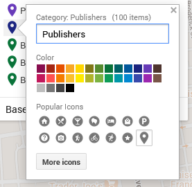
I head over to the Edit/Data pane in the My Maps interface. There, I can “Style” the dataset. Specifically, I can tell the GIS program to color my markers by the information in any one of my columns. I could have points all colored by year (here, 1955) or state (California), rendering them monochromatic. I could go by latitude or name and individually select a color for each point. If I did that, I’d run up against Google’s limited, 30-color palette and end up with lots of random point colors before Google defaulted to coloring the rest gray.
What I choose here is the types of business, which are listed under the column labeled “section.”
In that column, I have publishers, printers, and three different types of booksellers:
- Printers-Book and Commercial
- Publishers
- Books-Retail
- Books-Second Hand
- Books-Wholesale
To make these stand out nicely against my base map, I chose contrasting colors. After all, using contrasting colors can be an easy way to make one bit of information stand out against another.
In this situation, my chosen base map has quite a bit of light grays and oranges. Glancing at my handy color wheel, I can see purples are opposite the oranges. Looking at the purples in Google’s options, I choose a darker color to contrast the light map. That’s one down.
For the next, I want Publishers to compliment Printers but be a clearly separate category. To meet that goal, I picked a darker purply-blue shade.
Moving to Books-Retail, I want them to stand as a separate category from the Printers and Publishers. I want them to complement my purples and still stand out against the grays and oranges. To do that, I go for one of Google’s dark greens.
Looking at the last two categories, I don’t particularly care if people can immediately differentiate the second-hand or wholesale bookstores from the retail category. Having too many colors can also be distracting. To minimize clutter of message, I’m going to make all the bookstores the same color.
Pop-ups/ Information Dock
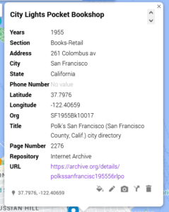
For this dataset, the pop-ups are not overly important. What matters for my argument here is the spread. Nonetheless, I want to be aware of what people will see if they click on my different data points.
[Citylights pop-up right]
In this shot, I have an example of what other people will see. Essentially, it’s all of the columns converted to a single-entry form. I can edit these if desired and—importantly—add things like latitude and longitude.
The easiest way to drop information from the pop-up is to delete the column from the data sheet and re-import the data.
Sharing
As I finish up my map, I need to decide whether I want to keep it private (the default) or share it. Some of my maps, I keep private because they’re lists of favorite restaurants or loosely planned vacations. For example, a sibling is planning on getting married in Cadiz in Spain, and I have a map tagging places I am considering for my travel itinerary.
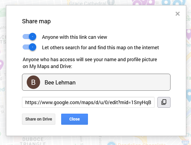
Here, in contrast, I want friends and fellow interested parties to be able to see it and find it. To make sure that’s possible, I clicked on “Share” above my layers. On the pop-up (as figured here) I switched the toggles to allow “Anyone with this link [to] view” and “Let others search for and find this map on the internet.” The latter, in theory, will permit people searching for 1955 publishing data in San Francisco to find my beautiful, high-contrast map.
Important: This is also where I can find the link to share the published version of the map. If I pull the link from the top of my window, I’d share the editable version. Be aware, however, that the editable and public versions look a pinch different. As embedded at the top of this post, the published version will not allow the viewer to edit the material and will have the sidebar for showing my information, as opposed to the edit view’s pop-ups.
Next steps
To see how those institutions sit in the 1950s world, I am inclined to see how those plots align across a 1950s San Francisco map. To do that, I’d need to find an appropriate map and add a layer under my dataset. At this time, however, Google Maps does not allow me to add image and/or map layers. So, in two weeks I’ll write about importing image layers into Esri’s ArcGIS.