Earth Sciences and Map Library
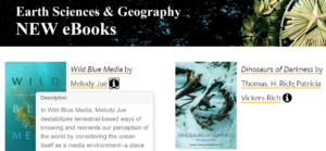
New Earth Sciences & Map Library E-Books LibGuide!
The New Accessible Earth Sciences & Map Library E-Books LibGuide is live!
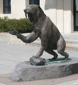
During the pandemic the Earth Sciences & Map Library team found a way to make our collection more accessible to our patrons who are unable to walk up to our “New Books” shelf and check out material housed in McCone Hall (yes the building with the Smilodon saber-toothed tiger statue). Although it started as a trial run for other Engineering & Physical Science Library collections, we saw how useful it would be to our patrons and created the LibGuide. Two months later, our online collection is live and accessible to our users who are connected to the library proxy and/or the Virtual Private Network (VPN).
What’s In Our Collection?
Many would be surprised by the vast variety of books we purchase for our departments and patrons. Books such as environmental justice, tourism during the pandemic, dinosaurs, and much more. We even have a “call to action” book by Jane Fonda, yes, THE Jane Fonda who is also an activist working towards climate change by having conversations with scientists and community members! Visit our libguide to find more intriguing books just in time for the holiday break!
The Earth Sciences & Map Library wishes everyone a safe holiday!
Lines of Latitude: Plano del puerto de Sn. Francisco (1776)
The most wonderful nautical chart of San Francisco Bay is the very first one that was ever made, in 1776.
A manuscript map, pen-and-ink and watercolor. Attributed to José de Cañizares, a Spanish naval officer. Cañizares was an ensign on Juan Manuel de Ayala’s ship, the packet boat San Carlos, i.e. a transport.
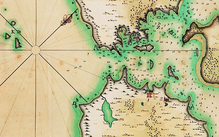
Plano del puerto de Sn. Francisco : situado por los 37. grs. 53 mins. de latitud septentrional, y por 17. grs. 10. mins. de longitud occidental del puerto de Sn. Blas: registrado por el paquebot de S.M. el Sn. Carlos al mando de Dn. Juan Manuel de Ayala, Teniente de Fragata de la Real (Real) Armada.
In 1768, the Spanish government drew up plans to built a naval base at San Blas, on the Pacific Coast of what is now Mexico, a bit north of Puerto Vallarta.
Three ships were sent north in 1775, for a Spanish expedition to explore the Pacific Northwest.
One of the ships was the transport San Carlos commanded by Juan Manuel de Ayala, the only Spanish ship to enter San Francisco Bay in 1775.
High resolution PDF:
https://www.lib.berkeley.edu/EART/maps/g4362s22_1776_c4.jpg
Image in the University of California’s digital collection:
https://digicoll.lib.berkeley.edu/record/58550
Various other nautical charts document the work of José de Cañizares in San Francisco Bay in 1775, including this one:
Plano del Puerto de San Francisco, registrado por el Paquebot de S.M. San Carlos, al mando del theniente de Fragata de la Real Armada Don Juan Manuel de Ayala, en esta año de 1775.
https://digicoll.lib.berkeley.edu/record/58549
StoryMaps tells Viewers a Story through Maps
At the Earth Sciences and Map Library staff, students, and faculty have access to fantastic mapping resources. The library has resources for topographic maps, geologic maps, historical maps, sanborn & other fire insurance maps, nautical maps, and GIS data. Out of all the resources, one of the most fun to use is ArcGIS StoryMaps. To access StoryMaps with your CalNet ID, you want to access it through your institutional account. Go to http://cal.maps.arcgis.com and click on the link to login using your UC Berkeley Calnet account. If you do not have a CalNet ID you can access StoryMaps with an ArcGIS Public Account.
![View from the university ground [sic] at Berkeley, 1874](https://update.lib.berkeley.edu/wp-content/uploads/2020/12/View-from-the-university-ground-sic-at-Berkeley-the-Golden-Gate-in-the-distance-300x266.jpg)
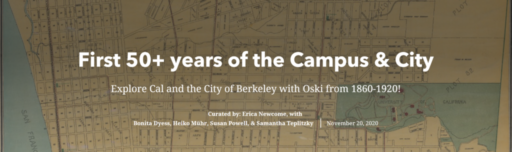
This November, the Earth Sciences and Map Library created an exhibit using StoryMaps titled First 50+ years of the Campus & City. StoryMaps allows you to do just as the title tells you, create stories with maps. You can add maps, text, images, and multimedia to tell your unique narrative. Staff of the Earth Sciences and Map Library were able to create an interactive story that showed how the campus and city changed over time from the founding of the UC Berkeley campus in 1868 to 1920 when the city and campus had greatly expanded over 50+ years.
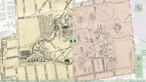 One of the most powerful components of StoryMaps is its interface that allows the creator to make an exhibit that is highly interactive. In the exhibit for the Earth Sciences and Map Library, there is an app called swipe which allows a creator to place two maps side by side which users can then swipe left to right to compare the maps. This tool was added to the exhibit for the Earth Sciences and Map Library using two maps of the UC Berkeley campus from 1901 and 1911. Users are able to swipe left and right to see the differences between the two maps that show the changes campus underwent in a ten year span. The ability to have these types of interactive and comparative maps allows users to learn visually the differences and similarities between 2 maps.
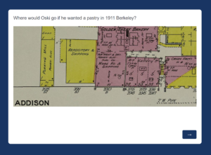
StoryMaps also has the capability to insert embedded code. This allowed the exhibit to have Qualtrics embedded. In the exhibit from the Earth Sciences and Map Library, Qualtrics was embedded and created to be a game that asks users to click on a map to answer related questions to old buildings. With the embedded Qualtrics the exhibit incorporated play into its story to engage users and added a bit of fun to its narrative. One thing to note when embedding code in StoryMaps is to double check that you have inserted the correct code. When creating the exhibit the Earth Sciences and Map Library staff learned the hard way that when code is entered incorrectly, it will cause StoryMaps to crash.
Another important feature of StoryMaps is creating groups on ArcGIS Online. This feature helped immensely when creating an exhibit for the Earth Sciences and Map Library. By having StoryMaps added to the group, all staff members of the library were able to edit the exhibit. This group sharing ability allows for large groups to easily collaborate virtually.
After our own positive experience creating an exhibit using StoryMaps for the Earth Sciences and Map Library, we highly recommend using it if you want to create an interactive experience for users by telling a story with maps. StoryMaps would be great for an exhibit, project, or presentation whether that be for an academic class, a professional presentation, or a library. There are so many features and tools with StoryMaps you can use to bring your maps to life!
Lines of Latitude: Sebastian Münster and his Cosmographia (1544)
Sebastian Münster, Hebrew scholar and theologian, was a curious man, a seeker and a risk taker. First a professor of Old Testament Studies, Münster reinvented himself. In 1536, he accepted a teaching position in mathematics at the University of Basel, in Switzerland.
And Münster developed a sideline that came to define how we remember him today–he worked as a cartographer and cosmographer. Already in 1536, he released a Mappa Europae, later followed by a Latin edition of Ptolemy’s Geographia. But Sebastian Münster’s legacy is wrapped up in his Cosmographia of 1544, a book that managed the rare feat of being both scientific and popular. It was a runaway bestseller which described and explained the cosmos. In fact, it revolutionized how 16th century readers thought about the physical world.
From 1544 to 1628 the work passed through 40 editions in German, Latin, Czech, Italian, French and English and somehow persuaded educated Europeans to get interested in geography. Münster was assisted by more than one hundred and twenty collaborators. Famous woodcut artists contributed illustrations and that surely must have helped. The richly illustrated Latin version published in 1550 is the most prized edition today, in part because of its amazing city views.
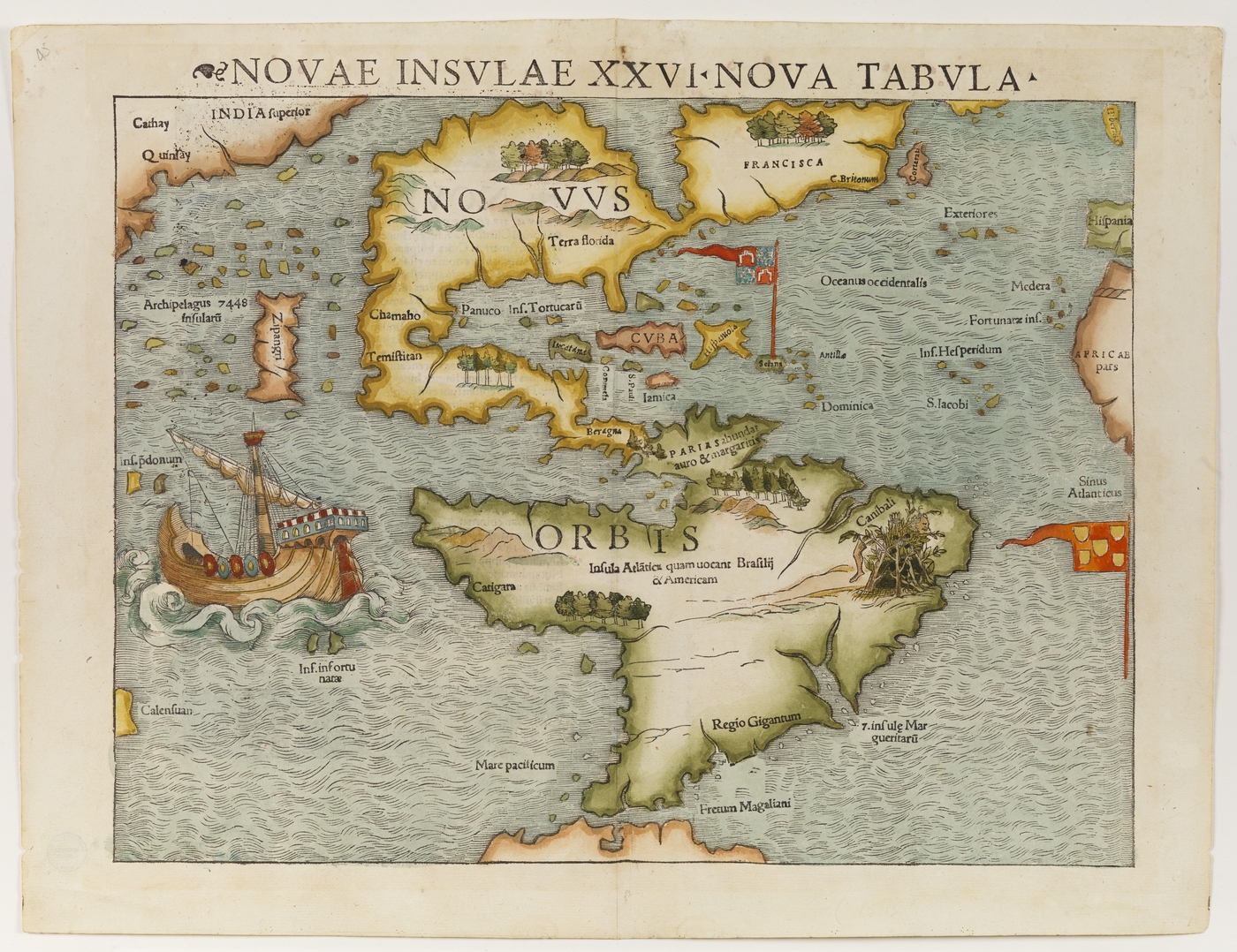
But there was something else in the Cosmographia that rightfully fascinated readers: Four maps which struck a mortal blow at the medieval world view that ordered the physical world based on religious ideas. For centuries, medieval mappae mundi [= world maps] had depicted the known world, Asia, Africa and Europe, arranged in a Jerusalem-centered T-O design. Separate maps of individual continents were extremely rare in the European Middle Ages.
Münster made a radical choice. He insisted that this divinely ordered world, God’s creation, could be disassembled and depicted in parts, on different maps, which together would make up the known world. For his Cosmographia Sebastian Münster created four separate maps to depict the four known continents– the Americas, Africa, Asia and Europe. That includes his now famous depiction of the Western Hemisphere.
Lines of Latitude: Telling the Story of Maps
Why do maps speak to us?
Maps have explanatory power. They are visualization tools which help us to comprehend the social and physical world around us. They orient us. They impose order on chaos. But maps are also based on subjective choices made by cartographers who employ visualization techniques to reduce complexity. Cartographers create meaning by simplifying the social and physical world.
Cartography is a varied visual tradition which reaches back thousands of years. It emerged in different places and created the diverse mappy universe which we will explore through this map blog. Maps offer insights, a greater understanding of the world around us – and also of the past. And they are a window into the incredible biological and cultural diversity on this planet we call home.
The University of California Library at Berkeley just started the soft launch of our German World War II Captured Maps spatial humanities project which involves digitizing rich collections with about 20,000 maps, chiefly issued by German mapping agencies between the 1880s and 1945. That project will last into 2022 and our initial posts will focus on telling stories related to this important project.
But the Earth Sciences and Map Library at UC Berkeley is also located in a particular place, the East Bay, at the edge of the vast San Francisco Estuary, in northern California. Our small Bay Area world is connected to the larger world through Oakland’s vast commercial port. Transportation networks sustain our lives at the edge of the Pacific Ocean. Commuter ferries whiz across San Francisco Bay. We are close to some incredible physical spaces, the Marin Headlands, Muir Woods, Point Reyes National Seashore, several ranges of the Coastal Mountains.
The Ohlone are the predominant Indigenous group of the Bay Area. Spanish colonizers and the European diseases they brought to northern California undermined Ohlone existence and culture. In the wake of the Gold Rush the California state government sanctioned the murder of Indigenous populations by local militia. By the 1880s, the Bay Area Ohlone population was dramatically reduced.
Historically this area has been part of larger geographical frames, for example the Southwest, the borderlands of New Spain, Alta California, and the Western United States. We will look at how historical change has affected northern California.
And we are planning to explore many other worthwhile places and topics–the larger mappy universe. That is a world filled with surveyors, cosmographers, explorers, topographic engineers, mapping agencies, globes, atlases, aerial photography, satellite images, geological maps and rhumb lines, in short many worthwhile things.
Right now we are still working from our home offices, separated from the physical collections at the Earth Science and Map Library, in the middle of the COVID-19 pandemic. This also will be a place to publicize what is happening at the Earth Sciences and Map Library.
We hope you will find something enjoyable here and come along for the ride!
Bonita Dyess
Erica Newcome
Heiko Mühr
Susan Powell
Samantha Teplitzky
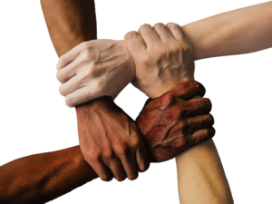
Diversity, Equity, and Inclusion: Earth Sciences Map Library & Earth & Planetary Science Department!
Stemming from an impressive call to action by a group of Earth & Planetary Science Graduate Students, we’ve found a way to provide resources to further educate faculty, staff, and students on the topic of Diversity, Equity, and Inclusion. This EPS Diversity, Equity, and Inclusion Libguide was created in partnership by the Earth & Planetary Science department graduate students and the Earth Sciences and Map Library. Along with the libguide living on the library website, it’s been placed under a new DEI tab on the Earth & Planetary Science Department website.
What’s in the Libguide?
It includes a Zotero Library, tools on how to add content to diversify Wikipedia, strategies to search for and follow diverse voices via social media, conferences, and more. The Libguide also links to the Engineering Library’s DEI Book Collection Libguide!
How did this get started?
While staff member Bonita Dyess and Open Science Librarian Samantha Teplitzky were reading the grad student’s call to action, they noticed a potential section the Earth Sciences/Map library could be of assistance. They contacted the graduate students and met via Zoom due to the pandemic. The conversation resulted in the creation of the LibGuide!
How can this benefit my library?
Diversity, equity, and inclusion is important to create community and belonging. DEI efforts are strongly supported by the library and campus as a whole. This libguide can serve as a tool for various departments creating and promoting DEI efforts. EPS and geography are the subjects highlighted in this particular libguide, but the strategies are universal especially within the STEM fields. It’s also important to note that collaborative efforts between staff and librarians can be beneficial!